Available Fonts
While you can technically add any Google Font in the fonts section, they won't all work. We've defined a specific subset of fonts that we've tested to ensure:
- they load quickly
- they don't cause CLS
- they have the correct font weights (eg. boldness)
We recommend using the Feast Fonts plugin found in your downloads.
Fonts we recommend and support:
Heading Fonts
- Agbalumo
- Aleo*
- Caprasimo
- Fredoka
- Inter*
- Josefin Sans*
- Karma*
- Lato*
- Montserrat*
- Open Sans*
- Poppins*
- Quicksand*
- Raleway*
- Rubik*
- Source Sans 3*
- Source Serif 4*
- Abril Fatface
- Bree Serif
- EB Garamond*
- Josefin Slab*
- Lora*
- Libre Baskerville*
- Marcellus
- Playfair Display*
Body Copy Fonts
- Open Sans
- Inter
- Lato
- Source Sans 3
- Quicksand
- Raleway
- Rubik
Accent Fonts
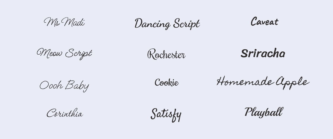
- Caveat
- Cookie
- Corinthia
- Dancing Script
- Homemade Apple
- Meow Script
- Ms Madi
- Oooh Baby
- Orelega One
- Playball
- Rochester
- Satisfy
- Sriracha
* Headings marked with an asterisk have both regular and bold weights available. You can set this under "Heading Weight" on the Feast+ Branding Page.

Font Pairing Ideas:
Choosing another Google Font that isn't listed enough may result in:
- downloading very large font files (eg. 500+ kb) which will slow your page speed due to downloading font subsets that aren't used on the site
- choosing a font whose heights don't match the system font height, which results in the font size increasing/decreasing, which results in CLS
- using a font that doesn't have all the necessary fractions needed for recipe sites
Font weights
Many fonts have up to 9 different boldness options, defined in increments of 100 through 900. There's also italic variations for some, but not all, weights.
We've considered adding the ability to specify your own font weights so that other fonts can be used, but it's impossible for us to test every font weight for every font to make sure it's safe for CLS. It also adds a huge technical burden to you to understand how to check which weight is needed.
Trying to load a font weight at 800, which doesn't have 800 as an option, means the font simply doesn't load at all.
You can set select headings to regular & bold using the list above.
Font pagespeed
We thought about maybe building a list of all font weights for a certain subset of fonts, but loading them all would cause pagespeed problems, and the majority of those weights would never be used.
And that doesn't even account for things like italics, which are often not available for every font weight (or at all).
Because of all this, we're sticking with 2 font options: 1 for the body, 1 for the heading.
- the body font gets loaded at font weight 400 (normal) and 800 (bold)
- the heading font gets loaded at font weight 800 (bold)
- note: we've made some exceptions to this for certain fonts and handled it automatically on the back end
We've tediously checked our font recommendations in the getting started guide, including fractions for the body fonts, to minimize your potential complications.
We've also spent considerable time pairing the fonts together to make sure they work cohesively, from an aesthetic standpoint.
Note: Google is working on some CSS specifications to allow better control over fonts to better control font widths and heights but this is years off being usable.
Despite all this optimization, using a Google Font will have some level of negative impact on pagespeed and opting not to use a Google Font in favor of the system fonts (default) will result in better pagespeed scores. Whether it's worth the trade-off is a personal decision you need to make.
All Feast+ sites we're aware of use Google Fonts and are able to pass pagespeed/CWV if the rest of the site is optimized (eg. javascript, plugins, server, caching, etc).
Custom fonts
We simply can't support all of the thousands of font options at Google so any font not specifically listed above is not supported.
You can still use a custom Google Font if you're able to:
- understand how to load fonts
- choose the appropriate weight
- control it with CSS
- check for fractions
- check for CLS
- monitor and respond to changes over time (eg. Google removing the font, or font weight)
Then you can opt to not use our font setup and do it yourself.
Feast Fonts
You can install the Feast Fonts Plugin to host our recommended Google Fonts locally on your site, which should improve pagespeed and avoid the GDPR issues below.
Note that this only impacts the Feast setup and not any third party scripts or plugins.
The list of available Feast Fonts can be found here.
Google Fonts GDPR
Loading fonts from Google (as implemented by Feast+, and any non-custom-theme) is a violation of GDPR.
Whether this matters to you or not is a discussion you'd have to have with your lawyer. Anything you read online about this is worthless.
If you want to reduce your Google-font-specific exposure, you can use the OMGF plugin to automatically download and cache fonts on your server. The plugin has good documentation and tends to work well.
Any issues you run into with this will need to be addressed with the plugin developer, your host, or NerdPress.
Most notably, OMGF caches fonts fairly aggressively which means that new fonts you set won't be displayed until the font cache has been cleared.
OMGF also has special requires for translations.
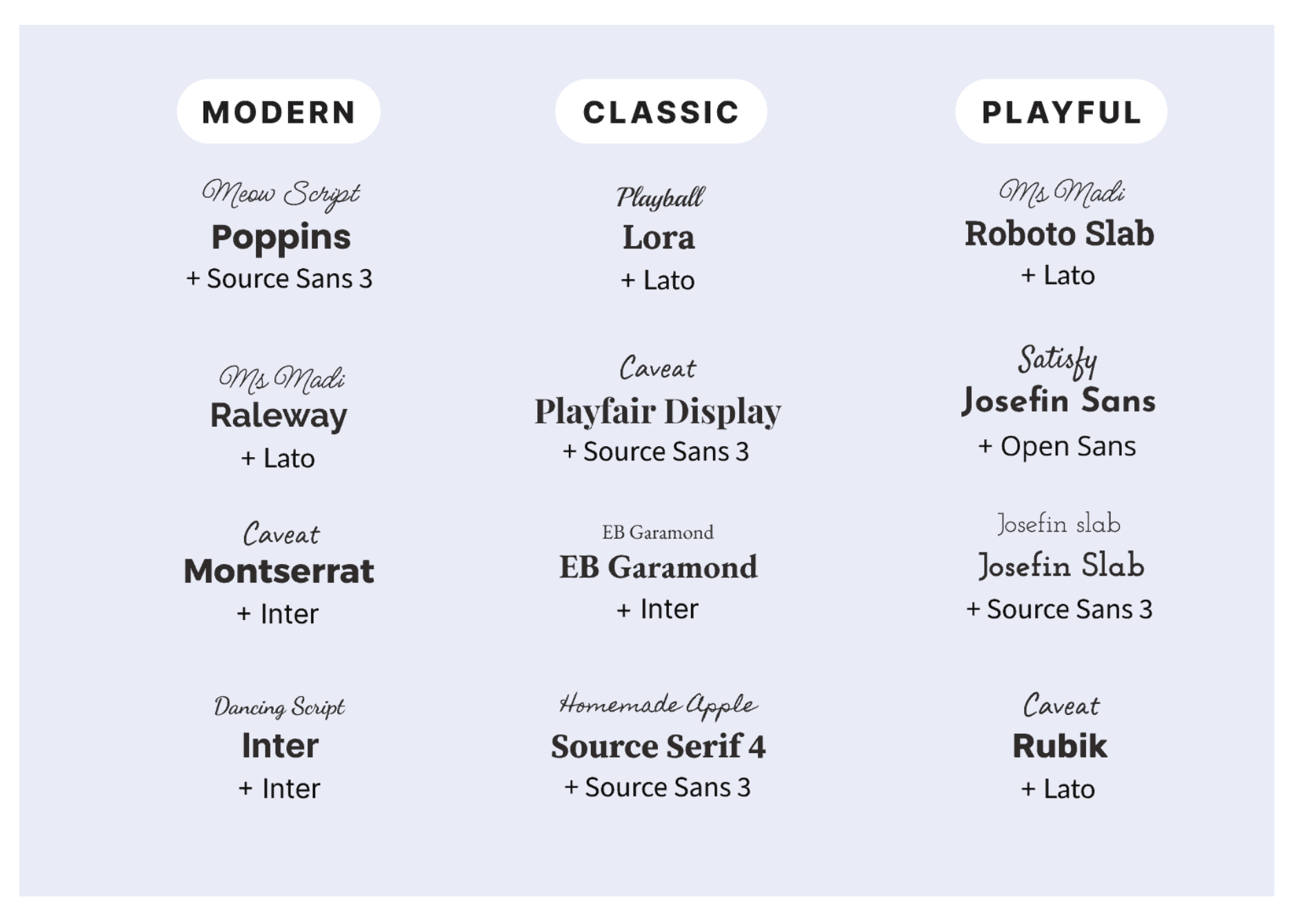
Font pairings
We've tested and adjusted the following fonts to ensure no (or minimal) CLS. The fonts below are designer-approved pairings for the accent font, heading, and body copy.
Accent font
You can now set an accent font on the Feast+ Branding page.
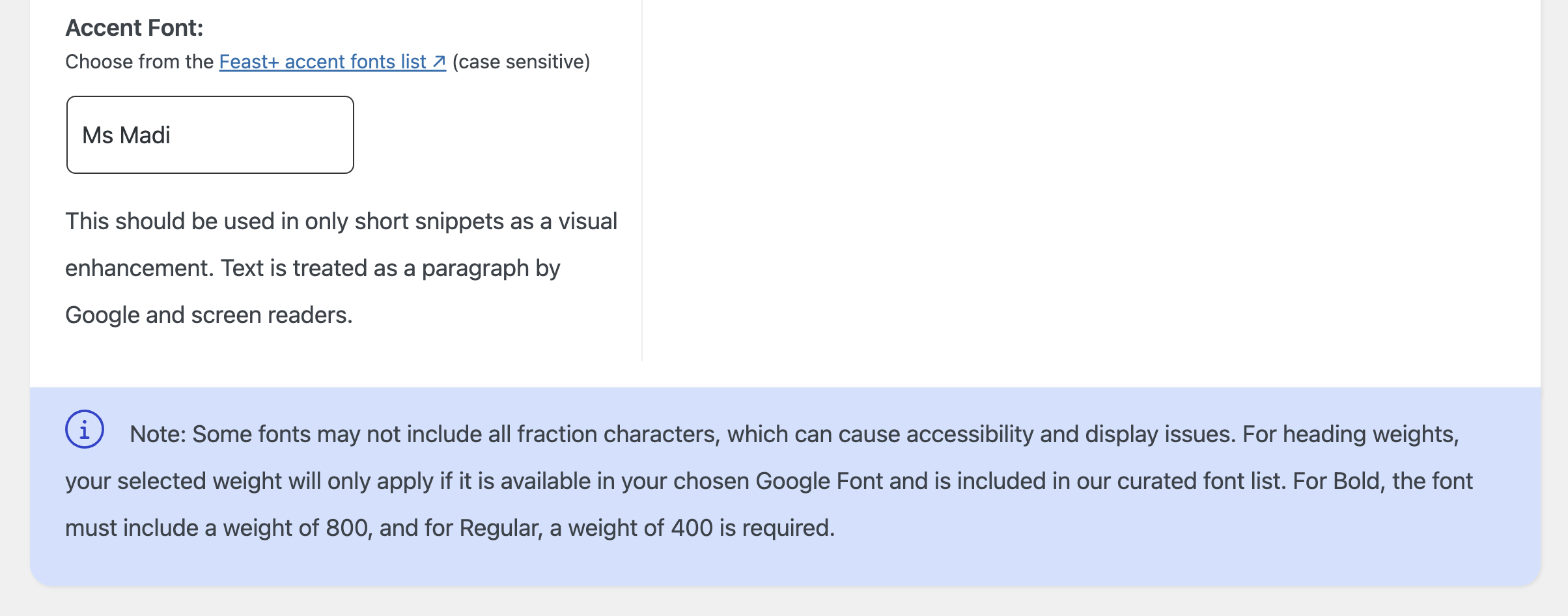
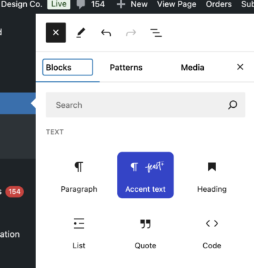
The accent font is inserted via the new Accent Text block using the [+] button in the block editor:
This should be used primarily for small calls to action and pre-header text. It's treated by search engines and screen readers as simple paragraph text.
Due to a lack of support in most handwriting-style fonts, bold and italics are not options on this text.
Choosing an Accent Font
The below fonts were curated by Melissa as fonts that felt most professional and readable. If choosing your own font from Google Fonts, be sure to consider legibility. We recommend avoiding fonts that are all-caps by default, as it's hard to maintain proper sentence case while typing and you will likely need to edit the text later if you change the font.
Not a fan of these styles of fonts? In most cases, the heading font you are using will also make for a great accent font, so feel free to use the same font for both!