Design Guidance (Feast+)
Need some extra design guidance? We're here to help! We've included some font pairing, color palettes, and style combinations below.
Jump to:
Preset styles
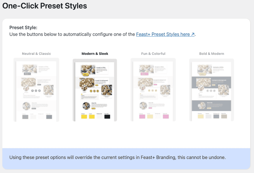
If you're not sure where to start, you can match your Branding Page settings to the designs below to achieve one of these styled looks! Use the One-Click Preset Styles at the bottom of the branding page.
Custom Background Patterns
We've created a customizable Canva file where you can go in and customize the patterns to your site colors (rainbow stripes, anyone?).
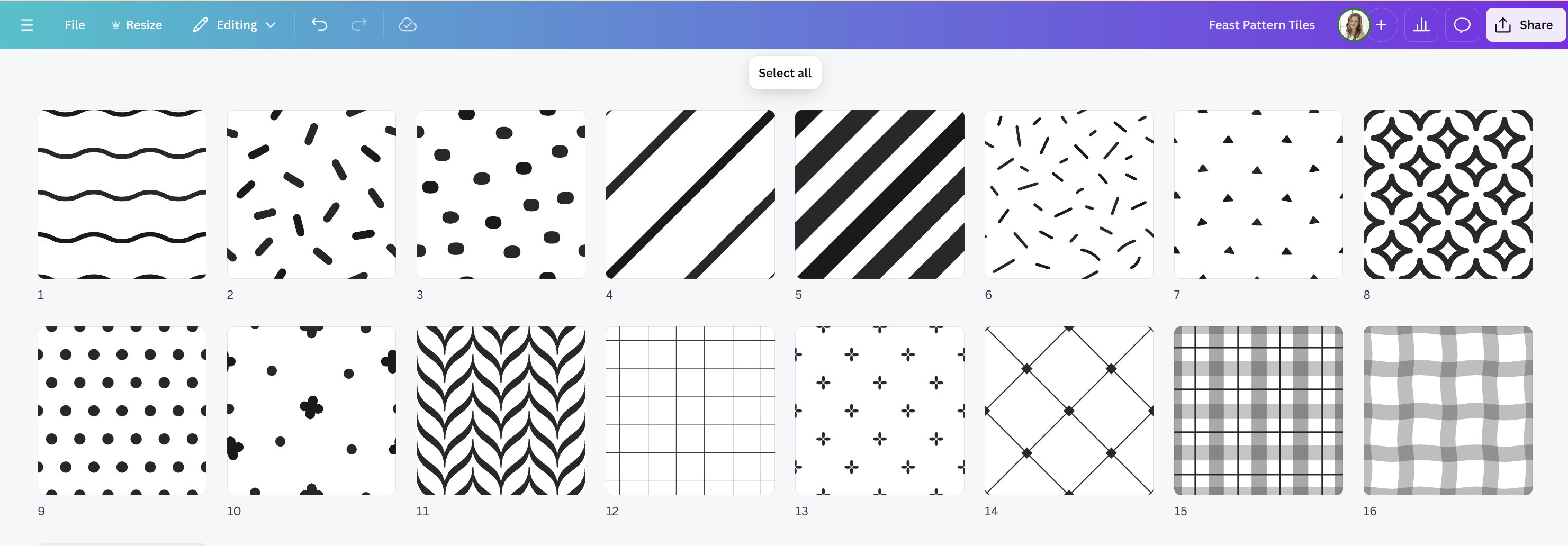
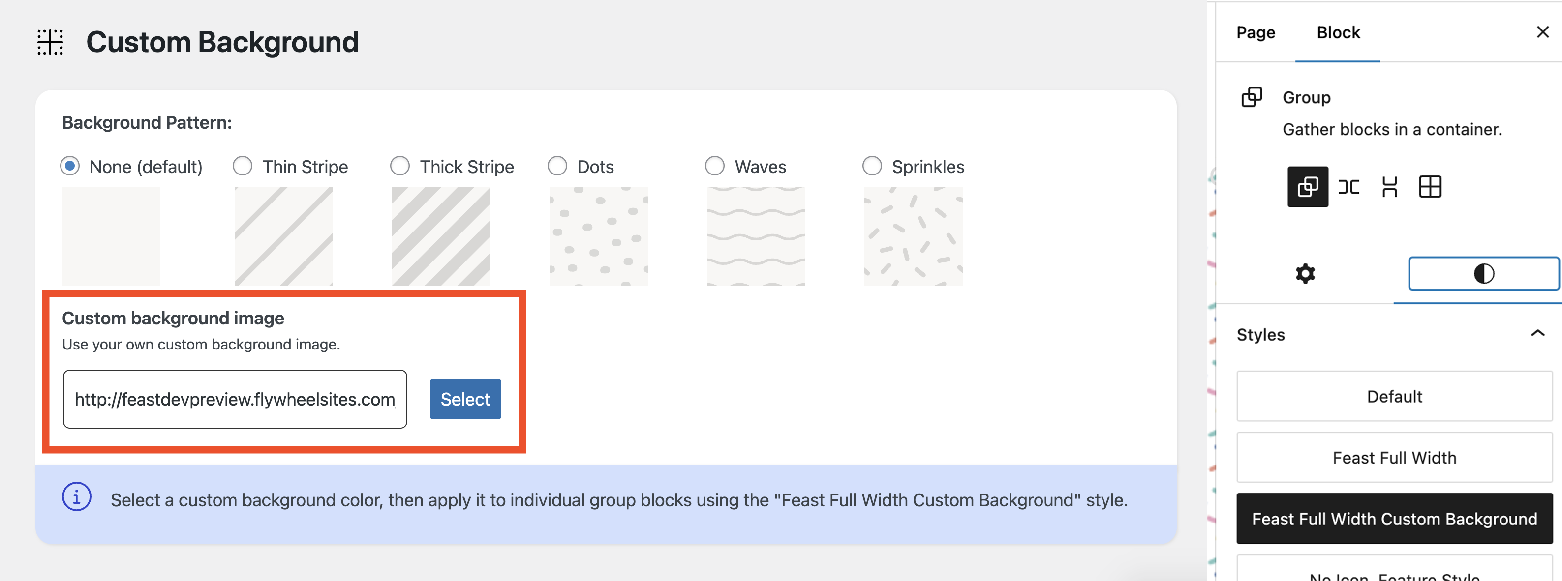
When finished customizing, export it in Canva as a 100x100px PNG file (with white background), then upload it on the Feast+ Branding page > Custom Background Image.
Accessibility Notes:
- We only recommend using the Custom Background behind "Media & Text" blocks that have the White Background enabled. This will ensure proper color contrast.
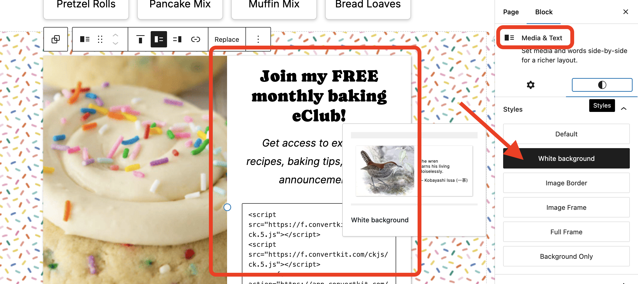
- Text will not automatically detect the background color used in your custom pattern, so it's your responsibility to manage accessibility and ensure sufficient color contrast. For this reason, we strongly recommend only use the custom patterns on pages, not on posts.
Canva Templates
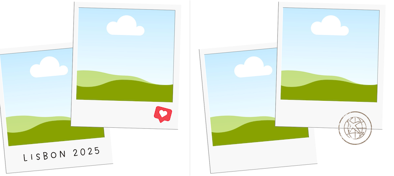
Click the images below to get taken to the Canva travel templates:
Polaroids:
Homepage ideas
Two pre-built homepage options have been added to: block editor > [+] > Patterns > Feast+ Pre-built pages
Use these pages in their entirety or as starting points to make your own!
Recipe Index ideas
Two pre-built recipe index options have been added to: block editor > [+] > Patterns > Feast+ Pre-built pages
Use these pages in their entirety or as starting points to make your own!
Category ideas
Removing Duplicate Subcategories
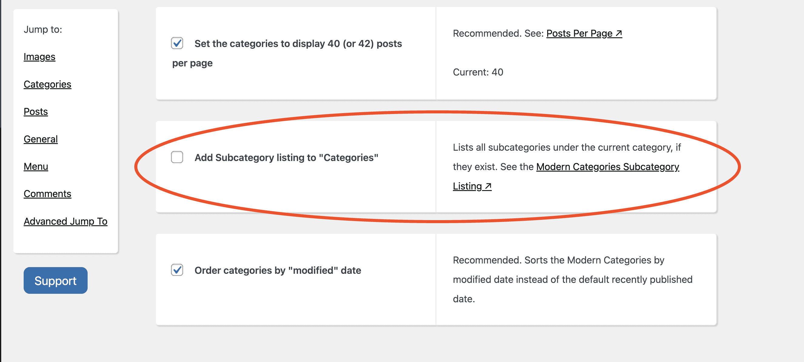
Because the Modern Categories now allow you to display subcategories in a more visual way using the FSCI block, you may consider turning off the auto-inserted Subcategory buttons on the Feast plugin settings page.
Note that this will disable them site-wide, so we only recommend doing this if you have added a FSCI block with those subcategories to your Modern Category page.
Color Contrast & Accessibility
Accessibility is a complex topic, so we've designed Feast+ to handle many of these considerations for you. That said, if you're checking your site with an accessibility tool and notice color contrast errors, you may need to make some adjustments to your color palette.
The most important step is to ensure that the hyperlink color you choose provides sufficient contrast, whether it's used on a white background or your Feast+ background color.
- If your background color is light: your hyperlink color should meet a 4.5:1 contrast ratio on both white and your Feast+ background.
To test this, insert your link color and background color into the WebAIM link contrast checker (keeping the body text color set at #000000) and ensure all three tests 'pass'." - If your background color is dark: your hyperlink color only needs to meet a 4.5:1 contrast ratio on white, as Feast+ automatically changes the links to white when used on a dark background.
To test this, insert your link color into the WebAIM link contrast checker (keeping the body text color set at #000000 and background set at #FFFFFF) and ensure all three tests 'pass'."
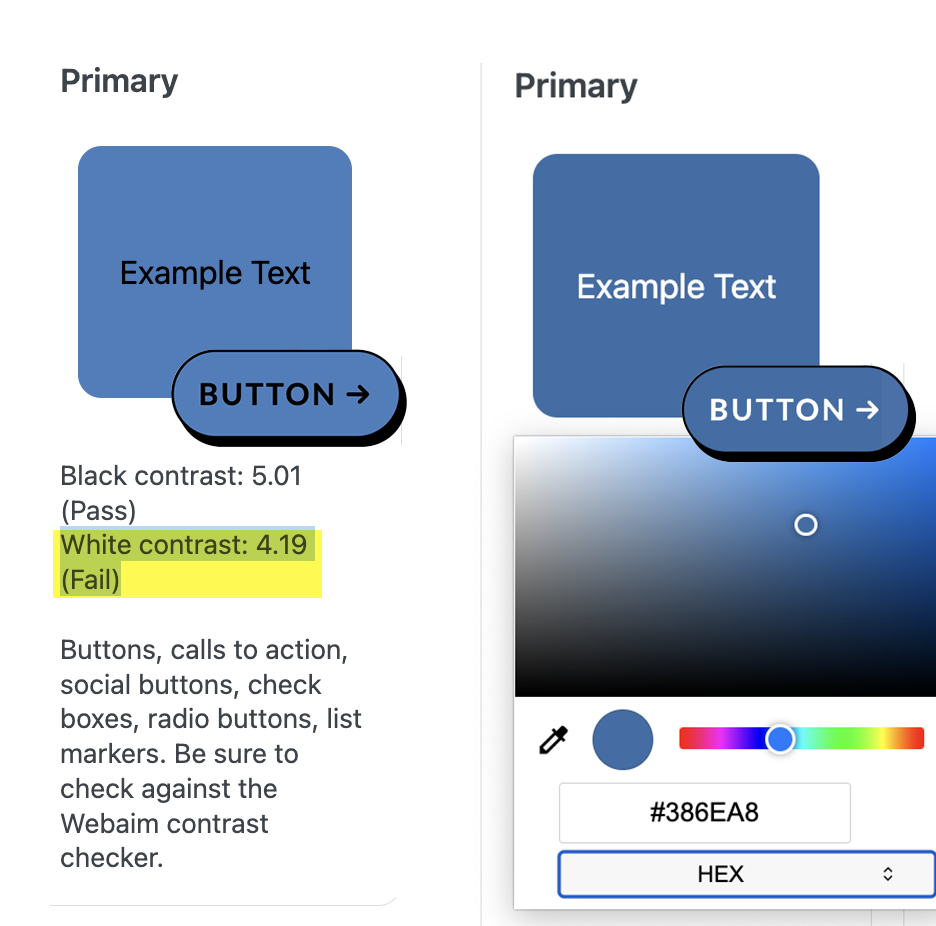
Feast+ includes built-in contrast checkers to help ensure your colors meet accessibility standards when text or icons appear on top.
If an element is showing black text but you'd prefer white (or vice versa), you'll need to adjust your color (either by darkening or lightening it) until it meets contrast requirements.
In this example, the blue just needed to be darkened slightly for the white text to become compliant:
Check out the Feast+ Instagram!
For more design inspiration & feature updates, be sure to follow along on Instagram!
