Modern Menu for Desktop
The Modern Menu is an enhancement to the classic theme menus, that incorporates inline display on the desktop version (screen/browsers over 1200px). You must complete the Modern Menu setup for this to function correctly.
Note: on most food blogs, 80% of all pageviews happen on mobile, and so that menu needs to be designed for mobile first and desktop secondly.
Jump to:
The Modern Menu replaces the theme header and menu with a mobile and accessibility-optimized layout. As of 2021, with pagespeed, SEO and accessibility being major concerns, the Modern Menu is designed to:
- improves user experience by increasing above-the-fold content
- improves user experience with a subscribe button
- improves core web vitals by removing CLS issues
- improves pagespeed by removing render-blocking javascript
- improves SEO by supporting good site structure by making use of index pages for navigation
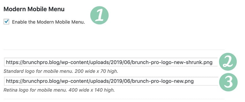
Setup the Mobile Menu
To set up the Modern Mobile Menu:
- Enable the menu with the checkbox
- Upload and set mobile-only logo at 200x70 px
- Upload and set a mobile-only retina logo at 400x140 px
- note: both of these logos are required
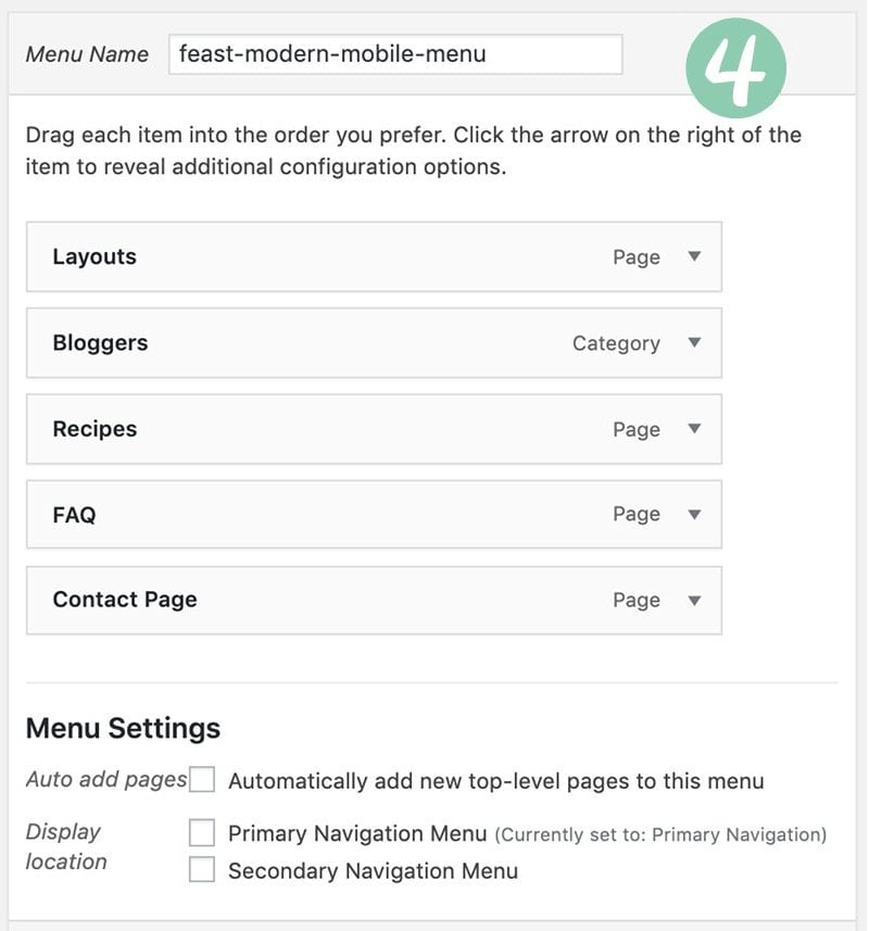
- Create a new menu named feast-modern-mobile-menu (or simply use the "Primary" navigation menu)
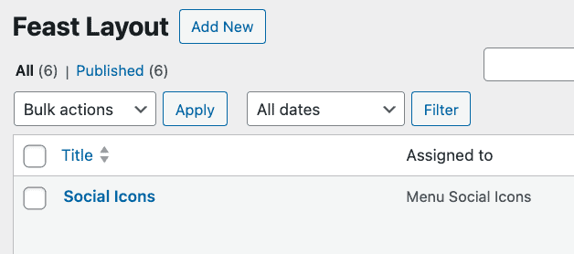
- Add the Feast Social Icons block to the new Feast Layouts
#4 - by default, the menu will use the Primary Navigation menu, or you can create a new menu named feast-modern-mobile-menu in Admin > Appearances > Menus:
#5 - add the Feast Social Icons block to the new Menu Social Icons Feast Layout widget area in Admin > Feast Plugin > Feast Layouts:
Due to space constraints, only the first 3 icons will be shown on desktop.
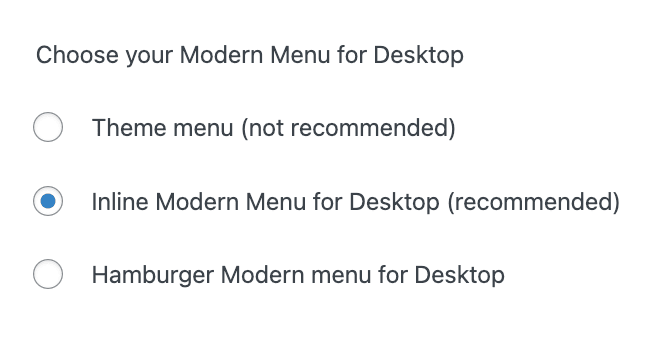
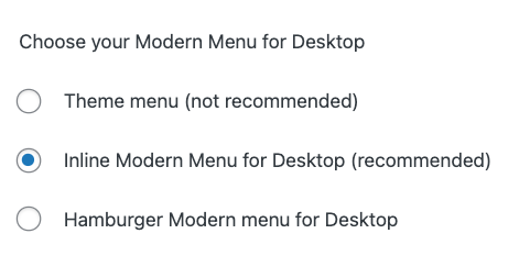
Inline Desktop Menu
We recommend using the Inline Modern Menu.
The Inline Modern Menu improves on the original theme menu by:
- showcasing your 5 most important links for site structure and a call-to-action
- a "sticky" menu that lets your readers go back home, and access search, and all times
- a minimal logo, ensuring that the on page content that your readers are on your site for is give the most screen real estate
- social icons for readers to follow you on other platforms
- Due to space constraints, this is limited to the first 3 items only

Note: this uses the feast-modern-mobile-menu you created when setting up the Modern Mobile Menu.
Hamburger Modern Menu
The hamburger menu is a design scheme for mobile devices, because displaying an entire menu on a mobile screen isn't possible.

However, we had enough requests to allow this as the desktop menu, so we've made it an option.
Classic theme menu
While we don't support using the theme menu anymore, the Modern Menu can be disabled to fall back to the traditional theme menu.
Note: the theme menu style varies depending on which theme you have set up.
User experience
The first 5 links in the Modern Mobile Menu you created are what gets automatically embedded, and these should be the most important links you want to promote.
This requires conscious effort and is actually very important for the user experience - you want to guide your readers through your site with a good site structure, not simply overwhelm them with options.
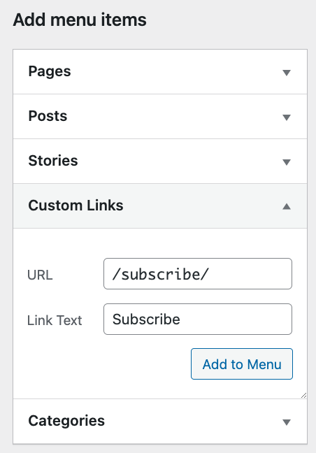
Mobile subscribe button
There is limited space on the mobile version of the Modern Menu, so only a single image/button can be placed next to the logo.
By default, this is a Subscribe image with a link to a /subscribe/ URL on your site, intended for newsletter signups. You can create a new page with the /subscribe/ URL to
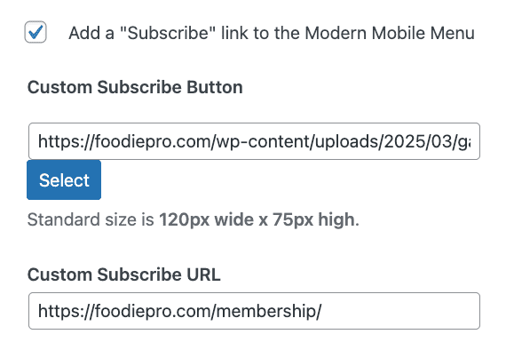
Optionally, you can specify your own subscribe image and a custom link if you prefer to promote something else on mobile. This can be used to promote a:
- membership option
- ebook
- course
Depending on your primary goals.
On desktop, the subscribe button is removed on the inline menu, in favor of having additional menu items. If you'd like, you can add a Subscribe link to the desktop menu using a custom link:
This also provides translation support.
Purpose
Menus serve a specific purpose online.
The menu is the broadest level of navigation on your site, focused on linking to "index" pages that allow users to navigate deeper into the site, or focus on key calls-to-action such as subscribing to your newsletter, or contacting you.
For SEO, accessibility and user experience reasons, we don't recommend having 2 navigation menus, or stuffing the header with too much content unrelated to the main content (the recipes). The purpose of the menu is to provide top-level navigation to key pages.
Editing
The Modern Menu has links to edit logo, edit menu and edit social icons on the left side, to make it easier to access the sections:
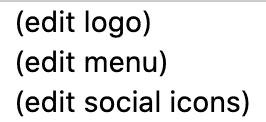
This is not in the customizer.
This only shows to the admin when logged in, not to site visitors. This can not be removed.
Submenu
Based on recommendations from consultants on accessibility, SEO and pagespeed, we strongly recommend a simple single-level menu with no dropdowns or submenus. Instead, provide users with a good site structure, using multiple Modern Recipe Indexes if necessary.
A simple one level navigation menu without submenus can benefit accessibility best practices, user experience and SEO by presenting a flexible page structure conveying information and relationships through deep links, text and content.
Kim Krause Berg, Accessibility Expert
As of the Feast Plugin 13.0.0 we now support submenus/drop-downs on both desktop and mobile. Note that stuffing too much into the menu is bad for accessibility and increases DOM nodes which can negatively impact pagespeed.
Troubleshooting
You may not have created the feast-modern-mobile-menu as with the correct name, or you may have older unused menus that need to be deleted.
This is a caching issue, because it hasn't been regenerated to include the styling necessary. Please clear all hosting, WP Rocket and CDN caches.
If your menu items title is too long, it will wrap to the next line. To resolve this, shorten the menu title. For example, "Recipe Index" should just be "Recipes". "Work with me" should be "Collaborate".
Yes, submenus/drop down menus can be used, though we recommend against it due to pagespeed and accessibility concerns. Instead, provide users with a good site structure, using multiple Modern Recipe Indexes if necessary.
You'll need to follow the instructions for setting up the Modern Mobile Menu Social Icons.
If you've set your social icons larger than 50px, there's not enough space inline so they stack. Reduce the icons to 50px in the Modern Mobile Menu Social Icons widget area.
Either the theme you're using (non-Feast) loads their menu in a different way, or you have a "secondary navigation" menu set. Simply unset the "Secondary Navigation" option in the menus screen.
Sticky
Foodie Pro 5 has customizer settings to disable sticky, edit height and change colors. See the Modern Menu section of the customizer (requires Foodie Pro 5 with the Feast Plugin 13.0.0+)
We strongly advise against disabling sticky for ads, or minimizing the menu height for ads. This is objectively a worse user experience which is a MAJOR factor in SEO, and just an overall experience for your readers. We believe recommendations to minimize the menu or remove the sticky are short sighted and user hostile.
Inline Modern Mobile Menu
Mobile devices don't have the screen width necessary to accommodate an inline menu, so this is not available for mobile.
I love this update as I've been trying to figure out how to do this for a while. (I love the modern mobile menu but felt that it's too simplistic for desktop.)
I know it's currently in Beta, but do you think it will be possible to add social icons in the future? Also I've found that there's space after the search icon (I guess everything is aligned to the left or middle?) Is there a way to change the alignment of the menu titles and search icon?
The social icons have been integrated into the 6.2.0 release!
Thank you so much!
Is there a simple way to add anchor text to the magnifying glass button in order to link it directly to slickstream search?
I love this update. But while the formatting of the feast mobile menu appears good on the desktop, in mobile it took the post body format which was, the links changed color, and gets underlined which is how I had set up. So while I'm excited about this update, had to keep it turned off 🙁
And would also love the social icons additions in the future.
Go ahead and submit a support ticket and we'll look into the issue.
Could you comment on the easiest way to add a bit more space between the modern menu on desktop and the site content? It feels a little crammed when I enable on my site. :/
If you haven't made any modifications, this shouldn't be necessary. Please submit a support ticket to have us take a look at the site.
Hi Team, this menu only shows three social media icons (even though there are more in the settings). How can I show more than three (all) SM icons in the Modern Menu for Desktop?
Due to space constraints with other items in the menu, it's only possible to display 3.
Is it possible to turn the sticky menu off? I wanted to use the filmstrip setting on the Slickstream plugin, but the sticky menu would conflict with that.