Modern Mobile Menu
This is a feature of the Feast Plugin
The Modern Mobile Menu replaces the theme header and menu with a mobile and accessibility-optimized layout. As of 2021, with pagespeed, SEO and accessibility being major concerns, the Modern Mobile Menu is designed to be:
- improves user experience by increasing above-the-fold content
- improves user experience with a subscribe button
- improves core web vitals by removing CLS issues
- improves pagespeed by removing render-blocking javascript
- improves SEO by supporting good site structure by making use of index pages for navigation

The formatting and guidelines below have also been applied to the Inline Modern Menu for Desktop.
Jump to:
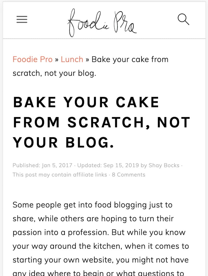
The navigation bar for the modern mobile menu drastically improves above-the-fold content being displayed. This is a more user-friendly experience, providing the reader with content they came to see instead of a logo that provides no value.
We've also added the magnifying-glass search icon as a visual indicator that the site has search capabilities. Spoiler alert: it opens the same menu as the menu icon, which has the search bar.
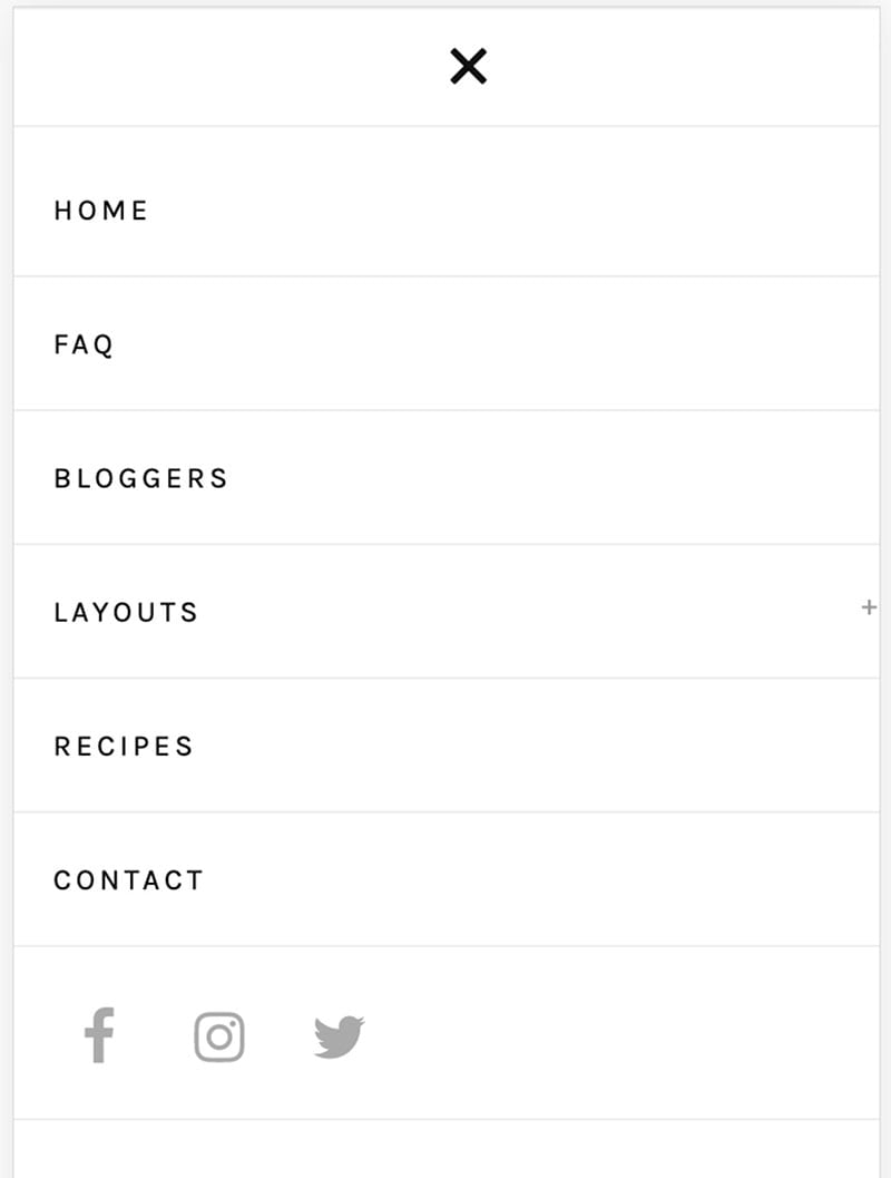
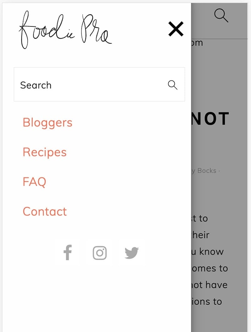
A not-uncommon piece of feedback that we got was that the theme's mobile menu sometimes didn't behave properly - the hamburger menu (the 3 horizontal lines) and the "x" were difficult to click. We've corrected this by beefing it up and getting rid of the javascript used to animate it.
Setup
Setting up the Modern Mobile Menu requires:
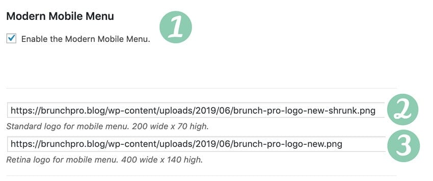
- Enable the menu with the checkbox
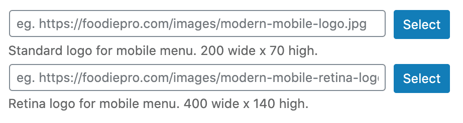
- Upload and set mobile-only logo at 200x70 px
- Upload and set a mobile-only retina logo at 400x140 px
- note: both of these logos are required
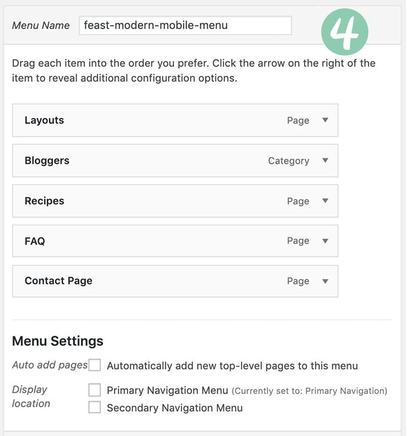
- Create a new menu named feast-modern-mobile-menu
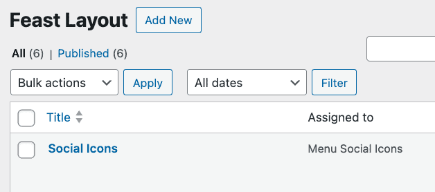
- Add the Feast Social Icons block to the new Feast Layouts
#4 - create a new menu (guidelines for content below) named feast-modern-mobile-menu in Admin > Appearances > Menus:
#5 - add the Feast Social Icons block to the new Menu Social Icons Feast Layout widget area in Admin > Feast Plugin > Feast Layouts:

Due to space constraints, only the first 3 icons will be shown on desktop.
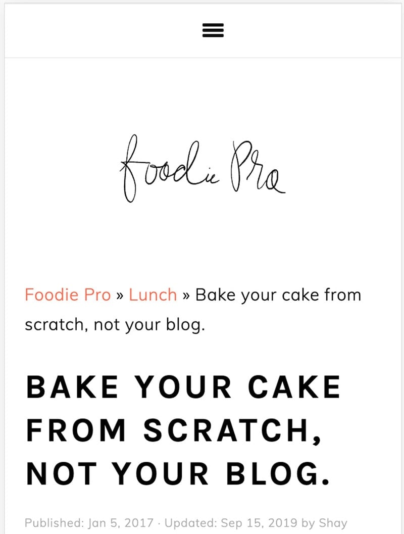
Logo
When someone lands on a specific recipe post on your website, they're there to see the recipe, not your header. That's why we've been advocating to shrink the logo for over a year now.
With the modern mobile menu, you can set a new logo (200px wide by 70px tall) to be rendered in-line with the menu bar.
Click Save to save them.
Note: The file must be a .jpg or .png, not WebP or slug.
Due to user experience, pagespeed, CLS and accessibility reasons, there is no option to change the menu or logo size. See rethinking the nav menu. This is set up per our best practices and if you require a large menu or logo, you'll need to pursue a third party solution that we can't support and strongly recommend against.
Menu
Historically, desktop-style dropdown menus have been popular, but these just don't translate well to mobile.
While a drop-down is easy and quick to navigate up-and-down the sub-menu trees, this process is cumbersome and slow on mobile. Your mobile menu should be tight and focused for bother user experience and accessibility.
Create a separate mobile menu named feast-modern-mobile-menu, that links out to your key navigation and call-to-action pages.
- Do not use sub-menus
- Do not link to your homepage (this is what the logo is for)
- Be picky about what goes in here
- Use concise anchor text (eg. "Recipe Index" should simply by "Recipes")
A simple one level navigation menu without submenus can benefit accessibility best practices, user experience and SEO by presenting a flexible page structure conveying information and relationships through deep links, text and content.
Click depth (for site structure) is handled by surfacing the top categories on the Modern Homepage, and linking to all your categories in the Modern Recipe Index.
See this webinar on information architecture for publishers by Casey, Arsen and Andrew.
Check out the Inline Modern Menu for desktop introduced in version 6.1.0.
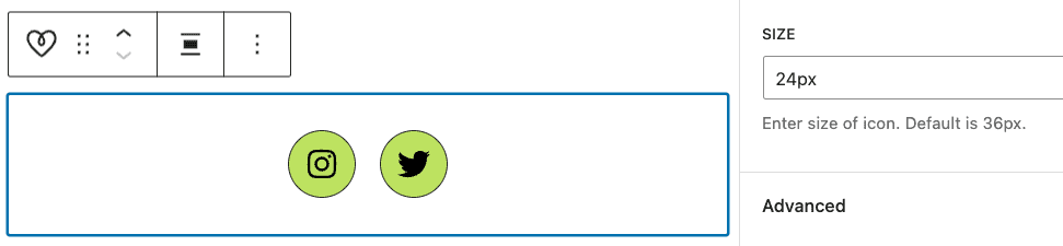
Social icons
Add the Feast Social Icons block to the new Menu Social Icons Feast Layout layout area in Admin > Feast Plugin > Feast Layouts:
Due to space constraints, only the first 3 icons will be shown on desktop.
Note: Make sure your icons are set to 24px width.
Javascript
The Modern Menu does not use any javascript.
The themes old mobile menus use javascript to display the menu, and was written circa 2014 when this was a good practice.
But this is no longer the case because javascript can cause pagespeed issues, and fails if third party scripts/ads fail to load.
Relying on javascript also causes the menu to fail if (or more likely when) there's a javascript error or conflict, such as those that happen to do ads the billion other plugins out there. A menu is a critical website component and having it fail because of javascript is unacceptable.
Unfortunately, there was nothing out there that accomplished what we wanted to do, without using javascript. We've been looking for a solution for over a year.
So we had to redevelop a new way of doing things, combining some clever new CSS properties to create a CSS-only menu.
We think this works even better than the original menu, but please let us know if you have any feedback.
Pagespeed
With the modern mobile menu being entirely CSS, we can now remove javascript entirely from the theme. This improves pagespeed by:
- not requiring additional file downloads (fewer resource requests)
- eliminating render-blocking javascript on sites without WP Rocket defer js (which all sites should have anyway)
- not requiring the browser to process and render the javascript
This won't prevent other plugins from loading and using javascript, but it keeps the theme pagespeed-friendly.
CLS
The Modern Mobile Menu has been designed to eliminate CLS issues. Make sure to enable the "Add missing image dimensions" setting in WP Rocket, per the SEO for food bloggers tutorial.
Only on scroll-up
We've been asked a few times to have the menu hidden on scroll-down, and only showing on scroll-up. We've looked into this and decided against it because:
- it would require javascript (see above)
- it typically triggers CLS events (see above)
Subscribe button
The subscribe button allows you to remove embedded newsletter forms, as well as javascript and pop ups associated with newsletters that can negatively impact SEO, pagespeed, CLS and accessibility.


This is designed replace:
- intrusive interstitials (eg. pop ups)
- inline sign up forms using javascript from newsletter providers (eg. Mailchimp)
- inline sign up forms using outdated widgets (eg. Genesis eNews)
The reason we want to eliminate popups and inline sign up forms is because they typically cause either:
- CLS issues due to missing dimensions
- pagespeed issues due to javascript calculations
- SEO issues due to the poor pagespeed and CLS above
- accessibility issues due to improper use of headings
- accessibility issues due to missing form labels
- accessibility issues due to poor guidelines around color contrast
Once enabled, simply create a new page with the slug "subscribe" and embed your newsletter form into that one page.
Custom subscribe menu
There is limited space on the mobile version of the Modern Menu, so only a single image/button can be placed next to the logo.
By default, this is a Subscribe image with a link to a /subscribe/ URL on your site, intended for newsletter signups. You can create a new page with the /subscribe/ URL to
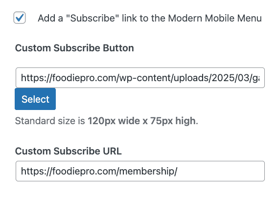
Optionally, you can specify your own subscribe image and a custom link if you prefer to promote something else on mobile. This can be used to promote a:
- membership option
- ebook
- course
Depending on your primary goals.
Shortcomings
There are some limitations to this.
The first is flexibility. The modern mobile menu is not designed to be heavily customized, though you can alter the CSS by making customizations in your "Additional CSS" screen.
Dual or secondary navigation menus
We do not recommend or support dual navigation (or "secondary navigation") menus.
These are not mobile first and they are not accessibility compliant.
Any administrative pages (contact, privacy policy, etc) belong in the footer, not the menu.
Drop down menus
We don't recommend or support drop down menus because they're not mobile-first and have questionable accessibility compliance.
Instead, link directly to navigation pages such as the recipe index or other resources, which drill further into your site.
Please review the Food Blog Site Structure post.
Accessibility
The Modern Mobile Menu has been tested with keyboard navigation and behaves as expected.
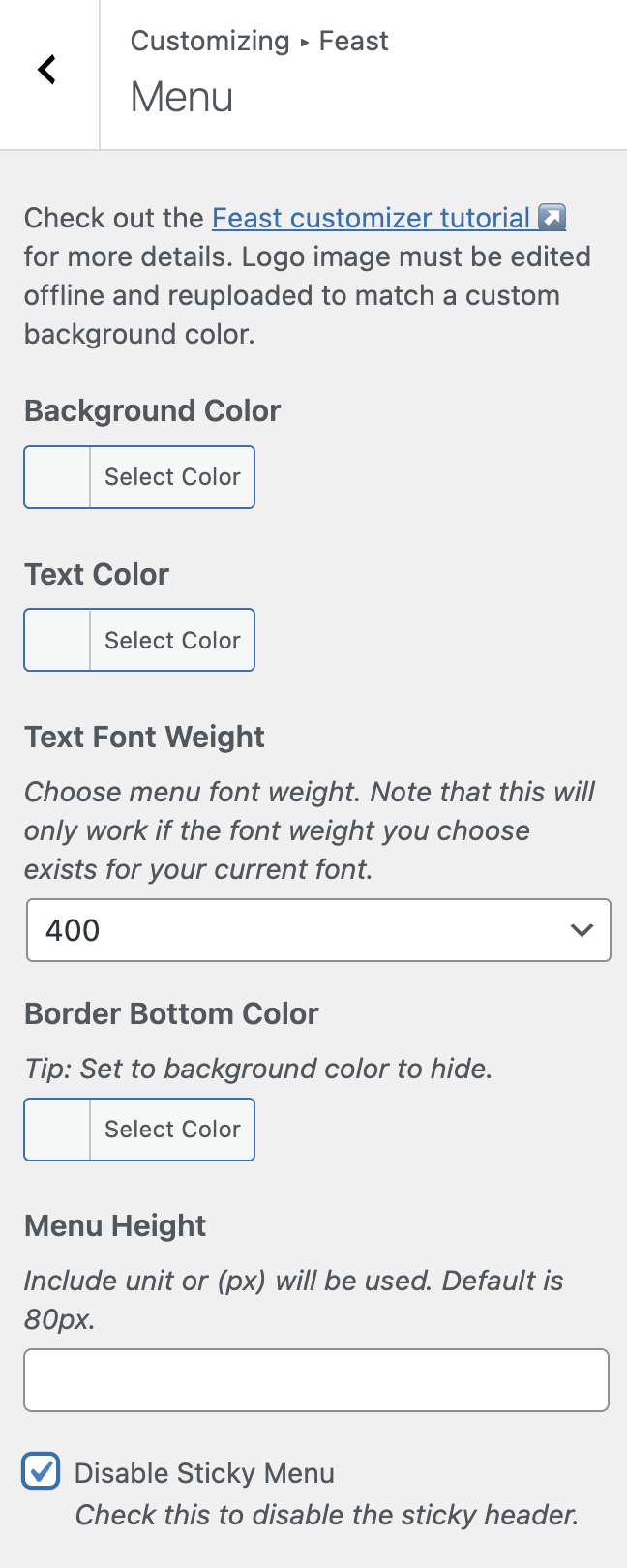
Disable Sticky
The Modern Mobile Menu sticks to the top of the screen as the reader scrolls, so that it remains easily accessible. This is a good user experience.
Some ad networks recommend disabling the sticky menu in order to jam in more ads on the page. We believe that the minor improvement in revenue is not worth making the user experience terrible by filling the screen with as many ads as possible.
Focusing on user experience is important for long-term success of your site. Making the user experience worse for a few dollars is short-sighted.
If you still want to disable the sticky menu, navigate to the Customizer > Feast > Menu > Disable Sticky Menu:
Styling
The Modern Menu can be styled to better match your brand, using CSS:

You can customize the background color with:
.feastmobilenavbar {
background: var(--feast-branding-secondary-background) !important;
border-bottom: 4px solid var(--feast-branding-primary) !important;
}
The icons can be colored (version 5.5.0+) with:
.feastmenutoggle svg, .feastsearchtoggle svg {
color: var(--feast-branding-primary) !important;
background: var(--feast-branding-primary-background) !important;
border-radius: 8px;
border: 2px solid var(--feast-branding-primary) !important;
}
The "subsribe" button can be styled (version 5.5.0+) with:
.feastmenutoggle svg, .feastsearchtoggle svg {
color: #F00 !important;
background: #005;
border-radius: 8px;
border:2px solid #CCC;
}
Remember to provide adequate contrast for accessibility.
Troubleshooting
In the Cook'd Pro theme, the recipe index filter breaks due to the removal of the theme's Javascript. Add this code to the code snippets plugin to re-enable it:
https://gist.github.com/feastdesignco/54128474021374785d2a028c5f379be3
Note that we're dropping support this recipe-index setup and filter in 2020, so we consider this a temporary fix. The current Cook'd Pro recipe index was not designed to be mobile-first, and doesn't comply with modern best practices.
This is a super helpful explanation of your features, better than your sales page for the Feast plug-in to be honest. I especially like the mobile vs. desktop menu. That feature alone might make it worthwhile for me to sign up for the subscription (which I have to triple think about because, you know, recurring payments)
This is good feedback 🙂 I've gone and updated the plugin page with a snippet of preview.
Great. And thank you for your reply to my support ticket on the mobile retina logo causing my "2x" 404 errors. I didn't realize it was a must-have. I just assumed it would be a nice-to-have and could degrade nicely if I didn't explicitly specify it.
We'll have it fallback to not attempting to display any image in the 3.2.0 release 🙂
In general, we recommend using a logo there, because it reinforces your site's branding.
Skylar, I put in my mobile menu logos, both the 200px wide and 400px wide as recommended. The logo shows up beautifully in the mobile menu. But it looks cut off in the "Nav" bar header by a couple of pixels from the top. You can see this if you go to garlicdelight.com on your mobile phone or minimize your desktop browser window. What should I do to fix it? Do you want me to open a support ticket?
How do you disable this menu from being sticky?
Hi Skylar! I would love to have an option to disable sticky mobile menu, but have the menu reappear anytime user scrolls up. How can I achieve that?
Hi Skylar! Also, when I pasted the code to customize my "subscribe" button, it actually was changing my "Navigation" and "Search" buttons.
This would require javascript (which we avoid due to code conflicts/errors), and could result in CLS issues.
Very good move. Mobile UX is something which is very very necessary and installing additional plugins make no sense when Feast Plugin was released.
I know that every release should be implemented step by step and search option is a visual indicator however I would suggest to make search a search and menu a menu to avoid confuse and not double functionality.
Looking for new updates! Thanks.
Because it states next to sticky mobile menu “this can be disabled if using modern mobile menu”.
I think it’s important that the option is available.
Many bloggers run ads and mobile adhesion ads with the introduction of sticky video players along with a sticky menu leaves little screen space for readers to see the content.
This is just a fact. Bloggers want to make money too and we also want to give our audience the best experience.
I’m glad you explained that there is no option currently available because I have messing with my site for hours trying to figure out why I couldn’t disable it as it says you can do within the plugin.
Thanks!
Thanks for explaining that Elizabeth - and I see where the confusion comes from.
The "sticky mobile menu" was a feature of the OLD mobile menu, and is unrelated to the Modern Mobile Menu. It was added to make the old menu sticky, which was not how it was originally designed in the themes. See: https://feastdesignco.com/sticky-mobile-menu/
I'll look into a way of disabling the Modern Mobile Menu from being sticky.
Just implemented this. It looks great and it was so easy to set up. Thanks for your continued work on these features!
For some reason, when I try to view the logo on my android phone, I cannot see it. I can view it on my husband's iphone though. Any suggestions?
Two possible causes:
Any hints on troubleshooting this? I followed the directions to the letter and my site looks the same on mobile as it did before installing the plugin and configuring it.
Thanks!
The Simple Category Index will display the categories wherever you use the shortcode - have you inserted the shortcode anywhere? I realize that "now go add the shortcode" is missing from the setup steps... I'll get it added.
The video tutorial shows how to do this.
I absolutely love this new feature! It looks so great on my site and is making the UX SO much better. I use my mobile site regularly to re-make my favorite recipes, and this feature is incredibly helpful for quick navigation. Thank you for this wonderful update!
I just bought the Feast Plug in and use the Cook'd Pro theme. My recipe filter is broken. i'm going to implement the code to fix it, but you mention you're dropping support for this in 2020? What will take it's place for Cook'd pro so my users can view a drop down of my recipe categories?
The goal is to remove the drop-down menu entirely, which is not a mobile-first experience. It's also not great for internal linking, and it causes pagespeed issues by loading unnecessary javascript. Overall, the drop-down is an outdated element and has no place in modern food blogs: https://feastdesignco.com/why-were-dropping-support-for-the-category-drop-down-menu/
The replacement for this is to properly set up your category pages.
Hi Skylar,
Is there a way to lazy load the logo in the modern mobile menu? I see this as an opportunity in the google page speed while all other images lazy load. Is there something in the setting that I should be looking at?
Thanks.
No - lazyloading is for images below the fold only. You can't lazyload images above the fold.
Thanks for the guide. Mine is now setup.
Hello! Thanks for all this helpful info. For the modern mobile menu after it is created how do you point it to be used for mobile vs just the primary menu? I'm asking because I created the modern mobile menu, but have no idea what to do with it now. Thanks.
Please follow the complete tutorial above - the instructions on how it works to go live are there.
HI there. Can we change the point size of the modern mobile menu or would you recommend against this? I have a couple of longer items I'd like to include in the menu, I am reducing the words in them but they still just go onto 2 lines. Could you provide the CSS to use to control it please?
This is technically possible using "Inspect Element" and CSS, but it's not a customization we recommend or support. This will require maintenance over time and too much individual guidance to support (eg. making sure people don't accidentally set the font size below 16px).
The Modern Mobile Menu should be short and concise for SEO and accessibility reasons, with good site structure used to replace excessive navigation menus.
Hello- I'm having trouble adding my Subscribe button. Could you please explain with more detail on how to do this. I've read the text above many times- just need more information on how to place the subscribe button. thank you
It's just a checkbox in the Feast Plugin settings page. Please submit a support ticket if you need further assistance.
Hi, I have the Foodie theme with the Feast plugin. I read your points about not adding too many pages to the menu. I understand that it's important to only link to essential pages to avoid confusing users. However, I do think a drop-down feature in the menu would be super helpful for my users. Right now, the navigation looks cluttered because I have a few top posts in the menu that contain my top content. If there was a drop-down option people would only see those pages if they click on the drop-down. Wondering if there's a way for me to add a drop-down feature in the menu?
Top posts should not be in the primary navigation menu - they belong on the homepage, and in the sidebar. The only link needed in the primary navigation is to the recipe index, which provides users a better navigation experience for mobile AND accessibility users, and enhances site structure for SEO: https://feastdesignco.com/food-blog-site-structure/
We have no plans to support drop down menus for the Modern Menu, because they're not mobile or accessibility friendly - those are you two primary concerns. Designing primarily for a desktop user experience is a mistake.
Is this supposed to take the place of the menu for mobile as well as desktop? I've set it up but now my desktop website is also showing as the mobile menu.
The desktop implementation is set following this tutorial: https://feastdesignco.com/modern-menu/
You can choose how the desktop version gets displayed - we recommend the inline modern menu.