Rethinking the Nav Menu
Last year we updated the header/logo, making it simpler to manage for food bloggers, and correcting some faux-pas, like hidden off-screen text. We've continued listening to feedback and monitoring best practices, and there's another update in the works.
Update: this has been implemented in the Feast Plugin as the Modern Mobile Menu.
Jump to:
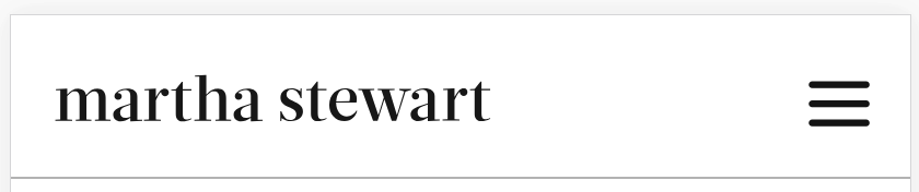
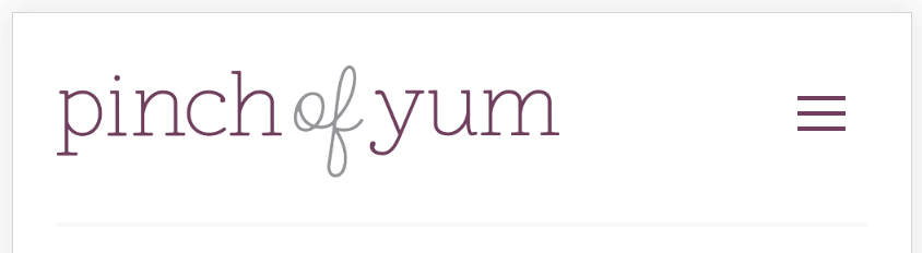
Examples logos at top food blogs
How have some of the top food/recipe blogs implemented their logos? Let's take a look:


Noticing a trend?
Logos are being simplified and tucked into the navigation menu, out of the way of the content.
The problem
In December 2018, Google updated their Pagespeed Insights tool to factor in "DOM nodes", which browsers have to factor in when rendering a page. This can become an issue due to the relatively limited processing power of mobile phones. More DOM nodes means that the browser has to run more calculations, which means slower pagespeeds, and shorter battery life for phones.
And because 80%+ of pageviews on food blogs are generally on mobile devices, this has become a problem where there wasn't one in the past.
As part of a continued effort to optimize the themes for the current (and future) state of the web, we're looking into further simplifying and future-proofing the themes.
In a happy alignment of interests, many of our bloggers have been asking to move the header into the navigation menu as a matter of preference anyways.
Why rethink the Nav Menu?
Under the current setup, there are two different menus being loaded on each page - one for desktop, and one for mobile. This may have made sense in 2016, but doesn't any longer in 2019, when factoring in nodes and webpage performance.
This is because the browser has to:
- build two separate menus
- then figure out which it's going to use based on whether it's a desktop or mobile device
- then it has to evaluate the menu javascript to determine how things are displayed.
All this is render-blocking, which slows down the perceived pagespeed for site visitors.
Additionally, the way the current mobile menu was implemented uses strange CSS transforms that are next-to-impossible to customize, and relies on javascript for a number of different features. For reference, the current menu uses: https://github.com/GaryJones/accessible-menu - which was designed and last updated almost 5 years ago.
And really, javascript shouldn't be used for something like a menu.
Designing for a mobile-first world means designing a navigation menu that's simple, so that the browser can render it quickly, and doesn't rely on unnecessary javascript.
While we're doing this...
Rethinking the header (logo)... again?
Last year we updated the themes and documented the change in our Rethinking the Header post, and the changes made life easier for bloggers. We took a pro-active approach to making customizations easier, and fixed some issues most blogger's didn't even know existed, like hidden text off-screen (a big faux-pas). This change was well received, reduced a common source of support tickets, and most bloggers never even noticed it happened.
From a styling perspective, the current setup is fine.
From a performance (and therefore user-first) perspective, it's unnecessarily bloated.
The current logo contains multiple DOM nodes:
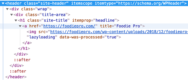
By my count, there's 6 DOM nodes, plus 2 pseudo-selectors (the ::after styling). For more details on pseudo-selectors, see: https://css-tricks.com/pseudo-class-selectors/
This styling using the ::after pseudo-selector - which I believe - behaves like nodes. Initial Google'ing hasn't turned up anything conclusive, but based on some pages on the topic, probably counts towards the DOM: https://developers.google.com/web/tools/chrome-devtools/inspect-styles/edit-dom
There's also a bunch of styling associated with logo, which can be removed, which saves a few more KB of data, and reduces the amount of time the browser has to spend calculating and rendering.
Proposed Solution
Updating the header+navigation menu for an inline display will improve pagespeed. A small, simple logo is all that's required to let the user know what site they're on.
Things we'll need to consider:
- Should we specify a maximum height/width via CSS? Many of the current logos are simply too large to fit in the menu
- A mobile-first design would mean the logo would be 50-px height - the same as the navigation menu
- Specifying a maximum height/width in CSS would be a band-aid to an improperly optimized image (logo)
- Not specifying a maximum height/width would force the blogger to create a properly sized image (logo)
- Is the itemtype="https://schema.org/WPHeader" and itemprop="headline" still relevant? This can be carried over if needed, but doesn't seem necessary or important - input is needed from experts
- Search engines seem to be pushing for schema to be added via json-ld, rather than marked-up inline
- While we're at it, we can axe the h1 from the site header - this should be reserved for the in-content header
- Should the navigation menu be embedded into the header? SEMRush's article on page structure gives an example with the navigation menu embedded into the header: https://www.semrush.com/blog/semantic-html5-guide/
- Currently, the <nav> and <header> are sibling elements in the site container
- It makes logical sense to have the navigation within the header, and would likely mean we can reduce the amount of CSS being applied to them separately
- Should the logo be an element of the <nav>? This seems logical - navigating to the homepage is a common feature
- This would mean the logo doesn't appear on the mobile menu though, which compresses into the hamburger icon
- Will this improve the performance of food blogs at all? Will that performance translate to better pagespeed scores, and more pageviews for food bloggers?
- Probably, yes. It would be small, but the menu is above-the-fold, which means it's critical to page rendering. Even small improvements are important when multiplied across thousands of food blogs, and millions of monthly pageviews
- How will bloggers react? Is the effort worth the backlash? There's a very vocal minority that complains about every change, even when those changes are designed to help them. Is the investment in updating this worth the garbage?
- Probably, yes. From a 10,000-ft perspective, these changes help site visitors, and brings blogs more in line with modern web standards. Mature bloggers understand and appreciate this, and the rest can continue running outdated themes. Over time, the bloggers who adapt will be successful and the rest will stop progressing, give up and move onto something else.
From the blogger's perspective, this should be relatively painless: the logo you've specified in the customizer will still be used, and nothing will need to be reconfigured.
I'm a food blogger, not a developer, this seems pointless/complicated/confusing
This is understandable. No one wants to have to learn about new, complicated, technical issues and support it. If I'm honest, Google asking developers - even experienced developers - to consider DOM nodes is overly burdensome and really, really stupid. This is a problem for browser software developers, not millions of individual site owners, who can't possibly understand the implications.
But this is the world we live in. Google has the best interest of its' searchers in mind (that includes you and me), and page performance and technical junk is a fact of life. If you're tired of keeping on top of technical issues, we highly recommend Andrew @ NerdPress.
Centered Logos
Centered logos within a menu are incredibly difficult. Cravings Pro currently has this, and the logo either needs to be:
- the exact middle element of the navigation menu, then somehow apply styling keep spacing consistent on both sides
- or the navigation menu needs to be split into two, which means two separate menus, which is confusing for search engines and accessibility (screen readers), then somehow re-combined on mobile
- Come to think of it, this is a desktop-first design consideration, not mobile-first
None of these are easy to configure, and add unnecessary complexity. Having a center-aligned logo embedded into a navigation menu doesn't improve user experience in any way, and doesn't earn the blogger more income. It's a waste of time.
All things considered, the cons outweigh the pros and we won't build in support for center-aligned logos within navigation menus. Bloggers who wish to make this change can hire a developer to make this customization and maintain it.