Modern Themes
This tutorial features the Feast Plugin, which enhances and extends your theme to improve SEO, pagespeed, accessibility and user experience.
This is currently in development and should be ignored. Stay subscribed to the newsletter to be notified when it's live.
Background
The themes were designed during a time when styling was the primary concern, with only minor considerations for SEO, site speed, accessibility and brand consistency.
As of 2020, the underlying infrastructure of the internet has changed, and as customer needs have evolved, tools have evolved to better meet those as well.
Because of this, we have to reinvent the themes in a whole new way that fixes previous issues. To do this, we're releasing features through the Feast Plugin. For more details, see themes are dead.
Branding
The customizer provided too much flexibility in selecting wonky colors and layouts. While other developers are going towards providing even more confusing settings and options, we believe that providing better guidelines helps you build a more professional, consistent site.
To do this, we're consolidating heading (h1, h2, h3) styles down to a single site-wide setting.
The homepage, category pages and recipe posts will all use the same font, size, and styling. This is possible in part due to the FSRI block replacing the outdated "Featured Posts Widget".
Layout
Back when the themes were developed, desktop was the primary concern, with some alterations provided for mobile.
This is no longer the correct setup for 2020.
In the food blog page structure post we outline what the 4 primary content areas are and how they're displayed. This is important not only conceptually, but also for accessibility, and in the near-future, providing better hints to browsers as to how to best render a page.
On mobile (80% of your pageviews), there is no "header" or "sidebar" or "footer" - it's all one continuous page to your readers. You should design your sidebar and footer as if it were an extension of your main content.
Pagespeed and CLS
Updating the styling and dumping mobile-media-queries in favor of desktop-media-queries helps to lighten the load browsers have to do when rendering your site, leading to faster pagespeed scores and better CLS.
The best tool for this remains "Critical Path CSS" found in WP Rocket.
Custom fonts
You can find custom fonts at https://setsailstudios.com/shop/
Brand colors
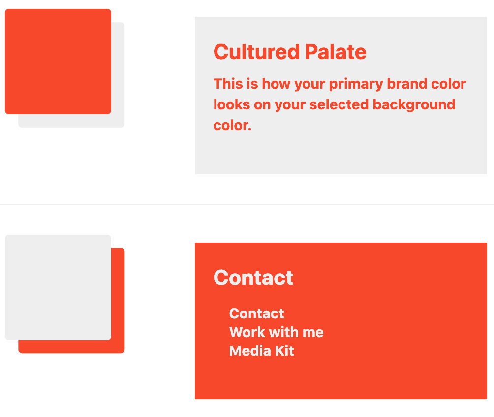
You can set custom brand colors in the Feast Plugin:

