Annoying, right?
Email signups are arguably one of the few assets a recipe site can own and develop, and as such, are a key part of running a food blog.
However, current practices fall short in a number of ways. Embedded forms experience "banner blindness", and pop overs violate the user experience.
Rather than look at how other "food blogs" operate, what if we stepped back and looked at the wider food-industry publishers as a whole? Are there insights we can pick up? Best practices that we're not aware of?
As it turns out, yes.
In order to comply with modern best practices for pagespeed and user experience, it looks like we'll be changing our recommendation to integrating a "subscribe" button into the Modern Menu.
- improves user experience by giving them the option to sign up when they're ready
- improves pagespeed by removing newsletter-oriented javascript
- improves accessibility by removing poorly developed newsletter widgets
- increases newsletter sign up rates
This setup is used by industry-leading recipe publishing sites to sign ups, such as:

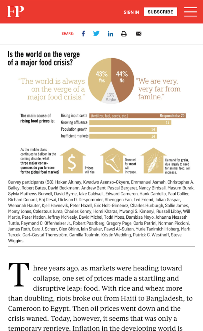
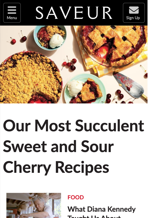
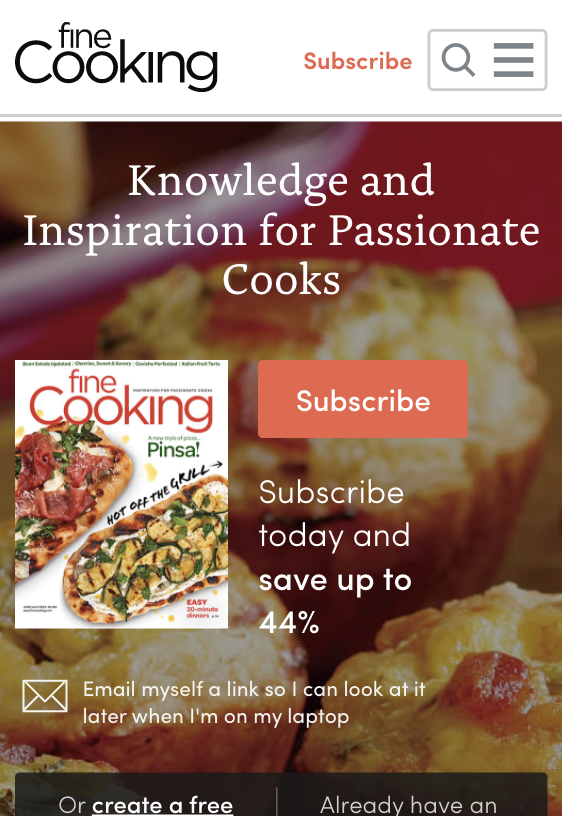
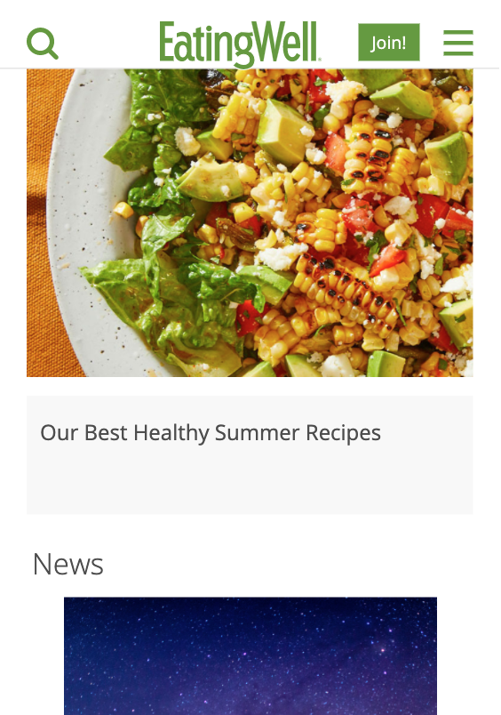
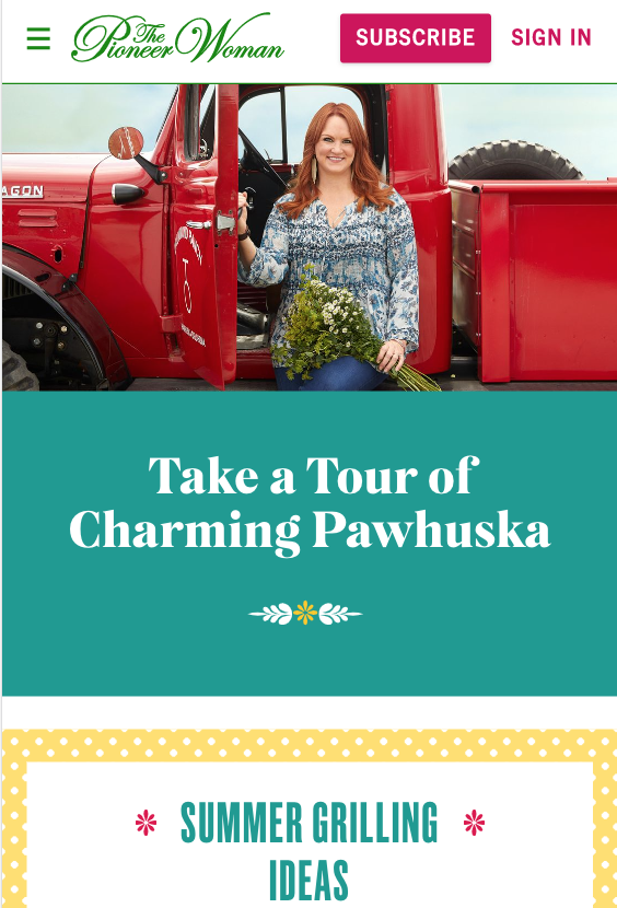
This button then gets linked to a dedicated newsletter sign up page (eg. https://feastdesignco.com/newsletter) so that you can:
- remove newsletter forms (+javascript) from every page
- remove user-unfriendly (intrusive) newsletter pop ups

This change is designed to:
- improve pagespeed by removing newsletter-related javascript from loading on every page
- improve pagespeed by decreasing DOM nodes
- improve accessibility by removing poorly-implemented newsletter forms (basically all of them)
- improve user experience by removing annoying pop overs or "intrusive interstitials" (which can also cause penalties if poorly implemented)
- improve sign up rates by creating a "subscribe" button that is available 100% of the time on the page when they are ready to subscribe, not randomly somewhere in the content or via an intrusive popup when they're not ready
- improve sign up rates by offering different options for the reader to sign up for, per Matt Molen's method, instead of just "get random recipes in your inbox"
Jump to:
Activating
Simply update to the Feast Plugin 5.3.0 and enable it via the checkbox in the Modern Menu section:

Once done, create a new page with the slug /subscribe and embed the form your newsletter service provides. See optimizing sign ups below for additional ideas.
You can remove the Yoast breadcrumbs from the page as well as social icons, and while it's not necessary, set a featured image.
Assumptions
While we've thought this through, and run it by multiple people, this setup is based on a few assumptions:
- newsletters are important for long-term viability, otherwise we wouldn't spend time working on this
- embedded sign up forms (in the content) experience banner blindness, which is why they perform so much worse than pop overs
- readers will subscribe when they're ready to and the action must be accessible, not simply because a form randomly appears
- pagespeed is important, but current pop overs and forms are poorly designed for pagespeed, SEO and accessibility and therefore shouldn't be embedded into every page
- intrusive interstitials (pop overs) irritate 99% of your readers and are a poor user experience (also an SEO factor)
- multiple subscription options that match reader needs will result in higher sign up rates
Sign up rates
Anecdotally, pop over sign up forms perform 200%-300% better than forms embedded into content.
This is such a massive difference, that it's clear that readers pay little-to-no attention to in-content forms.
By making the "subscribe" button sticky, prominent and available at all times, we're guaranteeing that the reader is able to subscribe when they're convinced you can offer them long-term value.
This doesn't happen on first page load, and it doesn't happen after an arbitrary number of seconds after page load. The current setup just isn't user-focused.
It happens when some part of your content triggers a desire to stay connected with you. This varies from person to person, and isn't something you have complete control over.
You need to to present them with the sign up option when they are ready for it, and the best way to do this is to have it constantly available.
Pagespeed
With the release of Lighthouse v6 update in May 2020 for Google Pagespeed Insights, javascript has become heavily penalized. A coming update in May 2021 will further refine these requirements.
Unfortunately, we're not aware of any newsletter/email company that has light weight, performant pop overs or sign up forms. More often than not, they're extremely bloated.
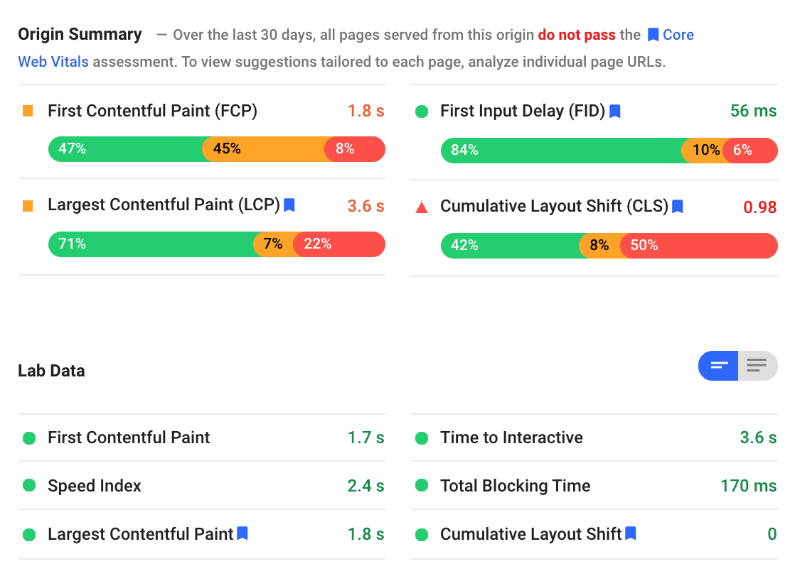
This is further compounded by the fact that Google appears to be scoring sites for pagespeed as a whole as well as individual pages.
Even if you optimize your top content and achieve high "Lab Data" results on a specific page, the "Origin Summary" shows whether your domain as a whole performs poorly using real-world Google Chrome data.
CLS
This doesn't apply to every newsletter form or opt-in out there, but there are a number that load either above the fold, or delayed on the page while the user scrolls. Both of these can cause CLS issues if not specifically addressed by a developer.
Removing site-wide opt in forms gets rid of this entirely.
Page Experience ranking factor
The page experience algorithm change coming in 2021 will specifically penalize intrusive interstitials. While this has been a ranking factor since around 2013, it appears to be receiving additional attention with this announcement.
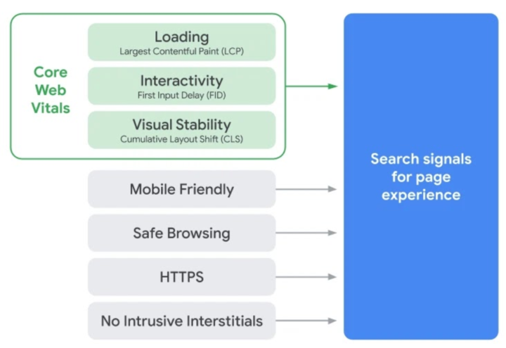
Intrusive interstitials are things that pop over content on the first page load - newsletter sign ups are the biggest offender in this category (followed closely by cookie notices).
The reason intrusive interstitials are an issue is: nobody wants to sign up for your newsletter before they've even read a word of your content.
Let's be honest: you don't want to share your email with any companies/sites either, before you know whether they're offering high quality content.
User experience
Aside from Google's upcoming page experience algorithm change, pop ups are just a terrible user experience. They get in the way of 100% of your readers, despite being something that less than 1% of users actually want.
Yes - newsletters are a critically important asset for recipe sites. As noted above, it's one of the few things you actually own. As a site owner, getting sign ups is necessary.
However, you do need to acknowledge that it has a negative overall affect on user experience. This falls into the same bucket as ads - which are necessary for revenue, which lets you continue to operate a site, but let's not pretend that they're pleasant.
Solution
Given the issues with pagespeed and user experience above, I think the best solution is to:
- incorporate a link/ability to have a sticky newsletter in the Modern Mobile Menu so that it's always accessible to the reader as they're scrolling down the page
- move the signup/newsletter to a separate page so that no javascript or styling is loaded on every page
On first reading this can seem like a backwards move, but it it supports multiple factors:
- improves pagespeed by removing CSS and Javascript that 99% of readers won't use (and don't want)
- improves user experience by removing interstitials that get in the way of content
- improves user experience by making the sign up accessible during the full reading experience
Having a dedicated newsletter sign up page also introduces new opportunities.
Optimizing sign ups
Your audience has a diverse set of needs and wants, and only presenting them with the option of "sign up for emails about new recipes" meets only a small fraction of those.
Instead, you can present multiple opt-ins for different purposes:
- to be notified of new recipes
- to be opted-in to an email series about a particular topic such as:
- "diet 101" / intro to your niche
- cooking skills or techniques
- 30 days of killer paleo breakfasts
- 10 vegan dinners that don't taste like cardboard
- repurpose your existing content into an email series such as "top 5 vegan breakfasts"
See Matt Molen's Email Jumpstart presentation on youtube.
While "get my latest recipes" may only be attractive to 0.1% of your readers, you can attract an additional 0.1% through additional lead magnets. Having 4-5 different offers can increase your sign up rates by 400%-500%.
This is something that's still not fully utilized for recipe sites. People come to your site looking for a specific recipe, not to just see what you happened to cook last week.
These are the same reasons we dropped support for the blog page and turned the Modern Homepage into a category-based display instead of "recent posts". People are interested in topics, not chronological content.
Customizing
Currently, the only option is to use the built-in "Subscribe" image that leads to a /subscribe page that you need to create. We plan on introducing customization options down the road.

Once you enable the subscribe button, simply create a new page with the slug "subscribe" and embed the form your newsletter service provides into the page content.
Logo
One thing you'll notice about the top recipe content sites is that their logo tends to be minimal, legible and out of the way - often just simple words or initials.
This is because your readers get no benefit from your logo, they're there to read your content. Oversized, elaborate logos are a relic of the now-dead "blogging" days.
Taglines belong in text on the Modern Homepage, not in a logo or site-wide.
Logos need to be redesigned for the modern web, to better serve the user experience. This means easily legible in a small format and out of the way.


When should you start using newsletters
Despite the obvious benefits of using one, we recommend people add newsletter sign ups only after they're seeing 1000+ visits per month.
This is because signing up for services and integrating them into the website is a complex process that detracts from the two most important things when starting:
- writing high quality content
- building backlinks
The traffic levels in the first year of building a recipe site are so insignificant that putting off newsletters has basically no long-term effect. Anything less than 1000 visits per month over the course of a year is meaningless compared to 10,000+ visits per month you should be above by year 2.
For context, you need 25,000 sessions/month to qualify for a decent ad network, which is what provides the income to actually pay for the monthly fees for a newsletter service.
This is why, much like ads, we recommend avoiding newsletters until they can make a meaningful difference.
Content autopilot
The great thing about creating email series around specific topics is that it can be done in a way that's cyclic. An email series about "top 5 best drinks for summer" is useful every summer.
Promising someone "I'm going to send you a new drink recipe to try every Friday, all summer" is timely, and offers a clear value proposition.
Or "I'll send you a new vegan breakfast recipe every day for a month" is a great offer for someone who is exploring a vegan lifestyle.
In theory, you have to set these up once and they're generating useful content forever.
Check out Matt Molen's course and services.
Google example
Google uses a dedicated newsletter subscription page coupled with a floating email-icon button for their web.dev site:
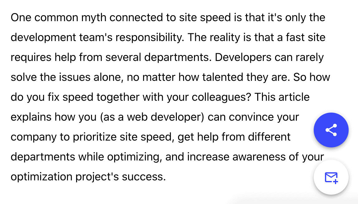
Which links to https://web.dev/newsletter/ - rather than loading unnecessary DOMs and javascript on every page.
Examples
- https://feastdesignco.com/newsletter/
- https://hot-thai-kitchen.com/hot-thai-kitchen-newsletter/
- https://www.acouplecooks.com/subscribe/
- https://delish.com/del-newsletter
- https://www.mrfood.com/section/subctr/action/signup
- https://www.foodnetwork.ca/newsletter/
- https://cookieandkate.com/subscribe/
- https://www.noracooks.com/subscribe/
- https://smittenkitchen.com/subscribe/
- https://www.seriouseats.com/newsletter
- https://recipeland.com/newsletter_groups/
- https://www.tasteofhome.com/newsletter/
- https://www.nytimes.com/newsletters/cooking
- https://www.eatthis.com/newsletters/
- https://www.thediaryofarealhousewife.com/subscribe
- https://myculturedpalate.com/subscribe/
- https://www.101cookingfortwo.com/subscribe/
- https://food52.com/p/sign-up-for-our-newsletter
- https://www.vegancoach.com/cooking-newsletter.html
- https://www.betterbaking.com/member-subscription/
- https://www.vice.com/en/page/sign-up-for-munchies-recipes-newsletter
- https://www.bbcgoodfood.com/howto/guide/get-inspired-newsletter
- https://southern-bytes.com/subscribe-to-southern-bytes
- https://wheatbythewayside.com/subscribe/
- https://www.effortlessfoodie.com/subscribe
- https://livinghealthywithchocolate.com/subscribe-to-living-healthy-with-chocolate
Genesis enews widget
One driving factor for developing this alternative is that the Genesis eNews widget we've relied on for years doesn't seem to be getting any updates or a replacement for the block editor.
With the widget-based theme setup effectively obsolete thanks to the Modern Homepage, Modern Sidebar, Modern Footer and Modern Recipe Index, this leaves no viable alternative for embedding a pagespeed-friendly newsletter form that integrates with the newsletter services.
As noted above, you'll simply embed the form that your newsletter service provides directly into the /subscribe page. Because this is a single page instead of site-wide, any pagespeed, CLS or accessibility issues are isolated to a single page, minimizing the negative impact they have on your domain.
SUBSCRIBE TO MY NEWSLETTER
This is an annoying pop up asking for your personal information before you've been given a chance to read the content.
✔ Yes, here's my email
✘ Get out of the way, creep
(click anywhere to dismiss this)

Deb A says
Hi Skylar, I know this is a work in progress and I was able to make the subscribe button work on mobile - 2 questions - is there a way to remove from desktop and how would I make a color block for the Subscribe button or a different color? Thanks
Skylar says
We'll build support for replacing the "subscribe" image after this is released.
For removing it from the desktop menu - no. Removing it from desktop means that you then have to re-include all the javascript and pop up garbage into the page, which is one of the primary things this is meant to remove. All of this re-included javascript+CSS would then be loaded on mobile, making the whole exercise pointless.
The same principle applies to desktop as well as mobile - you want to remove javascript and CSS that isn't used by 99% of your users, and provide them with a way to subscribe when the user wants to, not at some arbitrary, arbitrary point in your content.
Whitney Hight says
This will be such a useful feature! I currently have a newsletter but have always avoided popups due to the fact that they annoy me on other websites - I can't wait to have the option to have the Subscribe button as a permanent feature on the menu. Thanks!
M says
Hey,
I saw this update which looks great and have a couple of questions.
1) I noticed the subscribe button link is targeting /subscribe but then my site redirects it to /subscribe/ (with a final forward slash.) Is there any reason why it goes to the non trailing slash version of the page which most pages seem to redirect you to add that last forward slash?
2) I haven't updated to this latest version yet but noticed my Modern Menu already was using a subscribe button that took you to the subscribe page. How does this update defer from that?
Thank you.
Warmly,
M
Skylar says
1. This is a great point and we'll revise the URL to include the trailer slash to avoid the unnecessary redirect
2. This is the same setting, it was just previously under "BETA" and we didn't recommend people use it - we now support its use after the testing period has completed
AJ says
What is the text box for Grow.me Click to Subscribe? The link on the right takes to the details on integrating Grow.me. However, is anything required to be added to the text box field?