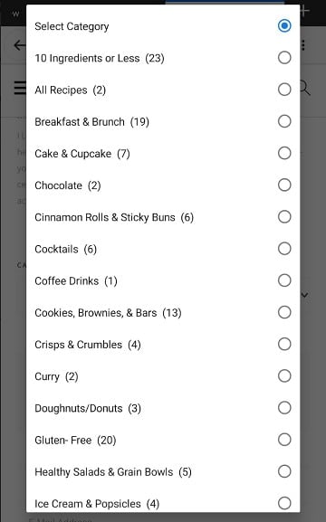
Note: due to ambiguity, we'll be calling this drop-down category menu the select category widget.
Put simply, the select category widget is a poor user experience, and has been replaced by updated recommendations for a better category site structure:
- How to use categories
- Category pages need content
- How to configure the category pages
- Food blog site structure
- Simple Category Index
Instead, you should be implementing the Simple Category Index to visually display your categories in an organized way.
Jump to:
Not mobile optimized
On desktop, drop-down menus are fine, usually. On mobile, they're a hellish nightmare.

Poor accessibility
Drop down menus are designed to be used as a way of selecting from a number of pre-set options as part of a form. The category/archive drop down menu is not part of a form, and provides accessible users no way of knowing what the menu is meant for.
Poor user experience
The category drop down menu is an uncurated list of categories displayed alphabetically.
This is a poor user experience for readers, who have to scroll through categories that are entirely unrelated to what they're searching for.
There's no reason to show recipes for breakfast next to recipes for dessert and cocktails.
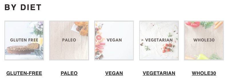
Instead, use the Simple Category Index to group related categories, just like you would with post.


Poor SEO
Search engines don't count the drop down menu redirects (javascript) as links to your category pages. This means that if you rely on the select category widget, your category pages don't have good internal backlinks, which helps search engines learn what a page is about.
This also means that your recipes suffer from poor click depth.
What does matter for us a little bit is how easy it is to actually find the content. So especially if your homepage is generally the strongest page on your website, and from the homepage it takes multiple clicks to actually get to one of these [pages], then that makes it a lot harder for us to understand that these [pages] are actually pretty important.
On the other hand, if it’s one click from the home page to one of these [pages] then that tells us that these [pages] are probably pretty relevant, and that probably we should be giving them a little bit of weight in the search results as well.
So it’s more a matter of how many links you have to click through to actually get to that content rather than what the URL structure itself looks like.
John Mueller, Google
Instead, you should be actually linking to those categories with normal hyperlinks, preferably in a way that's also easy to visually scan for readers on a mobile device.
Javascript
The drop down archive/categories feature relies on javascript, which is a source of errors and conflicts.
Poor browser support
Some browsers actually crash if a custom font is assigned to a drop down menu. There's no way for us to prevent users trying to assign a custom font to the drop down menu.
You are not your readers
One thing we've heard repeatedly is that bloggers themselves use the select menu widget to find their categories and posts, and this perfectly demonstrates the problem.
If you spend hundreds of hours building your posts and categories, you're intimately familiar with your site and where to find things. This means that when you look at a select category widget, you're using your in-depth knowledge to navigate your site.
But your readers don't have that intimate knowledge of your site. And from an outsider's perspective, 99% of bloggers categories are extremely poorly curated.
There are categories that are too small. Categories that are too large. Categories that overlap (why is there a pork and a ham category?).
Categories are displayed alphabetically, but there are many possible categories and they're not necessarily found side-by-side. If I want a pumpkin pie recipe, would I find it in [d]esserts? [p]ies? [s]weets? Why do I have to go through all of your categories to track this down?
This is a poor user experience.
The search bar easily replaces all of this, and is much quicker and intuitive to use.
If you need to rely on the select category widget to navigate your own site, there is something fundamentally wrong with your site structure and navigation. Follow the categories tutorials at the top of the page to bring your site in line with modern web standards.
Why deprecate this now?
The Modern Mobile Menu disables the theme's javascript implementation, which was required for the theme's default mobile menu. Removing this javascript improves pagespeed, by reducing the number of files the user's browser needs to download.
Additionally, it reduces javascript execution time, enabling the page to display faster.
An unforeseen side effect of this, is that the select category widget stops working, because it relies on the theme's javascript.
Upon review of how this works and evaluating it against modern best practices, we realized that this creates a false sense of "completeness", similar to the recipe index.
Bloggers were using it as a crutch to navigate their own sites, instead of building their homepage and internal linking in a way that users are familiar and comfortable with (see: no internal links).

Leave a Reply