This tutorial features the Feast Plugin, which enhances and extends your theme to improve SEO, pagespeed, accessibility and user experience.
The Feast Category Images (FSCI) Block lets you visually display your categories, by assigned images to categories.

This lets us to build a more user-friendly Modern Recipe Index that helps users navigate our site by category, and improves site structure.
Just insert the Feast Category Images (FSCI) block wherever you want to display a list of categories, like on the homepage and posts.
Calling the block with no additional parameters will output all eligible categories.
Jump to:
- Examples
- Auto suggested categories
- Round images
- Title Overlay
- Block settings
- Sorting
- Categories missing images
- Add featured images to categories
- Irregular images
- Icons
- Tips for building category images
- Grouping categories
- Image alt text
- Toggle title off
- Live examples
- Where can I use this?
- Eligible categories
- Randomizing categories
- Troubleshooting
- Separate mobile and desktop displays
- Related posts
Examples
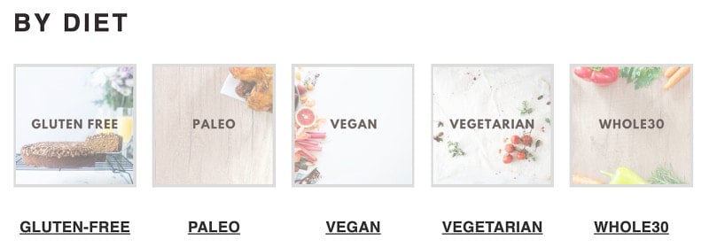
If you've embedded the category name into the image, you can disable the title output by adding toggling off the "show title" setting.
Auto suggested categories
As you type (2 letters minimum), the categories will automatically start populating for you to pick from:

Using the mouse to click the suggestion, or the down arrow then enter, will enter the correct category for you.
Round images
A trend that's surfaced on recipe sites is:
- using rectangular images for posts
- using circles for categories (must be uploaded square)
This adds a visual queue to readers about what you're linking to (but is not a substitute for good accessibility).
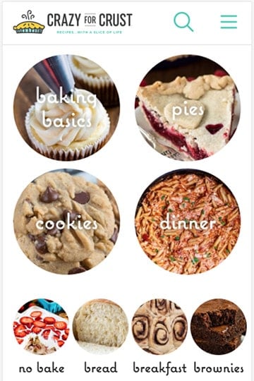
To accommodate this, we've added the ability to display the image as a circle (even if uploaded as a square):


By combining different styles, we can create entirely new and unique displays. The images for the pastries categories below are uploaded at full color, but displayed in a classical parisian monochrome-style and frame.
Title Overlay
To show the category title inside a box, use the "Title Overlay" checkbox. For square images, the title will appear in a gray box below the image. For circle images, it will be overlaid on top
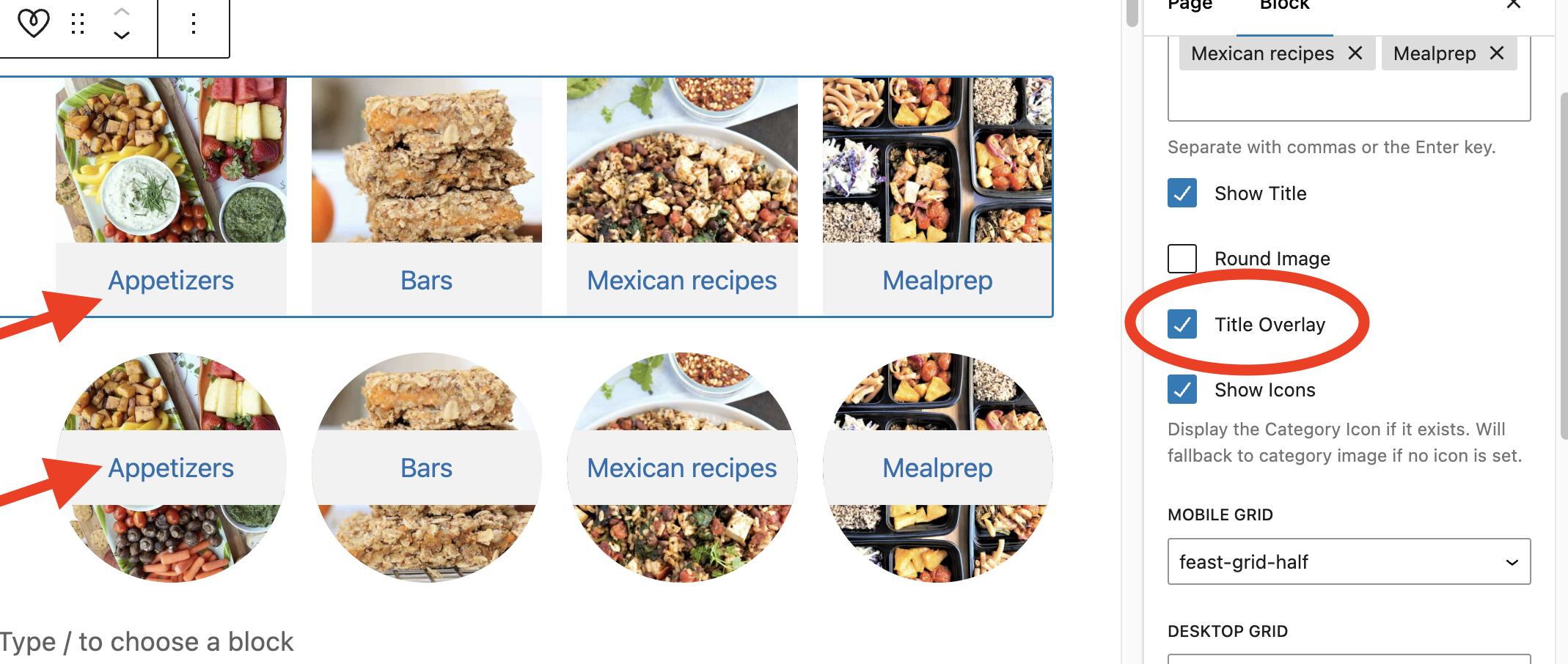
We do not recommend using the Title overlay for Mobile Grids smaller than "feast-grid-third" and it is not ideal for the "feast-desktop-grid-ninth", as the size is too small for a clear effect.
Feast+ users can further customize this color on their Feast+ Branding page:
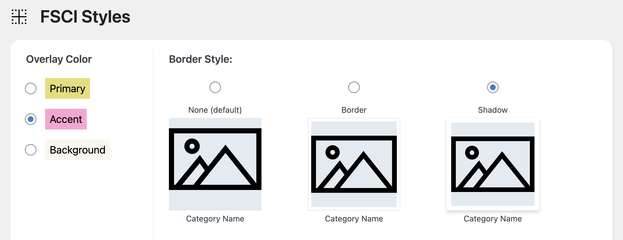
Block settings
The block settings let you customize the layout of the FSCI:
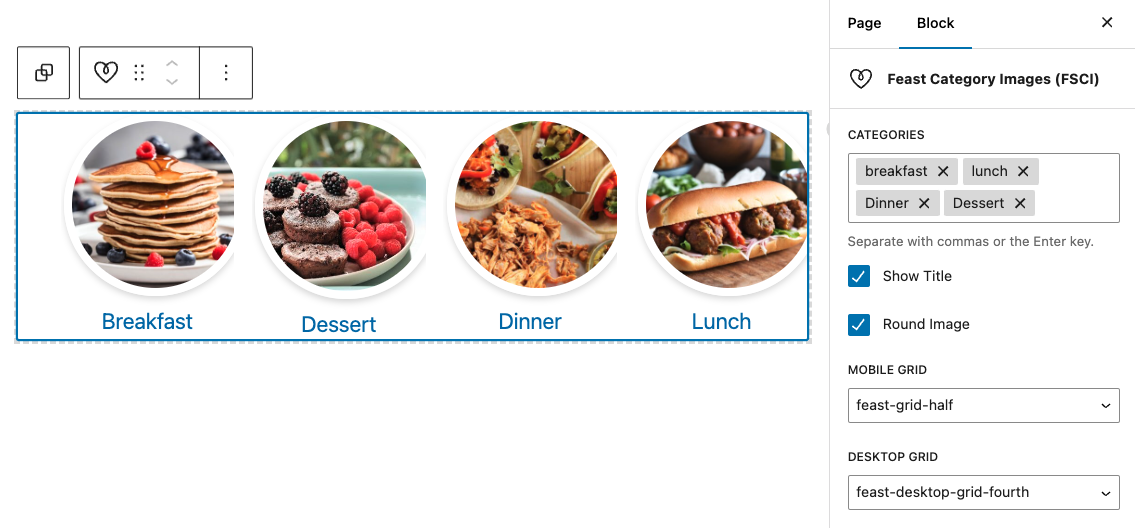
Note that the categories you enter must be the Categories field.
Using the Feast Category Image block without any parameters will display all your eligible category images and the category name, but this is not a good user experience and is not how it should be displayed.
We recommend customizing the display by specifying Categories field:
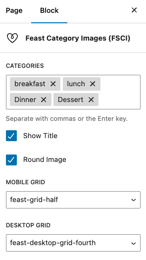
We recommend separating these with proper use of headings, as recommended in the Modern Recipe Index.
Sorting
The categories will display in the order they're added. To re-order them, you'll need to delete them and re-add them.
We recommend breaking the FSCI into groups of 4 when possible to keep them topically organized, and removing the need to re-add all categories.
Categories missing images
Any categories without featured images set will have generic placeholder styling:
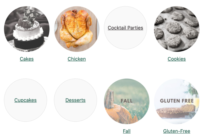
You'll need to add featured images to the categories, per below:
Add featured images to categories
You'll need to upload brand new images (JPG) to categories at 1200x1200 dimensions:
1. Upload your Category Featured Images
Upload the new square image in Media > Add New
Note: this must be square. If you don't upload a square image, it will appear as an oval once the circle effect is applied.
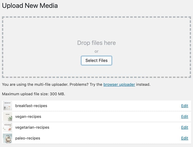
We recommend intentionally building new category images so that they have a consistent look.
Square images (1200x1200 px) with centered text that takes up around 70% of the width provide the best clarity:

2. Set the Featured Category Image
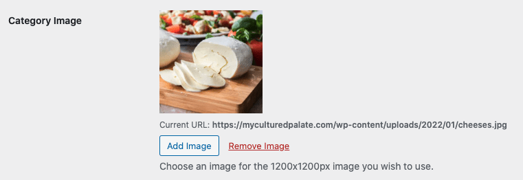
You can see which categories have images attached in Admin > Post > Categories:
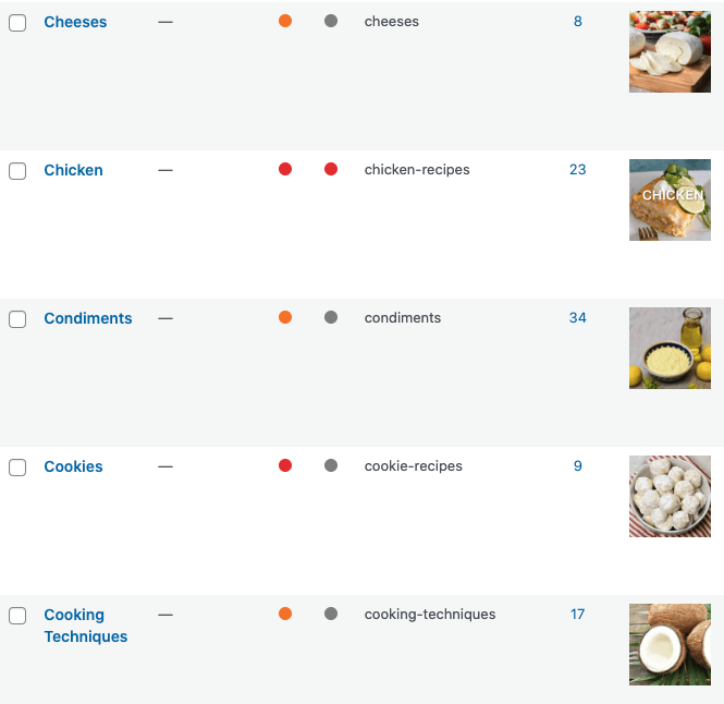
You can then edit or add them in "edit categories" screen:
Irregular images
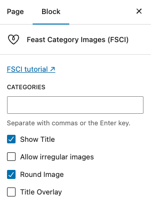
By default the FSCI block will force your images to display as a square/circle, since this is how the majority of sites display category images.
If you want to disable this and allow displaying irregularly sized images (not recommended), you can enable the Allow irregular images property in the FSCI block:
Icons
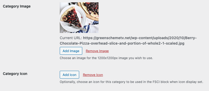
You can also set an icon, which is just a separate image (1200x1200) that can be used instead of the category image.
Once set, you can toggle it on in the FSCI block:
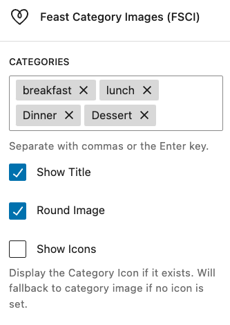
Note that if there's no icon image set, it will use the normal category image instead.
Sources to buy packs of icons:
Tips for building category images
- Images should be JPGs, and 1200x1200 or larger (minimum 1000x1000, maximum 2000x2000)
- Following a convention established by larger sites, we recommend using square images with rounded corners for categories, to visually distinguish them from posts
- Image names should follow good SEO practices: they should match the page content (be named after the category + word "recipes") eg. keto-breakfast-recipes.jpg
- Including the category name in the center of the image allows for flexibility in how it gets displayed, and allows for circle-styling
We recommend following the best practices outlined in the image optimization guide.
Grouping categories
We aren't big fans of nested categories, and with the Category Images block you can create a visual hierarchy by grouping categories under (h2) headings without actually requiring categories to be nested.
For example, you can have categories for seasonal recipes including "Winter", "Spring", "Summer" and "Fall", without having a useless "Seasonal" parent category by simply displaying these categories with a "Seasonal" h2 header.

Image alt text
The image's alt text is generated from the category's name for accessibility and screen readers.
For the Feast Category Images block, Alt text is intentionally left empty if the category title is displayed below the image, to avoid duplication of content for screen readers.
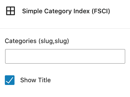
Toggle title off
If you have text embedded into the image, you can toggle the title off in the block settings:
Live examples
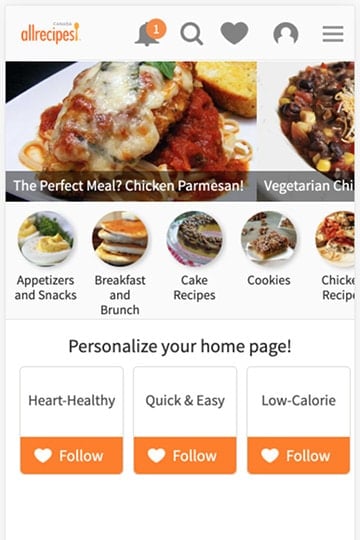
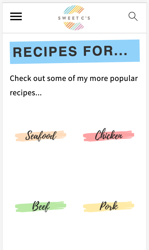
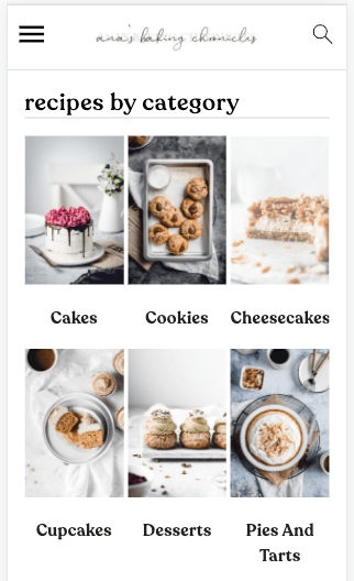
These are some sites that have category images.
Where can I use this?
All the places! The block can be inserted into the:
- Modern Homepage
- Modern Recipe Index
- The block can be inserted directly into posts to link to all the categories the current recipe is a part of
Eligible categories
To be eligible for display, all the following criteria must be met:
- the category must have a category featured image assigned to it
- the category must have at least 1 post in it
- the categories you specify must match an existing category
For more troubleshooting, see "Troubleshooting" below.
Randomizing categories
We get asked about randomizing the categories and will not support this because it's not a good user experience
A user expects content to be relative static, which means that if you click a link to go from one page to the next, and then go back, you'll see the same content.
If I see one category for "gluten free" recipes and one for "vegan" recipes and I'm interested in both, I'll check out one before going back to look at the other. However, if when I go back I see "dinner" instead of "vegan" I'm left disappointed and confused. I question whether I saw "vegan" at all, whether I'm on the right page, or whether it moved somewhere else on the page.
This is just a bad user experience, period.
It's also an issue with search engines, who consider non-static content to be excluded because of user experience.
Search engines won't rank or pass authority to content that isn't static. This is possibly because they can't reliable associate the content that users are searching for, with that page.
Our understanding is that Google keeps multiple caches of a page (once per crawl, up to 10 copies) and dismisses (or de-emphasizes) content that isn't present in each of the caches.
From a user standpoint, it would be a poor experience to click on one recipe, go back to the homepage to find another recipe you also want to see, and find that it has disappeared. You expect a reasonable level of consistency from sites you visit.
Much like sliders, if the content isn't important enough to be static on the homepage, it's not important enough to be on the homepage, period.
The purpose of the homepage is to display the top categories - between 4 and 8 FSCI category images. If you want to display more than that, use the Modern Recipe Index instead.
Troubleshooting
One of my categories isn't showing
- If the FSRI block doesn't find a category featured image for the category, it will not show
- If your category has no posts in it, it will not show
- If you haven't uploaded a new image, it won't show (WP bug)
- This typically displays as "failed to get attachment ID from URL"
- If the image you uploaded is too small for the thumbnail size, the image won't show (upload category images at 1024x1024 minimum, 1200x1200 recommended)
- If you're implementing this on a staging site it may not work - simply push the site live and then edit the FSCI block
- Make sure that the image URL on the category page is HTTPS and not-HTTP (if images are being loaded as HTTP, check your WordPress "General Settings")
We considered adding a placeholder image for all categories without images set, as well as displaying categories without posts, but decided that this would be a bad user experience for visitors.
It's important that you intentionally build these images, and categories, and optimize it for your readers so that you don't end up with thin-content garbage that you need to delete later on.
See our tutorial on how to configure category pages.
This has become especially prominent given that many sites being audited end up needing to delete poor quality content, and it drives up their ranking.
Note about CDNs: we've seen issues with image hosting platforms and CDNs including WP Offload Media and Jetpack. We always recommend removing Jetpack completely, but for WP Offload Media, you'll want to use the "remove from bucket" feature:

How can I prevent a category from showing?
The FSCI block is built to be additive, instead of subtractive. That means if you want to exclude a category from showing, you should list the categories you want to show, instead of trying to remove specific categories.
It's designed to be used as a short, specific list rather than display-all. This is because most blogs have a huge number of unrelated categories and displaying all of them in a single place isn't a user-first experience.
The categories you display should be related to the content of the page you're on. If you're on a desserts page, showing categories related to desserts (pies, cakes, cookies) is a good idea. Showing unrelated categories (salads, smoothies, soups) is not.
Sidenote: not setting a category featured image will prevent that category from showing. So if you have a "family" category, simply don't set a featured image.
Separate mobile and desktop displays
The default grid columns (feast-grid-half, feast-grid-third, feast-grid-fourth) should be used to control the mobile layout. We live in a mobile-first world - design for mobile.
You can use the separate desktop classes to change how the grids are displayed on desktop: feast-desktop-grid-half, feast-desktop-grid-third, feast-desktop-grid-fourth, feast-desktop-grid-fifth, feast-desktop-grid-sixth
Ideally, you'll want to use a mobile grid that divides evenly into desktop - the three primary would be:
- feast-grid-half with feast-desktop-grid-fourth
- feast-grid-third with feast-desktop-grid-sixth
- feast-grid-third with feast-desktop-grid-ninth




Rodney Lanthier says
Nice! Looking forward to this update so I can replace the custom code I am currently using. Keep up the good work!
ARCHANA POTDAR says
Sounds great. Is this something that I can set up right now?
Heather Cheney says
When is this update being released?
Skylar Bowker says
This came out with version 3.2.0.
Paul Collins says
Hi guys and gals,
it would really help if you format the code snippets under the heading "The Shortcode" as code. I just helped someone who copied code from your page and ended up with italic quotation marks instead of straight primes. The code does not work with italic quote marks.
For people who do not have eyes trained for code troubleshooting, they can spend hours not finding the mistake.
Hope this helps people in the future 🙂
Thanks, Paul
Skylar Bowker says
Good catch Paul - they are actually regular double quotes on the backend, but WordPress converts them to stylized "curly quotes" when outputting.
Added this to the code snippets plugin to fix it:
remove_filter("the_content", "wptexturize");
remove_filter("the_title", "wptexturize");
remove_filter("the_excerpt", "wptexturize");
remove_filter("comment_text", "wptexturize");
Or disabling it entirely:
add_filter( "run_wptexturize", "__return_false" );
Dalton says
Can an image in the Simple Category Index link to the recipe index rather than a category?
Skylar Bowker says
Nope! The Simple Category Index fetches from the categories database - it's specifically designed to list categories. You can create a basic image + link in a custom HTML widget if you want to visually link to the recipe index.
We'll be moving away from recommending that people heavily feature the recipe index, and instead focus on creating better homepages and site structure.
Amanda says
Would we be able to utilize this over the regular recipe indexes? I find my recipe index is still heavily trafficked and think this would be a better way to allow readers to explore the various categories as opposed to the way it is set up now using the recipe index as shown in the original setup tutorials.
Skylar Bowker says
Hey Amanda!
The Simple Category Index definitely has a role in a user-first navigation that also supports SEO. However, we'll be releasing a Modern Homepage soon that removes the need for a recipe index entirely, by turning the homepage into a recipe index. The Simple Category Index will be incorporated into this.
Update: you can now replace the recipe index with the simple category index.
Anna says
Skylar,
Can you please consider supporting the mobile display of feast-grid-full so that the following will display a recipe at the full width:
list_class="feast-grid-full"
The default grid columns all look terrible when using the fsri shortcode in the primary sidebar. Far too squished for my liking. The feast-grid-half is the best option but I would prefer to display the featured image at the full width and not half. Let me know if I'm not clear and you have questions.
Thanks.
Michele says
I am currently adding images to my categories and now notice that my slug is something like 'drinks' and 'cocktails' while the title is Cocktail Recipes and my new image is titled Cocktail Recipes. Should I make new categories so the slug matches everything as well? I am not a super high trafficked site if that makes a difference. I'd like to do it the correct way if I should!
Skylar Bowker says
Great question 🙂
We recommend including the word "recipe" in the slug, though this is a minor optimization. You can find details on how to customize and properly name your categories in setting your category fields
I wouldn't change the slug if your categories already exist (it's not that important), but certainly do it for new categories.
Dannii Martin says
Hi,
This was a great tutorial and I love how my categories are now set up.
Is there a way to centralise the category thumbnails though?
For example: On my new recipe index, I have 5 categories for course, but have the display set to desktop-grid-fourth, meaning there is a row of four and then one on its own. And on mobile this shows as two rows of two and one on its own. Is there a way to set the categories so they are in the centre, to make things look more symmetrical?
Many Thanks
Skylar says
Yes, you can use CSS to adjust how CSS-grid is displayed, but this is extremely technical and not worth the effort.
I'd recommend sticking to groups of 4, for consistent display across desktop and mobile.
Catherine Ramos says
I can't figure out how to make short code work. I insert the custom HTML widget, and type "[feast-simple-category-index categories= "appetizer" ] " and just this exact text appears on the page and not the categories. Can someone help? It has a featured image and that's the exact name of the category. Thanks!
Skylar says
Hey Cathy!
You'll need to enable "process shortcodes on Custom HTML" widgets in the Feast Plugin's Settings page. This is part of our recommended initial setup steps: https://feastdesignco.com/feast-plugin-setup/
For some reason, WordPress doesn't do this by default.
Molly Pisula says
Hello Skylar, I love this feature and got it working on my Modern Homepage with no problems. Now I'm working on having a category featured in the right sidebar, with a full-width photo. I'm doing this using the Custom HTML widget but I'm having two issues. The first is that above the category picture is a double carrot icon (>>). Not sure where that is coming from. And, I put in the show_title="off" code to turn off the label underneath the photo, but the title still appears. Any advice? Thank you!
Molly
Amanda Prince says
Hi Skylar! Thank you so much for this tutorial on the SCI. Do you have any advice on structuring category pages so they might be more user friendly to drill down? For example, one of my categories is Vegan. I would love for the user to be able to click on Vegan and then see top vegan recipes, vegan dinner recipes, vegan desserts, etc. So if they are adhering to a dietary lifestyle, they almost get transported into their own index. Visually I can see this working using the block editor (if this was a traditional page), but can't seem to actually execute on the category page itself. Would love your thoughts/expertise! Maybe I am overthinking it 🙂
Skylar says
We expect that the category pages will get a full revamp for the Full Site Editor and probably won't make any major changes/updates until then.
If you want to build a custom landing page, you can use a regular "page" with the block editor and the FSRI blocks. Sort of a sub-recipe-index: https://feastdesignco.com/modern-recipe-index/
Melissa says
Quick question:
When using the FSCI block instead of shortcode, how do add the feast-show_title="no"?
Skylar says
There's a checkbox in the FSCI block settings to disable or enable this.
Rachel Cox says
Is it possible to set the FSCI as a "full width container"? I'd like to use it in one place on my homepage instead of the FSRI.