Rethinking the Homepage
This is a post covering the thought process behind the Modern Homepage.
2020/03/29: See the Modern Homepage vs. Theme Homepage for a side-by-side comparison of the two setups, and the Modern Homepage Showcase for examples of what can be done with the Modern Homepage.
It's important to look at where we came from...
Jump to:
History
The theme's homepage layout comes from a time when food blogs were actually blogs. But those days are gone.
Modern food blogs are actually hyper-focused recipe sites.
This is more than just different terminology, it's a shift in mindset and methodology.
Recipe sites are topically focused, organizing information into topics (categories) rather than what you just happened to cook last week. Unfortunately, the theme homepages are of a "this is what I cooked recently".
Your job is to be the best match for a given keyword (recipe), and answer the question "how do I make this recipe" better than anyone.
This means linking to related recipes, not recipes you happened to make and post 3 days ago. You do this with a proper category setup.
Everyone is free to continue using the old, outdated layouts and site structure, but we don't recommend it. The themes we built in 2017 are still valid for the web of 2017.
If you're interested in running a successful recipe site in 2020 and beyond, you have to adapt to the times.
Changes in WordPress
The block editor is here to stay, and while it's still buggy and actively being developed, it's clear that this is how WordPress it's platform evolving going forward.
Over the next few years we'll see a shift from widgets to blocks - but how this ultimately plays out remains to be seen, and shouldn't be an immediate concern for the average blogger.
There's YEARS of development left before WordPress releases a stable, usable way of doing things.
Feast is here to keep the pulse on changes coming down, and actively prepare for them when they're ready for public use.
Mobile First
Most recipe sites see 70%-80% of their traffic from mobile devices, so the homepage layout needs to be designed primarily for mobile, with additional styling (CSS media queries) for enhancing desktop display.
We changed the default theme display on mobile display to half-width last year, which was a good first step, but this leaves plenty of room for improvement.
Featured Posts are outdated
The theme's featured posts widget was ahead of its time when first implement. The additional markup, and heading structure, that's included in the widget is no longer a best practice however.
See the Modern Homepage vs. Theme Homepage for details.
Incorrect use of article schema
Each post (recipe) displayed via the "Featured Posts" widget in the themes, is wrapped in HTML5 article element.
The guidelines for article elements defines article as a fully independent article specific to that page, which means using it as a summary for a link to an article (post) on another page is incorrect.
Remedy in plugin: output the post as a div, instead of article.
Incorrect use of heading tags for titles
Each post being displayed uses an h2 tag for the title, creating far too many heading tags on the page, which goes against Google's guidelines on headings.
The post title should really be nothing more than a basic hyperlink, not a heading tag.
Remedy in plugin: wrap the post title in a regular hyperlink without a heading tag. See: Modern Homepage vs. Theme Homepage.
Incorrect use of heading tags for widget titles
The widget title uses an h3 heading tag, and is supposed to be the "heading" for the post titles. This means you have multiple h2s (the post titles) that are nested under an h3.
This isn't just semantics, it's a direct violation of w3 guidelines:
Skipping heading ranks can be confusing and should be avoided where possible: Make sure that a
<h2>is not followed directly by an<h4>, for example.It is ok to skip ranks when closing subsections, for instance, a
W3 Web Accessibility Guidelines<h2>beginning a new section, can follow an<h4>as it closes the previous section.
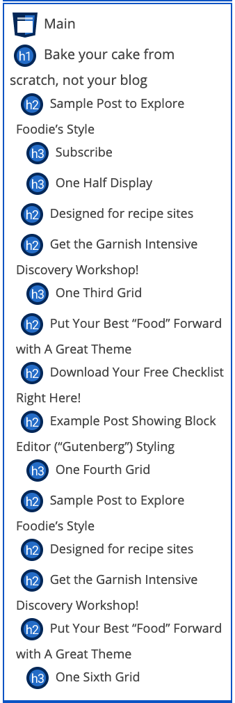
Plugging the old homepage into the wave.webaim.org we get a page structure that violates these guidelines, and doesn't make sense:
The sequence of headings on the right is incorrect - basically each "h3" should be an "h2", and each "h2" should be an "h3".

See: modern guidelines for page headings.
See: Modern Homepage vs. Theme Homepage
Too many unnecessary options
The featured posts widget contains over a dozen options, which made sense for blogs, but not so much for modern recipe sites.
Modern recipe sites which have a fairly narrow range of acceptable displays. Realistically, these posts should almost always display at one-half width, with just an image and post title.
- No read-more
- No content excerpts (duplicate content)
- No post dates/info/meta
While not too computationally expensive for modern web servers, we always want sites to run as performant as possible, and we will do everything we can do to optimize this.
Remedy in the plugin: require minimal configuration, and remove unnecessary options.
See: the FSRI shortcode.
Accessibility
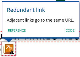
The featured posts widgets are not great for screen readers, with two hyperlinks (one on the image, one on the title) pointing to the same post for each one being displayed.
This makes the screen reader read the link twice, which is annoying and not technically correct. This actually throws a warning in the Webaim Accessibility tool:

Remedy in the plugin: use aria labels to prevent the image from being read by screen readers, or combine the image + title into a single hyperlink. See: Modern Homepage vs. Theme Homepage
Calling it "featured"
A "feature" is something that deserves special attention, such as your top performing posts. You can, and should, feature your top 6-8 performing posts.
However, "featuring" every recipe on your entire site means that everything is featured. And when everything is featured, it means nothing is featured.
All this is, is a tool to display post within a category, and improve your click depth.
Remedy in the plugin: displaying posts is not "featuring" them, so modernize the naming convention.
