Edit Body Font Size
This tutorial features the Feast Plugin, which enhances and extends your theme to improve SEO, pagespeed, accessibility and user experience.
All modern themes from Feast (version 4.0.0+) come with 16px as the standard body font size, for reasons outlined in the font size for food blogs article. This was done to bring the themes more in-line with modern web standards, and to resolve "text too small" errors in Google Search Console.
- increases ad revenue by decreasing ad density
- improves user experience by making content more legible
- improves accessibility by using larger font size, for vision impaired users
- works perfectly with the system font stack
Even just one year later, we're seeing stories of people benefiting from further increasing the body font size to 18px, and in the case of a few fonts, up to 20px.

As with all changes, you should be designing primarily for mobile devices. Stop editing your site for desktop display - that's not what 80% of your visitors see. Make sure it looks good first and foremost on mobile.
Jump to:
Examples
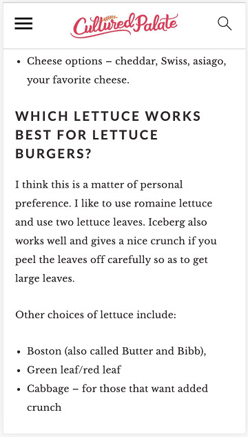
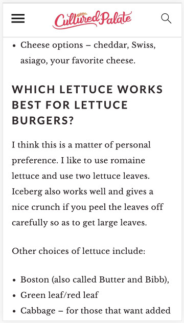
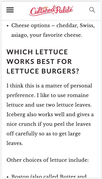
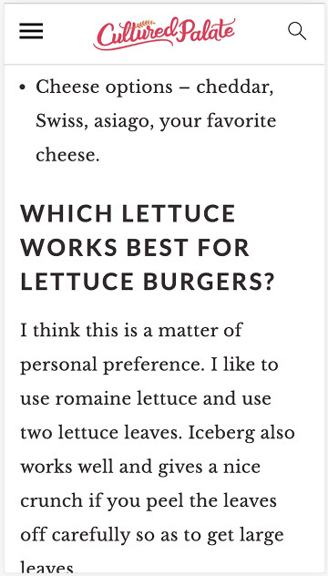
Below is the same page with the body font at different sizes:


Video walkthrough
Why increase the body font size?
The primary reason you may want to increase the body font size is if you've selected a custom font that's too small to read. Different fonts display at different sizes - some smaller, some larger.
This setting makes it easy to specify a larger body font size, which stays in place between theme updates.
Accessibility
A growing percentage of the population is reaching the age where they require assistance with reading small text, which means that a growing percentage of your audience would benefit from a larger text size.
The net effect of this is that it will take more scrolling to get through the same amount of content, because the text takes up more screen space.
And this is fine.
At the Google Webmaster Conference in November 2019, one of the presenting engineers specifically pointed out that scrolling is an intuitive, natural part of the mobile experience, and that extended content is perfectly acceptable on mobile.
Ad revenue
We'd never recommend making a change just for the sake of ad revenue (your visitor experience is always factor #1).
In this case though, the incentives align, so it's worth noting: a large body font size may lead to an increase in RPM (ad revenue).
Ad companies such as Mediavine have recommended increasing the font size because it leads to higher RPMs.
While the cause of this remains unclear, we can speculate that it leads to a lower on-screen ad density, which publishers are willing to pay more for, because each ad gets more attention.
Search Engine Optimization
While we have no direct evidence of this, we've heard anecdotally that people have seen increases in search engine traffic around the time that they increase the body font size.
This can theoretically be tied to user experience: by both making the text easier to read for a growing percentage of the audience, and decreasing the ad clutter, visitors have a better on-site experience.
Additionally, sites that have too high of an ad density and may have been penalized by search engines for this, may be nudged outside of the "penalty" by the decreased ad density.
However, this is muddled by the fact that there are usually multiple user-experience improvements being made after an audit. There is no direct evidence tying font size to search traffic (except in the case of a warning shown in Google Search Console for text being too small).
System Fonts
As of 2021, we recommend everybody implement the System Font stack in the Feast Plugin.
Side effects
The text headers are sized based on a percentage of the body font size, as explained in the font size for food blogs post. This is done to visually distinguish the headers from the rest of the text and make the page more legible, and scannable.
We do not recommend changing these ratios, which means that your header sizes will also increase.
The increased heading size means that you have to use headings intelligently. Make sure to follow our Modern Guidelines for Page Headings.
Constraints
To prevent allowing people to shoot themselves in the foot with ridiculously small or large text, we've restricted the body font size to 16px - 22px.
H1 font size
The site/post-title is set to 2em, or 2x the body font size, which means that increasing the body font from 16px to 18px changes the title from 32px to 36px.
Unfortunately, this often ends up being unnecessarily large.
The Feast Plugin 7.2.0 introduces the ability to change the h1 to a custom size:

Note: this is restricted to 24px to 36px to keep it within reasonable limits. It looks like 30px is a good size regardless of body font size.
Troubleshooting
The only problem we expect people may encounter is from caching (WP Rocket, server, CDN, browser), or plugins like autoptimize. Make sure you've cleared your caches, and check your site in a private/incognito window.

I watched the video but my Foodie Pro doesn't update like that. I have the live customize feature. Where do I find the spot to update the font size in live customize?
Hey Susie! As noted above, the is a feature of the Feast Plugin, not the themes.
I appreciate this. Some articles I have to bypass due to the small size font posts..
Now if you can fix the color of the font and ban this grayscale color and use black most of us vintage citizens could actually enjoy your articles. The font being so light even with glasses and zooming the screern, it's still a struggle to read even this plugin article. I don't even try to visit sites that really interest me if they use this color font. It just fades into a blob on the screen after a few sentences. Thanks,
Thanks for the feedback Sylvia! I've checked some accessibility testing tools and we actually do technically have adequate contrast: https://wave.webaim.org/report#/https://feastdesignco.com/feast-plugin-edit-body-font-size/
But we'll go ahead and increase the contrast based on your comment 🙂
Hi There! I updated the font size as per these instructions, but now the heading size looks too small (at most, the same size font as the body). Is there a way to increase the size of the headings? Or is that the way it should look? 🙂 Thanks!!