Rethinking the Thumbnails
Thumbnails are generated from the featured image specified in the post. In Rethinking the Featured Image, we came to the conclusion that the correct size for featured images is 1200x1200 (square) because this is what Google requires for article schema.
Summary:
- upload featured images at 1200x1200 px
- in-post images should be 1200px width minimum, the height doesn't matter
- large images do not affect pagespeed if lazyloading is used
- you'll want to disable the theme's built in thumbnail settings and then enable the Feast Plugin's modern thumbnail sizes, then run the Regenerate Thumbnails plugin
- you don't need to optimize (Shortpixel) the thumbnails unless Google throws an image size warning, but it is a best practice
Yes - this is new information. We only discovered this in August 2019, which means the recommendations we made in themes is outdated.
This is a key reason we're updating functionality in the Feast Plugin rather than the themes: so that we can update things as they change.
While food blogs typically have recipe schema that handles the featured image by a recipe card (WP Recipe Maker, Tasty Recipes, Create), this doesn't account for 100% of the pages on a site. Many recipe sites have a number of other pages, such as contact, about, media kits, photography services, and so on.
These non-recipe pages require a featured image as well, which Google requires to be 1200x1200 at minimum.
Assumptions
- Mobile screens make up about 80% of pageviews, and are the most important consideration
- We want 3 possible ratios: 1x1 (square), 2x3 (portrait), and 4x3 (landscape)
- Note: 4x3 is one of the ratios Google's Recipe Schema requires, so we're using this for consistency
- Note: 2x3 for portrait images is also for consistency, using the same ratio is easy to remember
- Note: you do not need to upload your images at these ratios
- The majority of food blogs are going to use square or portrait for thumbnails, because mobile is width-constrained
- The focus of the shot is centered in the image, allowing for cropping
- Most portrait shots contain "background" out-of-focus content at the top 1/4 and bottom 1/4 of the image - which contributes to the overall artistic look and feel of a site - but is not particularly critical to readers for thumbnails
Landscape images are great in posts because it avoids the need for excessive scrolling, but
Knowing that, we can move forward assuming that we'll want thumbnails that are square or portrait. Due to width constraints and loss of viewability, we don't want to display more than 4 in a row on mobile.
Here's our cheatsheet for mobile (360px width) and desktop (720px width)
| Images | 1x1 (square) | 2:3 (portrait) |
| Mobile: 360px @ 1/2 | 180x180 | 180x270 |
| Mobile: 360px @ 1/3 | 120x120 | 120x180 |
| Mobile: 360px @ 1/4 | 80x80 | 80x120 |
| Desktop: 720px @ 1/2 | 360x360 | 360x540 |
| Desktop: 720px @ 1/3 | 240x240 | 240x360 |
| Desktop: 720px @ 1/4 | 180x180 | 180x270 |
Using the above, we can come up with necessary thumbnail sizes:
Square
- 360x360 (desktop)
- 180x180 (both)
- 120x120 (mobile)
- 80x80 (mobile)
- 240x240 (desktop)
Portrait
- 360x540 (desktop)
- 180x270 (both)
- 120x180 (mobile)
- 80x120 (mobile)
- 240x360 (desktop)
The srcset images will be tied to the original image being referenced: in the case of the 1200x1200 featured image, only the square thumbnails will be used.
Sidenote: images don't actually display at the resolutions above due to margin and padding, but they're "close enough" for our purposes.
Scaling and cropping
The WordPress thumbnail creator has a couple of options in terms of how to handle cropping. For simplicity sake, we rely on the default, which crops equally from the top+bottom and left+right if needed.
Images will first be scaled down to the longest side - sometimes width, sometimes height. Because we're now recommending all featured images be square and always scaling for width, all images will always be 100% width.
Pagespeed
Another (albeit minor) issue is that each image with its thumbnail sizes adds
- text (kilobytes) that needs to be downloaded
- calculations the browser needs to run on each image to determine how it should be displayed.
The kilobytes concern is laughable on first thought, but people are so neurotic about this that they minify HTML and CSS for pagespeed, literally stripping a few hundred characters worth of whitespace and linebreaks.
By contrast, having 5-6 thumbnail sizes can add a 100 characters per image, which is multiplied by dozens of images on the homepage and category page, as well as sidebars if using images there. If you care enough to minify HTML + CSS, you care about this.
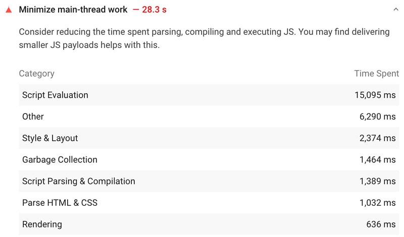
The browser rendering is generally less of a concern, but is still showing in Google Pagspeed Insights reports under "Style & Layout", "Parse HTML & CSS", and "Rendering":

The point here is that there are very real reasons you don't just want to generate 20 different thumbnail sizes for each image.
Super optimization
A possible way to save on the number of thumbnails required is to significantly restrict your own options for how things are laid out. If you only give yourself the option for one-half on mobile, and one-quarter on desktop, you only need 2 thumbnail sizes:
1x1 (square)
- 360x360 (both)
- 180x180 (both)
2:3 (portrait)
- 360x540 (both)
- 180x270 (both)
This means that anytime you display a list of posts or categories, you must use one-fourth display, which gets rendered as one-half on mobile.
This is overkill for most blogs, but if your host is really punishing you for taking up too much disk space, and your server is being stretch to its limits, and your pagespeed is suffering horrendously - it's an option.
Other setups
We made a ton of assumptions above, based on our experience selling thousands of copies of our themes and troubleshooting thousands of sites over the years. These assumptions to not apply to everyone.
When you start varying from these recommendations because you have a compelling, data-driven reason to and have the money to hire a custom developer to implement your dream, then you can (and should) hire a custom theme developer for $10,000 - $20,000.
Just be very aware that custom themes that we see often last less than 2 years before becoming outdated, and you're tied to that developer for ongoing support and maintenance (and that comes with a cost).
Until then, use the default recommendations. Messing with the technical setup (and image sizes and thumbnails are extremely technical) is a waste of your time. As a food blogger, your job is to create, write, and post recipes - that's what you get paid for.
Additional reading
- https://developer.mozilla.org/en-US/docs/Learn/HTML/Multimedia_and_embedding/Responsive_images
- https://alexwright.net/blog/web-design/responsive-images-wordpress/
- https://developer.wordpress.org/reference/functions/wp_calculate_image_srcset/
- https://developer.wordpress.org/reference/functions/wp_get_attachment_image_srcset/
