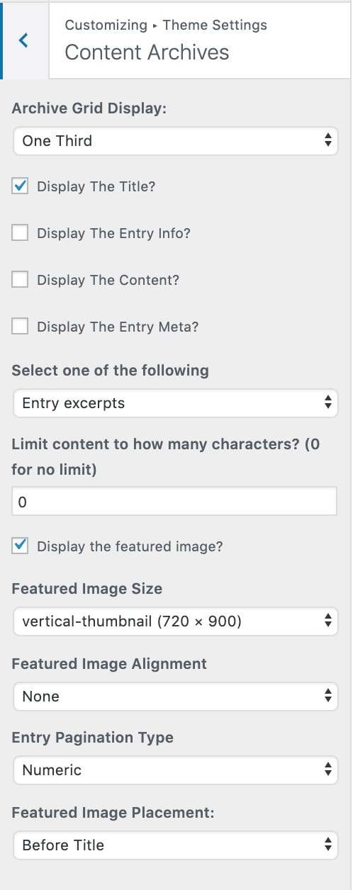
Why the category pages now display half-width on mobile
All theme versions prior to 4.0.8 displayed categories as full-width on mobile. This lead to needing to scroll excessively to browse through a category.
In version 4.0.8, we updated the default category page layout to display only the featured image and the post title, per modern best practices. This makes category pages much easier to browse, leading your visitors more easily to the recipe page they're actually looking for.
We no longer recommend displaying post-meta (author, date published, tags/categories) as this doesn't provide any value to the reader on category pages. We also don't recommend displaying the post-content, as this makes the page too visually distracting to navigate through.
This applies to:
- Foodie Pro
- Brunch Pro
- Cook'd Pro
- Cravings Pro
- Seasoned Pro
Note: This applies to archives - which includes search, categories, tags and date/author archives. We no longer use the term "archive" because it's technical and unnecessary. Category pages are the only important type of archive. For more information, see: food blog site structure.
Recommended featured post and category display settings
We no longer recommend displaying full post content on home and category pages - those days are long gone.
A good mobile user experience has the homepage and category pages displaying only the featured image and post title. The featured image and title should be sufficient for your readers to tell whether the recipe meets their needs or not.
This makes it easy to visually scan through a category of 20 posts.
The new the recommended layout is set this way by default in theme versions newer than 4.0.8, but older themes can configure it this way by copying these settings: