The customizer allows changing certain parts of a theme or plugin, changing your site from our prebuilt theme to your own custom theme. This will not and cannot provide every possible change you'll ever want to make, and anything not covered here will require hiring a developer.
Using the customizer breaks our theme setup that is designed to comply with requirements for:
- SEO
- accessibility
- pagespeed
- user experience
- ad optimization and revenue
All of the above can be negatively impacted through changing ou default theme setup. Use caution when using the customizer.
Jump to:
Step one: enable the customizer
To enable Feast settings in the Customizer, visit Admin > Feast Plugin, enable it:
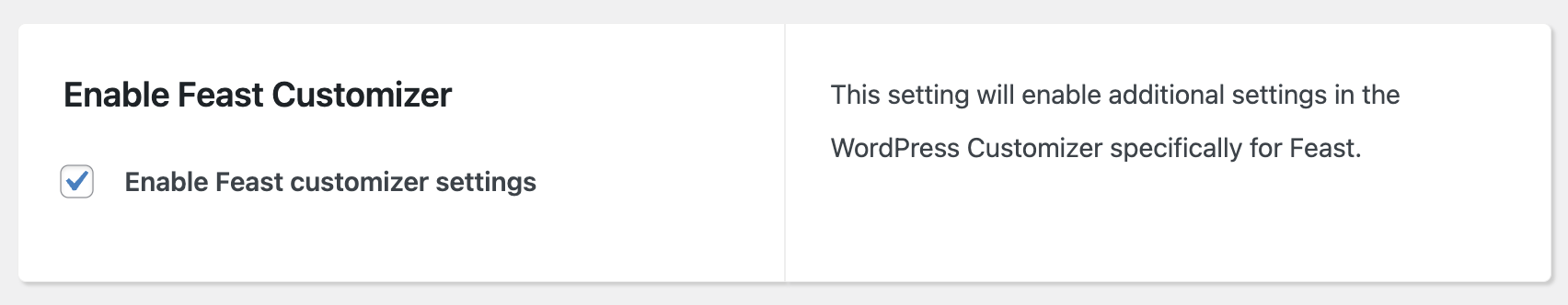
This requires the Foodie Pro 5 theme.
This enables options in Admin > Appearances > Customize to change fonts, colors, layouts, spacing and more, and creates a custom theme that we may not support.
Feast supports our own prebuilt themes. We're not able to support issues arising from creating your own custom theme.
Note that customizer settings are specific to your theme and will not carry over when you change themes.
However, for sites with technically savvy owners, or who have third party support from a spouse, or companies like Nerdpress, iMarkinteractive or Mike Zielonka, we've integrated options to create your own custom theme through the customizer.
Note that the options and interface may change depending on whether you're using a standard theme, or Feast+.
FSRI
A number of settings are available to customize the FSRI block in the customizer:
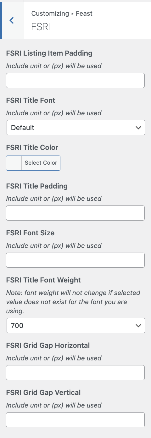
Note that this is the customizer, which applies site-wide, and not the block editor FSRI block options.
This setting applies to both the content (eg. homepage, posts) as well as the sidebar. Because 80% of pageviews are mobile, you want to optimize the styling for a mobile view, which is 2-posts-wide.
Video:
This includes:
- List Item Padding: this is the space between the image and the border of the listing item
- Title Font: this defaults to the body font, but you can choose to match the heading fonts of the body font
- Title Color: this is black (#000000) by default, but you can choose to match the link color or other colors - pay special attention to accessibility compliance
- Title Padding: this is the spacing around the post name (but not the image)
- Font Size: the default for this is the body font size, however you can increase this to make it more prominent. IMPORTANT: it's critical this is checked on mobile and sidebar for layout.
- Font Weight: the default is the body font weight (typically 400/normal), with 700 being the default bold weight. IMPORTANT: not all fonts support all font weights, so if the weight doesn't change then it doesn't exist
- Font Case: default (as written in the post title), uppercase or lowercase
- Grid Gap Horizontal: this is the horizontal spacing between posts being displayed
- Grid Gap Vertical: this is the vertical spacing between posts being displayed
FSCI
A number of settings are available to customize the FSCI block:
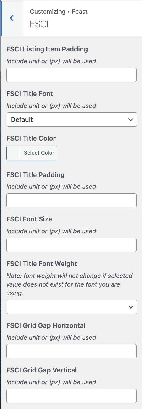
Note that this is the customizer, which applies site-wide, and not the block editor FSCI block options.
This setting applies to both the content (eg. homepage, posts) as well as the sidebar. Because 80% of pageviews are mobile, you want to optimize the styling for a mobile view, which is 2-categories-wide.
Video:
This includes:
- List Item Padding: this is the space between the image and the border of the listing item
- Title Font: this defaults to the body font, but you can choose to match the heading fonts of the body font
- Title Color: this is black (#000000) by default, but you can choose to match the link color or other colors - pay special attention to accessibility compliance
- Title Padding: this is the spacing around the post name (but not the image)
- Font Size: the default for this is the body font size, however you can increase this to make it more prominent. IMPORTANT: it's critical this is checked on mobile and sidebar for layout.
- Font Weight: the default is the body font weight (typically 400/normal), with 700 being the default bold weight. IMPORTANT: not all fonts support all font weights, so if the weight doesn't change then it doesn't exist
- Font Case: default (as written in the post title), uppercase or lowercase
- Grid Gap Horizontal: this is the horizontal spacing between posts being displayed
- Grid Gap Vertical: this is the vertical spacing between posts being displayed
Modern Menu
A number of settings are available to customize the Modern Menu:
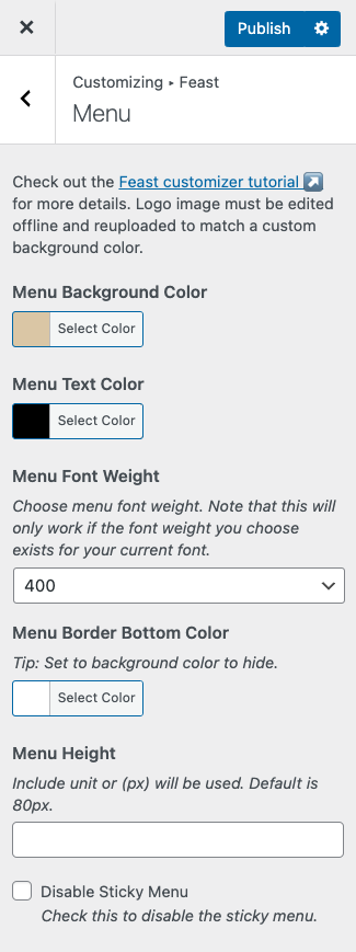
This includes:
- Menu Background Color: the background color for the menu, default white (#FFFFFF)
- Menu Text Color: the color for the menu items, default black (#000000), this will also change the search and menu icon color
- Menu Font Weight: how bold the menu items are, default 400, normal bold is 800, may not change if you have a custom font that's missing that specific bold
- Menu Border Bottom Color: the border at the bottom of the menu, default grey (#CCCCCC), you can set this to the menu background color to blend it in
- Menu Height: default 80px, making this too large can negatively affect ad viewability, and making it too small can negatively affect user experience
- Disable Sticky Menu: the Modern Menu is sticky by default in order to enforce branding and help user navigation, but this can be disabled
Note: most people upload logos with a white background, and will need to edit the logo offline and re-upload it if changing the background color
Links
The link settings can be found in the Customizer > Colors & Fonts > Links:
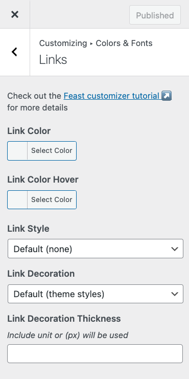
This enables setting the:
- Link Color: sets the color of hyperlinks
- Link Color Hover: sets the hover color of hyperlinks, note that this is not visible on mobile devices and shouldn't be relied on
- Link Style: italic or normal (default)
- Link Decoration: none, solid (default), double, dashed, dotted, waivy
- note that for accessibility purposes, none is not recommended
- Link Decoration Thickness: the thickness of the underline style
Video:
This overrides the site-wide link default link color from our themes (eg. #fb6a4a for Foodie Pro). If you want to selective apply it to only certain links, you'll need to hire third party customization support.
It's important to make sure that your link color is accessibility compliant on any background color it appears on.
Full Width Background Color
The Feast Full Width group block can be matched to your brand color site-wide.
You can choose a background color to apply site-wide in Customizer > Colors & Fonts > Colors:
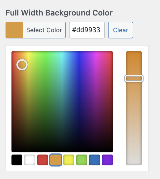
This should be a light color to avoid contrast issues with the text, link colors and buttons.
Note: for Feast+ users, the background color is automatically assigned to the Feast+ background color, and all necessary accessibility adjustments are automatically made. For Feast+, this is set in the Feast+ branding page and is not available in the customizer.
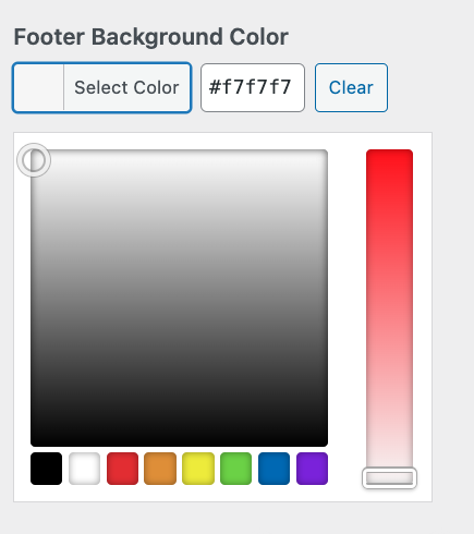
Footer Color
If you have the Modern Footer set up, you can choose a footer background color to apply site-wide in Customizer > Colors & Fonts > Colors:
Button Colors
The button color settings will set your WordPress button colors site-wide. WordPress buttons are often used in the sidebar, footer, and for the Replace Jump To feature.
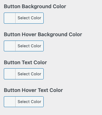
- Button Background Color: the standard background color for the button
- Button Hover Background Color: only applies on desktop, when the mouse hovers over the button
- Button Text Color: the text color for the button, should meet minimum accessibility contrast ratio
- Button Hover Text Color: only applies on desktop, when the mouse hovers over the button, should meet minimum accessibility contrast ratio against the button hover background color
You can test the button color contrast for accessibility by plugging your website into https://wave.webaim.org/
Note: for Feast+ users, the button color is automatically assigned to the Feast+ accent color, and all necessary accessibility adjustments are automatically made. For Feast+, this is set in the Feast+ branding page and is not available in the customizer.
Fonts
The fonts settings can be found in the Customize > Colors & Fonts > Typography (must be using Foodie Pro 5). These settings were introduced to Foodie Pro 5 to allow updating the fonts to more closely match the styling of the classic Brunch Pro, Cook'd Pro, Cravings Pro and Seasoned Pro themes.
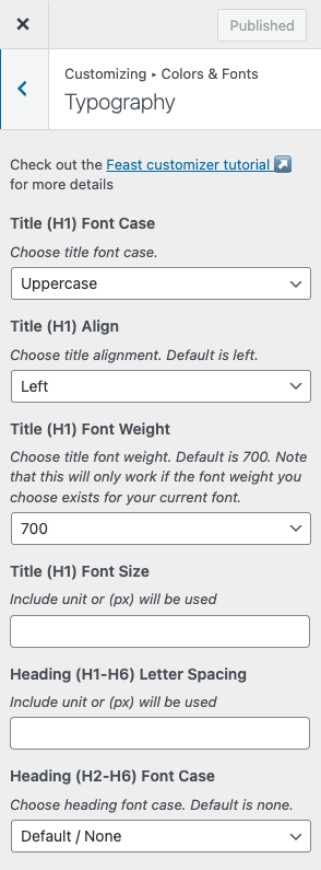
This includes options for:
- Title / H1: font case, font weight, font size, alignment
- Headings (H2-H6): font case, font weight, font size, alignment
- Breadcrumb (Yoast): font case, font weight, font size, alignment
- Post Info: font case, font weight, font size, alignment
- NOTE: review the disclosures documentation for FTC legal requirements around disclosures in the post info
- Body font: font size for most text, should be 18px-20px for most fonts, see this note on font size for ad optimization
- Desktop Sidebar: font size adjustment for the sidebar, but only on desktop (mobile should match the body content)
Tip
Font weight is the "boldness", where 400 = normal text, and 700 = regular bold. Setting the title or heading to 800 or 900 is a simple way to further distinguish headings.
Pay special attention to the font weights if using non-web-safe fonts (eg. Google Fonts) as they may simply not be available.
Skylar says
If you mean on the FeastDesignCo.com site, it's because a different contrast/color draws users attention to a specific item. In our case, the Feast Plugin is our cornerstone product, replacing the 5 individual themes, and is our "conversion" item - we want people to visit that page and make the purchase. This is just "conversion optimization".