This post uses examples from the Modern Thumbnails of the Feast Plugin.
You may also be interested in checking out the more general image optimization guide.
Here's a brief breakdown of how thumbnails work.
Let's say we have a 1200x1200px featured image:
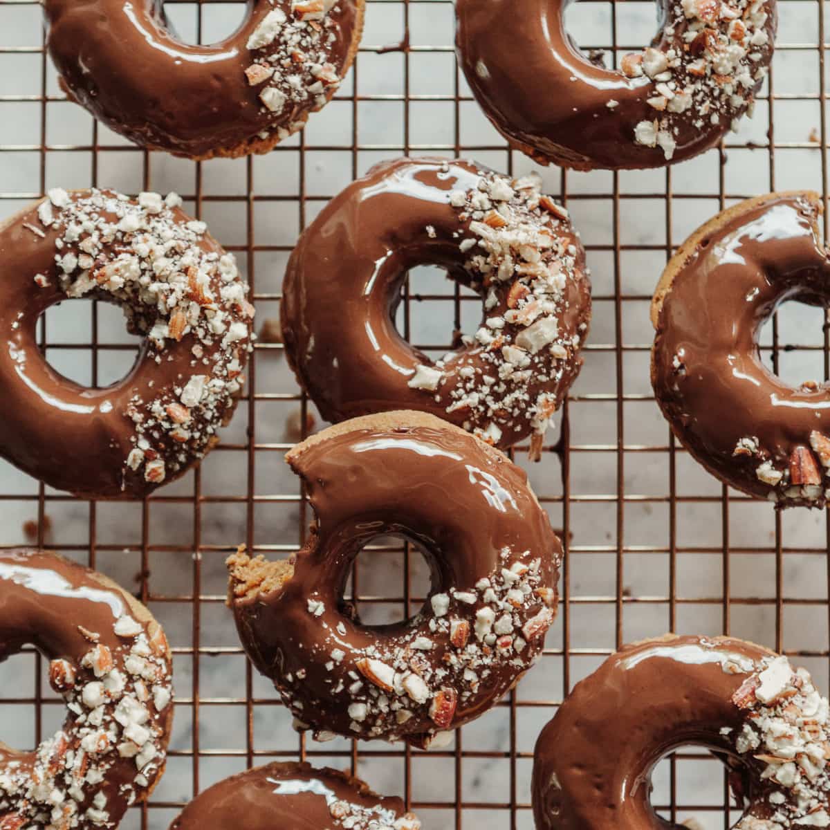
Note: since the content width here is only 720px, it appears to be the same size as the original image. The original 1200x1200 image is actually being displayed at 720x720px.
Jump to:
Vertical / Portrait thumbnails
And we have a vertical thumbnail selected in our "featured posts" widget at 720x960 and a hard crop. First, WordPress will resize to the longest size - 960px height in this case, then crop the shorter size (the width in this case) to meet the width requirement:
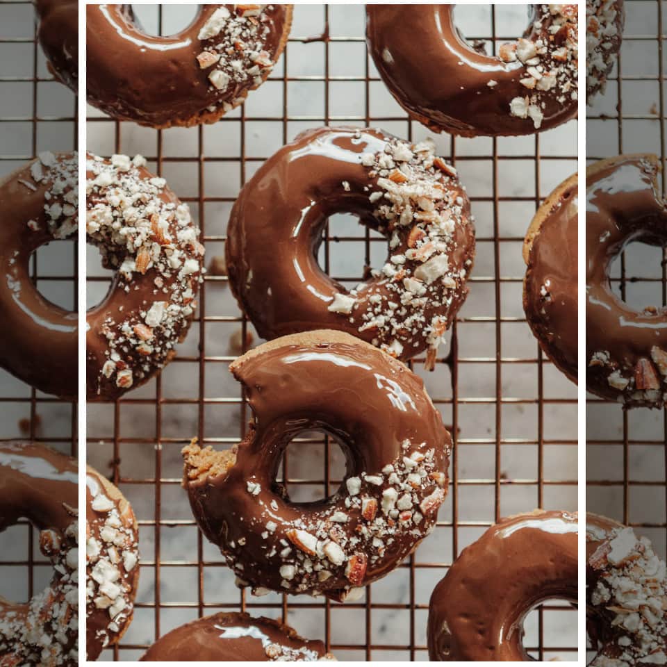
This 720px width image will fill the full width of our content, if we display it full-width on desktop.
Horizontal / Landscape thumbnail
Conversely, if we have a 4:3 (720x540) landscape thumbnail that needs to fill the 720px full width, we'll resize to 720px width and crop out whatever height is needed to achieve 540px height:
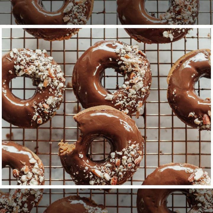
This size takes care of our full width desktop, but the majority of our pageviews are on mobile, which is 360px content width.
So we also want to register 360px width images. For vertical (3:4), this is 360x480 and for horizontal (4:3), this is 360x270.
Mobile display
But we now display mobile thumbnails at half-width by default, which means we're not done.
We also need thumbnail sizes for half of 360px, which is 180px. For vertical (3:4), this is 180x240, and for horizontal (4:3), this is 180x135.
Note how the width always stays consistent: 720px, 360px and 180px.
The width on screens is more or less fixed, while the height on screens is what we're accustomed to scrolling, so the height is the side that can be adjusted at will.
Why 1200px?
Google's Discover requirements state that the image must be 1200px width minimum. If our featured image is under 1200px, there's no way to up-size it to comply with this requirement.
Why 3:4 and 4:3?
4:3 (landscape) is Google's requirement for recipe + article schema.
Truthfully, we can use any ratio for vertical images, but for simplicity we decided to keep the ratio the same - so we get 3:4.
Work smarter, not harder.
Recipe plugin images
Recipe plugins use 3 sizes as defined by Google's recipe requirements:
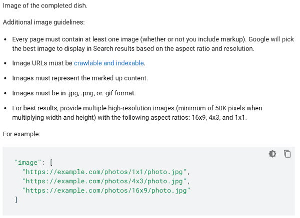
When using the same image for the featured image and recipe card, you'll end up with auto-generated images for the recipe that look like:
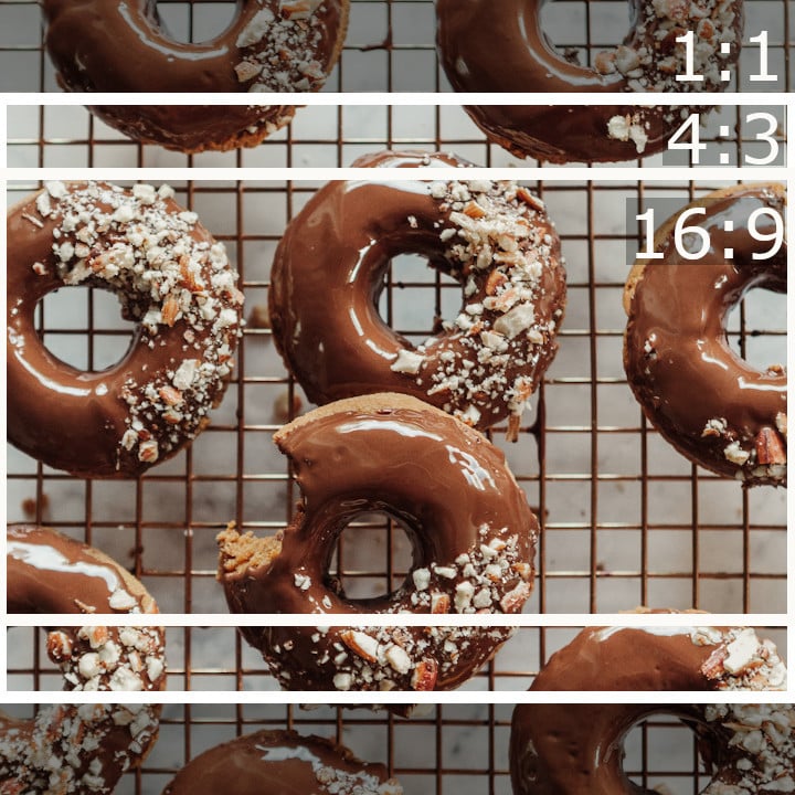
This means that you have to select your featured images + recipe card images in a way that if you lose (approx.) 25% of the top and 25% of the bottom of the image, the finished recipe is still visible and useful to the reader.
Facebook uses a 1.91:1 crop when sharing links to their platform, which is slightly smaller than 16:9 (actually 16:8.38).
However, Facebook traffic is a distant third relative to Google and Pinterest, and shouldn't dictate the image crops and ratios.
Focus zone
Combining the fact that the recipe card's smallest image is 16:9 (horizontal), and we may want to use 3:4 (vertical) for thumbnails, we can create a "focus zone" by combining these options:
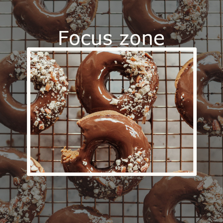
The part of the image outside of the "focus zone" should be considered sacrificial - it's not critical in conveying important information about the recipe.
With the 16:9 ratio required for article+recipe schema and 3:4 ratio for displaying thumbnails on the site and a 1200px width image, we get:
- 16:9 = 1200px x 667px
- 3:4 = 900px x 1200px (scaled down to 720x960 on-site)
That means the "focus area" on a 1200x1200 image is 900px wide by 667px tall.
Why is this important?
Human beings are visual - we're drawn to images. Better images = more clicks.
Google currently (2020/04/09) uses the 16:9 thumbnail in order to save vertical screen space.
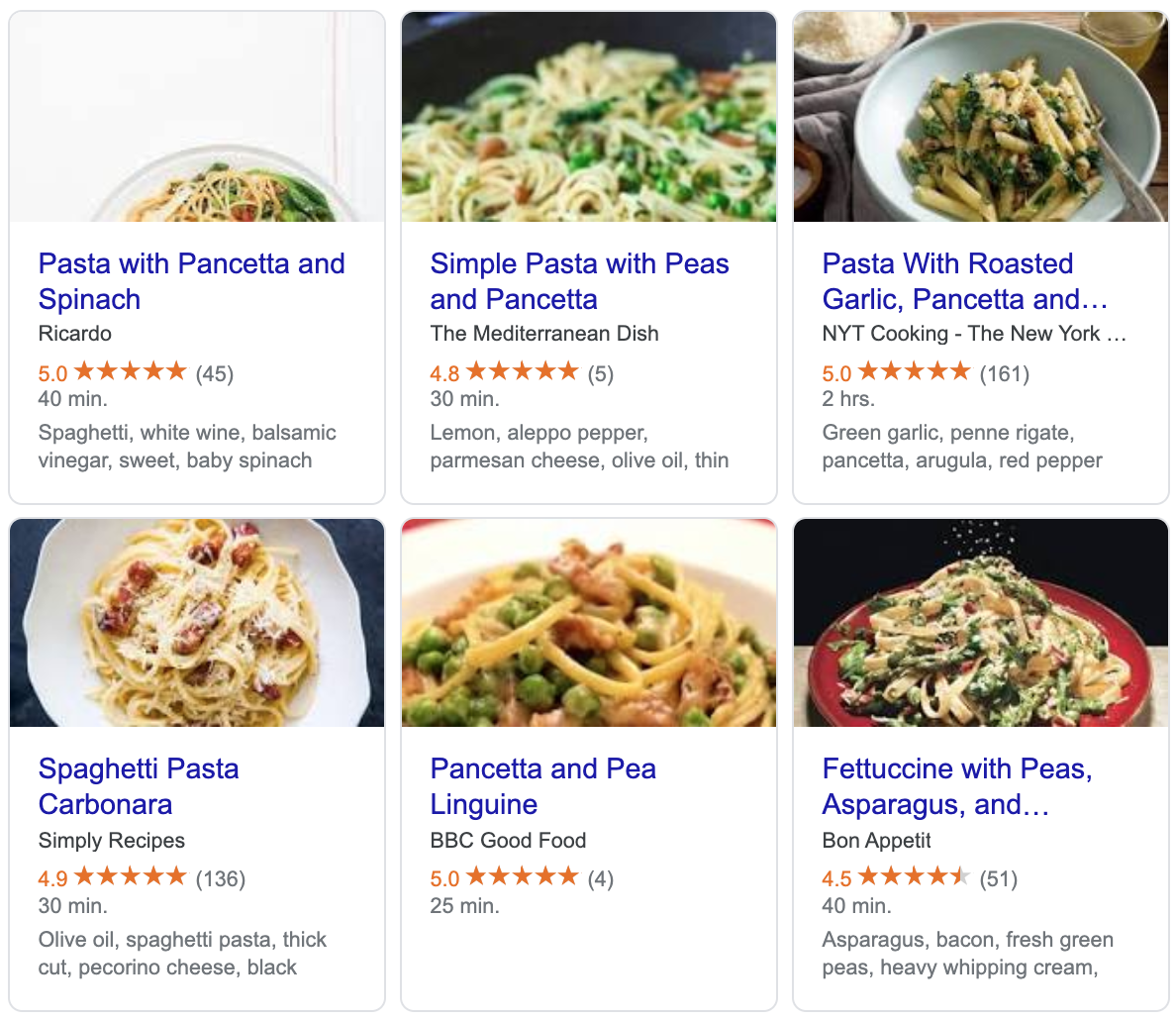
- The top-left image is basically useless because the plate is too low - likely an artsy vertical image that had to have too much cropped from the top+bottom
- The top-middle and bottom-middle don't contain enough context and are too zoomed in - likely image sizes that are too small
- The top-right, bottom-left and bottom-right are the best of the bunch, and could even be zoomed in a little for more granular detail
Stop selecting images based on on-site thumbnails
Most people focus on optimizing images so that the thumbnails on-site look good.
However, the featured image that's going to get the MOST VIEWS and make the biggest difference in click through rates is the one that gets used by Google in the search engines.
Those 1x1 images in the search results, and 16:9 images in the recipe card carousel are going to drive 80% of the traffic to your site. In relative terms, your on-site featured image are almost irrelevant.
Need proof? Head over to your analytics.google.com and take a look. We'll provide a hypothetical report from Analytics > Acquisitions > All Traffic > Channels:
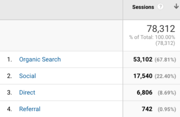
In this example, we have 78,000 sessions with 71,000 of them coming from non-direct sources (approximately 90%). How many of those people end up clicking through to another page (using the thumbnails?)
Let's head over to Analytics > Behavior > Behavior Flow:
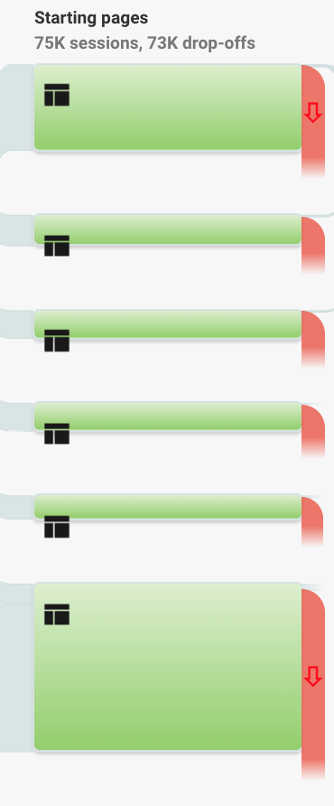
The drop-off rate here is higher than usual, but industry standard seems to be about 80% drop-off.
This means that 90% of visitors will see your featured images off-site, and only 20% of those people will use or interact with them on-site. That makes off-site thumbnails about 4x more important to get right than on-site.
Does this mean that the thumbnails on your site aren't important at all? No. But how they look in search engines and social networks is far more important.
In-post images
In post images also register "thumbnails" using a "soft crop", which means that it resizes based on best fit. The in-post thumbnails registered in the Feast Plugin specify only a width, which means that it resizes the width and does not crop the height.
This keeps images proportional.

Cindy says
Thanks for this. Could you also cover Google’s crops. Food bloggers have all kinds of weird crops on the carousel - would love more insight on how that works / why it happens.
Skylar Bowker says
Added!
Katie says
Thanks for this! In relation to Google you mention they prefer 4:3, but the example following is 3:4. Can you clarify which is correct? Thank you!
Skylar says
Hey Katie!
Please see this section: https://feastdesignco.com/how-thumbnails-work/#why-34-and-43