Modern Homepage vs. Theme Homepage
This tutorial features the Feast Plugin, which enhances and extends your theme to improve SEO, pagespeed, accessibility and user experience.
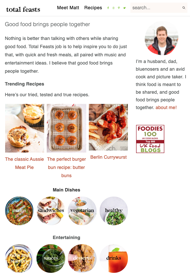
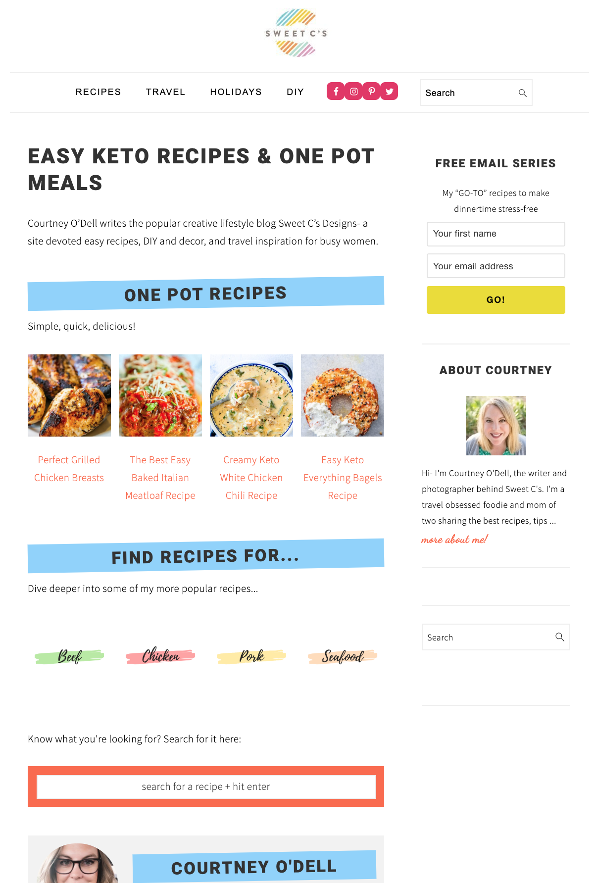
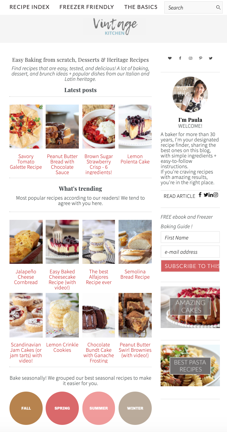
Check out the Modern Homepage Showcase for examples of sites that have made the transition.
The Feast Plugin is designed to allow us to release frequent, minor updates to functionality as best practices change.
Unfortunately, the theme homepage is built using functionality via the "Featured Posts" widget that is simply unfixable from our side. In contrast, the modern homepage allows us to provide automatic updates over time as necessary through the plugin-based shortcode.
See: Modern Homepage Setup.
Modern homepage
- Built as a WordPress "Page"
- Uses the Feast Plugin's updated FSRI shortcode
- Organizes and displays posts by logical categories
- Follows SEO best practices
- Dedicated areas for unique content
- Follows accessibility best practices
- Uses proper anchor text
Theme homepage
- Built using the widget area
- Uses the theme's outdated "Featured Posts" widget
- Displays random posts based on recency
- Very poor SEO
- No unique content
- Not designed for accessibility
- Uses outdated "read more" text
The FSRI block is used to build the homepage and provides a solution that
- is better for SEO
- provides greater design and content flexibility
- resolves some long-standing accessibility issues
Why would you care about accessibility? Because of this:
Note: SEO and user experience go hand-in-hand - good SEO is a good user experience. We focus on SEO below but the same applies for UX.
Jump to:
- Who should use the Modern Homepage?
- SEO: Reduced DOM nodes
- SEO: Remove unnecessary CSS
- SEO: Click depth and recipe indexes
- SEO: Prevent repetitive post listing
- SEO + Accessibility: Read more
- SEO: Unique content
- Accessibility: Headings
- Accessibility: Redundant links
- W3: Article schema
- Pinning
- Better for bloggers
- Smoother theme updates
- Credit
Who should use the Modern Homepage?
Everybody!
The theme homepage is now considered to be outdated. It's bad for users, it's bad for SEO and it's bad for accessibility.
The Modern Homepage not only fixes these issues, but allows for more customization.
SEO: Reduced DOM nodes
The theme homepage uses an unnecessary number of DOM elements to display what is basically just an image and title.

The FSRI shortcode significantly reduces this by:
- wrapping the image and title in a single link (per this Yale accessibility guideline)
- removing unnecessary containers
To display just 4 posts for example, the "Featured Posts" widget uses 34 DOM nodes, while the FSRI shortcode uses 33% fewer at just 22 DOM nodes.
On a homepage displaying 5 categories with 4 posts each, this adds up to a reduction of 60 DOM nodes alone.
Why does this matter? Having very heavy pages (high DOM nodes) causes the browser the render the page slower, which decreases pagespeed. It can also cause rendering issues for Google, which may result in content not being indexed.
SEO: Remove unnecessary CSS
There's chunks of CSS embedded into the theme stylesheet that are dedicated to specific pages, without actually being used on those pages. The styling for homepage widgets are one example of this.

By moving to the FSRI shortcode that can be used on the homepage, category pages and recipe posts, we can eliminate homepage-specific CSS, making the whole theme leaner.
This not only reduces the KBs required to download, it also reduces the browser rendering time, making all pages appear to load faster.
We can further trim down the styling by removing tweaks made to sidebars and widgets, making the site more consistent aesthetically as a whole.
SEO: Click depth and recipe indexes
The most important page on your site is your homepage. It typically receives the most links, it's used as the "launching point" for Google's crawling, and categories and pages linked to from the homepage, get a big internal link boost. It's the foundation of a good site structure.
"…we'll see the home page is really important, things linked from the home page are generally pretty important as well.
And then… as it moves away from the home page we'll think probably this is less critical."
That pages linked directly from the home page are important is fairly well known but it's worth repeating. In a well organized website the major category pages and any other important pages are going to be linked from the home page."
John Mueller, Google
The recipe index in the themes is a better homepage than the actual homepage, organizing posts by topic rather than recency. Unfortunately, it typically has zero backlinks, has no unique content, and in some cases uses mobile-unfriendly drop-down menus.
The alleged simplicity of a recipe index was actually a problem-in-disguise for food bloggers, who mistakenly believe their job was complete after setting it up. It created a number of issues from:
- poor internal linking to categories
- poor sequence of posts being displayed (date-based, rather than category-based)
- no unique content on the homepage, recipe index or categories
The solution? Merge it into one homepage.
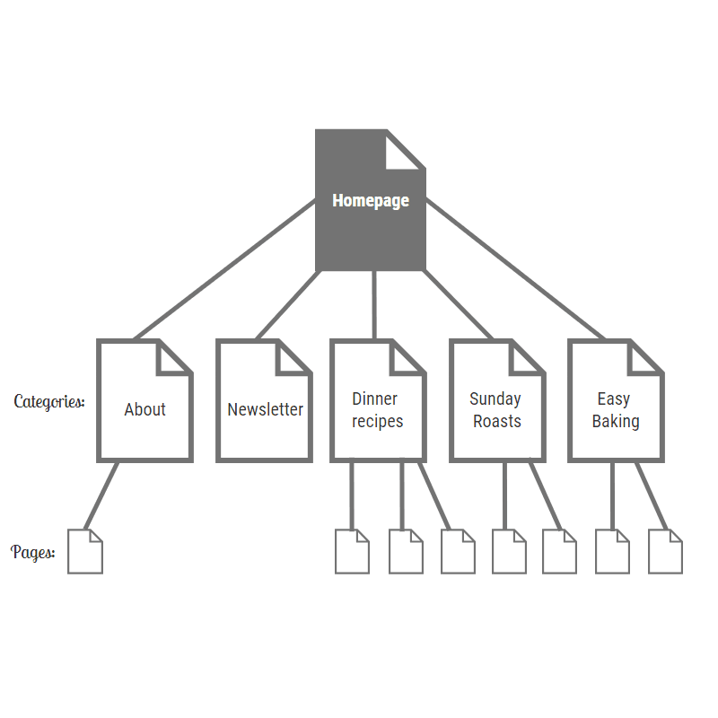
Update 2020/04/04 - it's been suggested that we can convert the "recipe index" into a page dedicated to displaying the categories using the Simple Category Index. This is being looked into.
This has a side-benefit of eliminating the allure of javascript-based recipe indexes such as FacetWP, removing a costly additional plugin.
SEO: Prevent repetitive post listing
If using multiple "Featured Post" widgets on a page and sidebar, posts can be displayed repetitively if they're found in more than one category.
The FSRI shortcode automatically excludes any previously displayed post, surfacing new content instead.
This provides more options for the reader, and better internal linking for SEO.
SEO + Accessibility: Read more
Anchor text is used to provide search engines and screen-reader-users with context about what the link they're about to follow is about.
Having "read more" a dozen times on the page is unacceptable from both an SEO and accessibility standpoint, as it provides no details at all about where the link goes.
The Modern Homepage removes the "read more" option entirely, and replaces it with manually curated anchor text.
SEO: Unique content
The homepage is just like every other page on your website, which means that it needs unique content. Anything that appears primarily on your actual posts are attributed there, which means that rehashing the introductory text on the homepage creates duplicate content.
While duplicate content within your own site won't penalize you, Google doesn't count it on the pages (homepage) that it's on. This means that from Google's standpoint, a homepage created with no text that you've intentionally inserted on only that page is low quality.
In order to have a high quality homepage, you need to provide context to Google and readers with and guidance on how to navigate your site. This includes proper use manually created headings and unique content and proper anchor text.
Accessibility: Headings
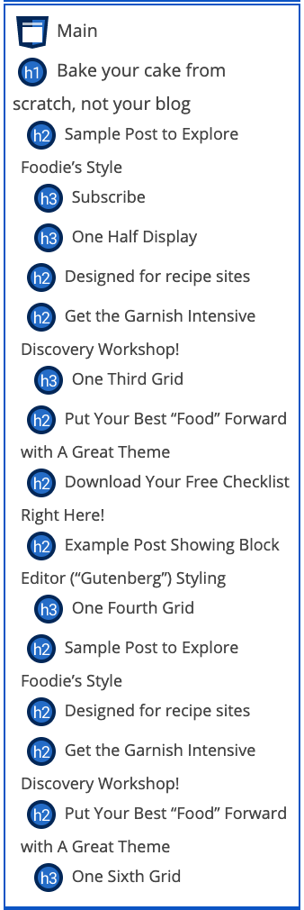
The theme homepage uses an incorrect heading structure, trying to nest post-title <h2>s under headings as <h3>s.
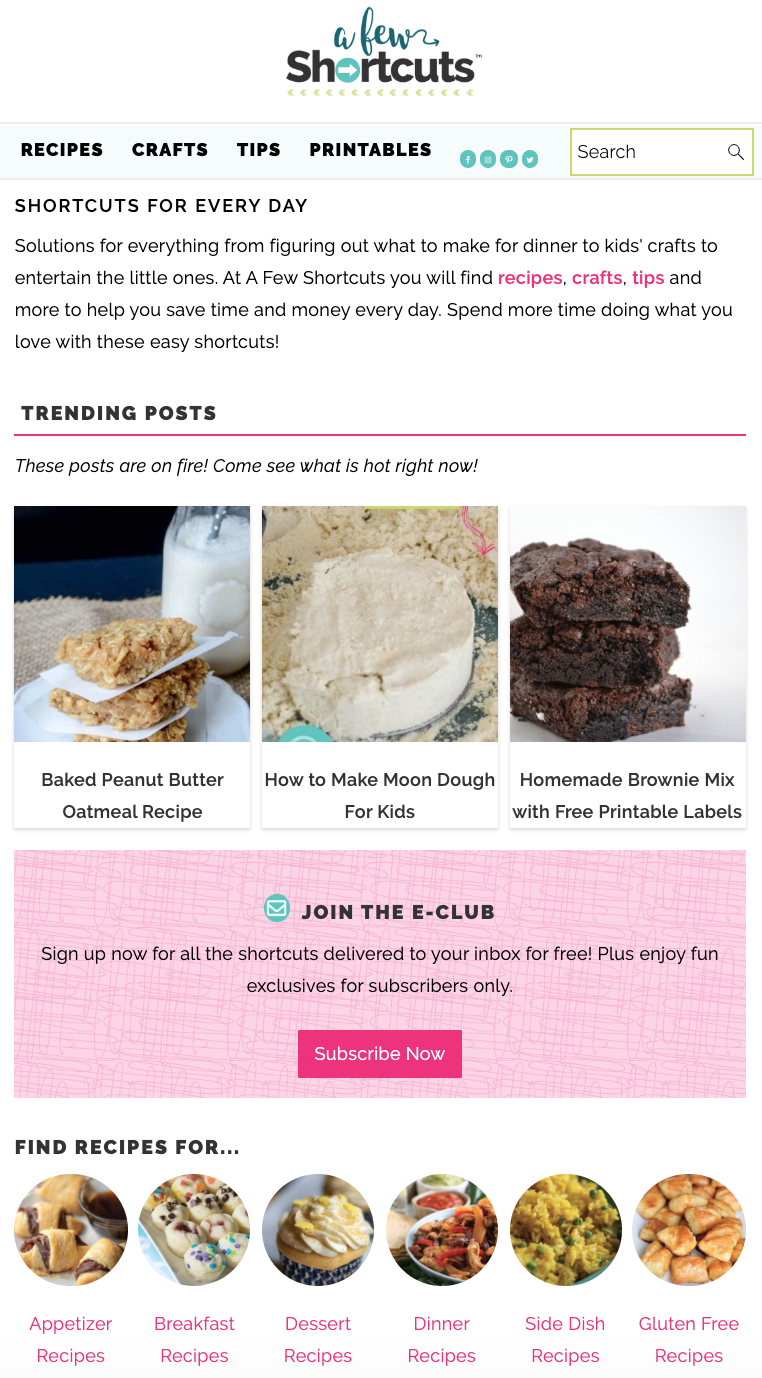
Theme homepage
Modern homepage
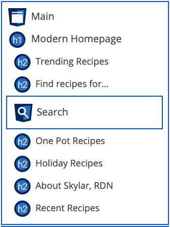
So what happened to all the post title <h2>s on the theme homepage? Well, they were turned into regular hyperlinks, because that's all they are: links to other posts. Links should not be headings.
Accessibility: Redundant links
The "Featured Posts" widget displays both the image and title with separate links, causing problems with keyboard navigation:

The FSRI shortcode wraps both the image and post title in a single link, removing this accessibility issue. This is the recommended method per this Yale accessibility guideline for adjacent links.
This also reduces redundant internal linking for SEO.
Note: the image alt tags in the modern homepage are intentionally left blank per w3 decorative image accessibility standards, because they're decorative only. The description for screen readers comes from the post title itself.
W3: Article schema
The theme homepage uses the article element to display the posts in the "Featured Posts" widget.
However, the most comprehensive documentation on the article element has very a specific use case for this:
The HTML
Mozilla Article Element Documentation<article>element represents a self-contained composition in a document, page, application, or site, which is intended to be independently distributable or reusable (e.g., in syndication). Examples include: a forum post, a magazine or newspaper article, or a blog entry.
This means that each post we display should be a self-contained, complete article that other sites can copy and distribute. This is not the case.
Each post we display using the "Featured Posts" widget is really just a link going to the actual post on a separate page.
A section forms part of something else. An article is its own thing.
HTML Specification
Further, the accessibility use for the article element is clearly defined, and has not been complied with in the themes:
The
Mozilla Accessibility Document on the article tagarticlerole indicates a section of a page that could easily stand on its own on a page, in a document, or on a website.
In retrospect, this has been incorrectly used for years, which we'll chalk up to an oversight.
This is resolved in the Modern Homepage with the use the FSRI blocks, which properly implement internal linking with accessibility in mind, and does not use the HTML5 article element.
Pinning
While not historically an issue on the homepage, the images in the "Featured Posts" widget lacked the data-pin-nopin="true" attribute.
Images that are just links to other posts should not be pinned, and this attribute has been added to the FSRI shortcode.
Better for bloggers
The FSRI has best practices baked into it with defaults set, instead of options.
The "Featured Post" widget contains over a dozen settings, the majority of which are completely useless and unused. This creates unnecessary confusion and uncertainty.
The Modern Homepage is built using the block editor as opposed to widgets, which provides greater flexibility in the type of content that can be added.
By beginning the transition to the block editor now with the homepage, we'll reduce the number of changes coming all at the same time, down the road.
Smoother theme updates
Both the homepage and recipe index are widget-based and can get jostled around by a theme update. When changing themes, they have to be completely rebuilt.
A homepage built with the FSRI shortcodes will remain the same before and after a theme update or theme change, simply with new styling applied to it.
Credit
The Modern Homepage is a huge technical leap forward, thanks to feedback and contributions from:
- Bill Erickson for the Display Posts shortcode foundation
- Casey Markee for SEO guidelines and recommendations
- Andrew Wilder for groundwork and research into accessibility issues

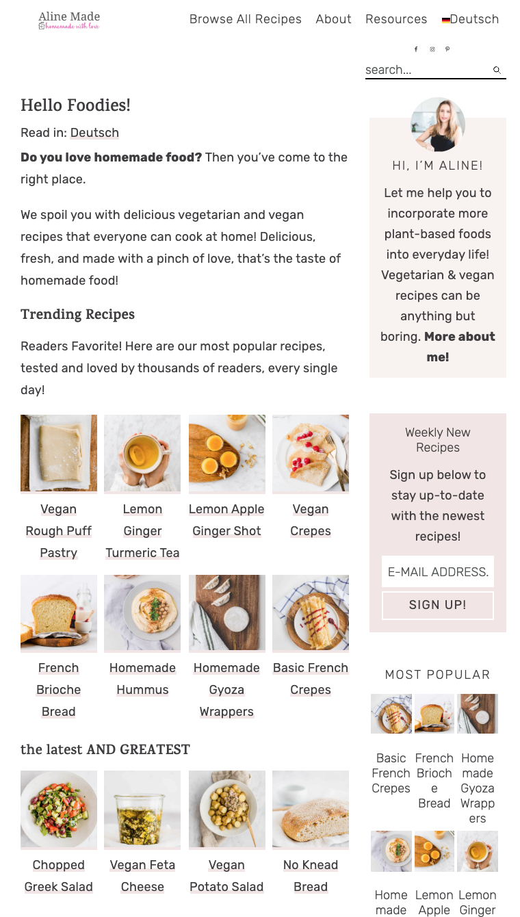
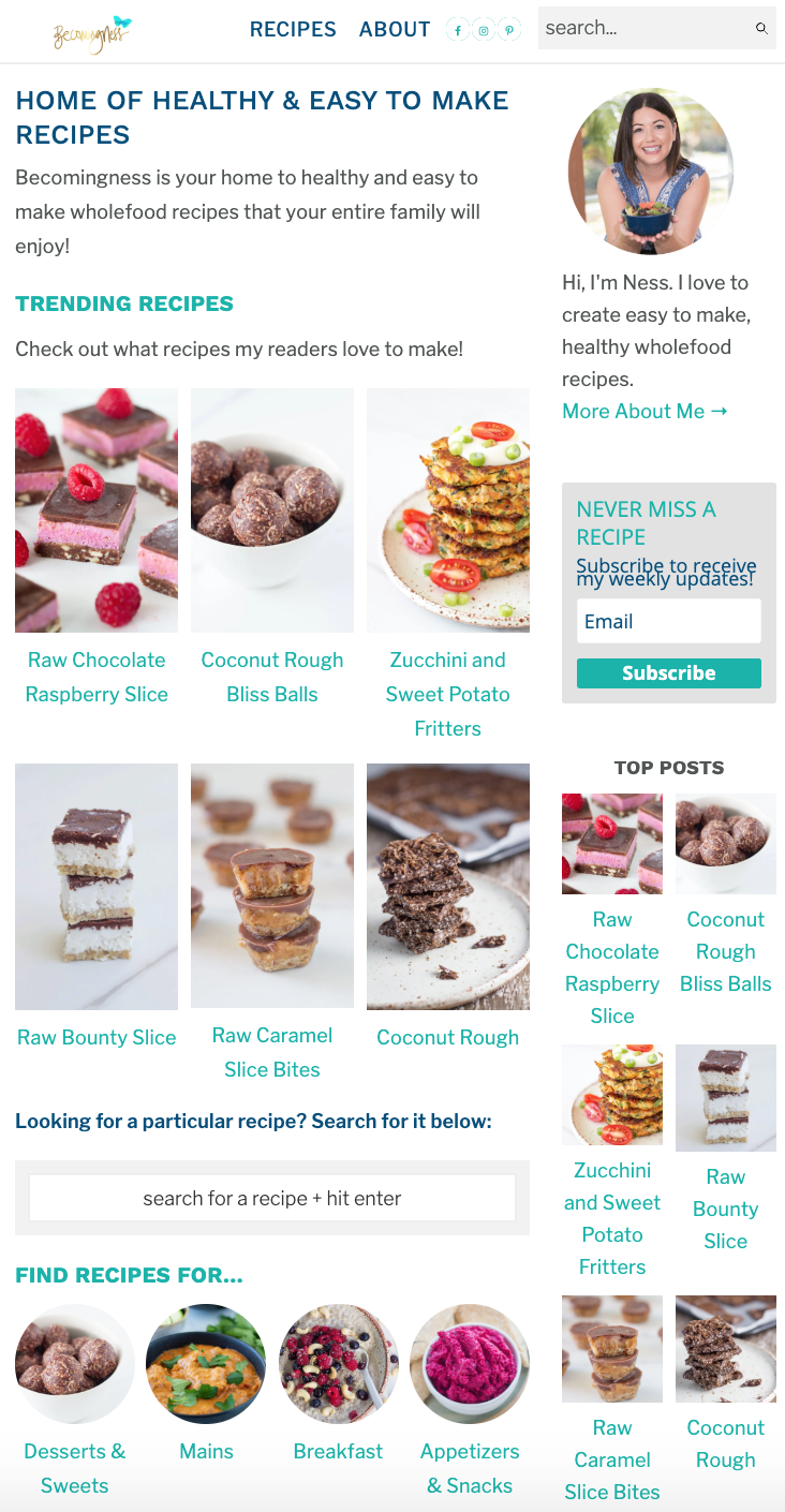
Hi, my modern homepage is up and running and I've directed by Recipe Index URL to the home page but in terms of deleting - I just have a question that on the Cultured Palate bottom widget the recipe index is there... Is that just an oversight or should I be doing the same? Thanks
That's an oversight - fixed! Thanks
this may be a silly question... but if I update to a modern homepage do I lose the design elements that I love (within the cook'd pro theme specifically)? I recently updated our site using this theme and I love the way it looks so much!! Of course I want to improve our site, but I don't want to lose the signature feast design elements that I have come to love so much.
Thanks Jackie 🙂
The Modern Homepage can be styled any way you want, so you can retain the styling of the classic theme. We'll be providing an updated styling guide next week to let you match the Cook'd Pro homepage at https://cookdpro.com/
Note that some of the elements that the classic theme contained, such as category tags, or context excerpts, are no longer recommend or supported for user experience and readability reasons: https://feastdesignco.com/how-to/why-we-dont-support-the-read-more-tag/
Hi.
I run Foodie Pro on Genesis Framework.
Do I need to change too?
Regards
Henrik // Edison & Co
The Modern Homepage is available via a premium feature in the Feast Plugin.
It was not designed for the theme and does not belong in the theme. As outlined in the plugin, the Modern Homepage is a feature we intend to update and enhance over time, which themes can't do.
You can continue to run the theme's version of the homepage if the issues outlined in this post are acceptable to you.
My personal opinion is that anyone who runs a serious recipe site should upgrade.
I have the Brunch Pro Theme. To change to the Modern Homepage, what do I have to do? Get the Feast Plugin premium? Do I need to delete anything currently set up? Can I do the new set up without impacting public access to my blog? I assume there are tutorials for the set up. Thanks. Cheryl
Cheryl:
The Modern Homepage is available via a premium feature in the Feast Plugin. You will need the Feast plugin in order to take advantage of this feature.
You can do the setup without impacting public access to the public (It's all done on a "private" page until you are ready to go live). Once you're ready to go live, you will need to remove any content from your homepage widgets.
There are tutorials on setting up the Modern Homepage on the Feast site.
I run on the cook'd theme, but when I did every step you had on the Modern Homepage the "fsri" sections do not connect to my categories. I used the correct slugs and all? Is this supposed to be good for all the themes?
Victoria:
In order to implement the Modern Homepage, you need to have the Feast plugin installed & active on your site.
Is this meant only for food blogs ?
Our recommendations and support are catered towards food blogs, but the blocks can be used to display any posts and categories regardless of the blog niche.
The only caveat is that our recommendations may not be optimal for your specific industry.