How Do I Set Up My Navigation Menu?
This tutorial covers setting up the navigation menu for Foodie Pro, Brunch Pro, Cook'd Proand Seasoned Pro.
Navigation menus are a core element of WordPress and are primarily configured in the WordPress settings.
Official WordPress menu guide: http://codex.wordpress.org/WordPress_Menu_User_Guide

The themes are built for a single navigation menu, using the Primary Navigation menu.

Remember, don't try to stuff every little page into the navigation menu. Keep it confined to only important parts of your website that you want accessible from every page.
Making the Menu Fit
Here's some ways to get your navigation menu to fit:
- Reduce the number of items
- If your header image is in-line, shrink the size of your header
- Create a drop-down / list menu / sub-menus
- Change the font, and font-size (as a last resort, but don't go too small)
Your first step should be to remove items from your header menu - only put things that are crucial to your readers, and then to you personally. Everything else should be linked to from your footer menu, or from within the posts themselves.
For example, you don't need a "home" link in your menu, since your logo should serve the ability to return to the home page.
Drop-down / List items in Menu
Creating a drop-down list or sub-menu is a core WordPress function and not theme-related.
Please see the following tutorial: https://codex.wordpress.org/WordPress_Menu_User_Guide#Creating_Multi-level_Menus
Mobile Optimized
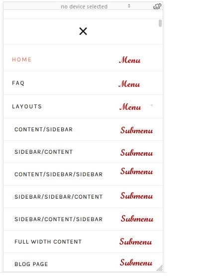
Menus and even sub-items are mobile-optimized in all of our food blogger themes.
That's it! Want to learn a little more about what's right and what's wrong to put in the navigation menu? Read on...
The Perfect Recipe for a Useful Navigation Menu

Okay, that may be a little misleading – there is no one perfect recipe for a useful navigation menu. Websites come in so many different shapes, sizes, and purposes that it's impossible to come up with just one way of helping users find their way around.
That's why, instead of giving you a recipe out of our book, we're going to teach you the underlying principles you need to know, and the tools you can use, to create a recipe that's perfect for your own navigation – one that you'll be able to continue improving as time goes on.

Use the right words for the job.
Your food blog's navigation isn't the place to be creative, clever, or cute. You only have a handful of words to work with – total – and each of them has to work hard to get the reader onto the next page. That means every word in your navigation menu should play an important part in making it 100 percent clear what the reader will find on the other side of the link when they click on it. If not, find another, more clear, more concise way of saying it.
However, this doesn't mean you should automatically default to the generic keywords that you see everywhere. If you can find short, descriptive keywords related to the content that you can use instead, they'll help search engines understand the contents of your site better from an SEO perspective.
(Just make sure you do your research to guarantee that your users really do understand where those links will take them. The card-sorting exercise included at the bottom of this post is a great place to start!)

Ask your audience if it makes sense.
One of the greatest challenges of publishing your own food blog is that it's so easy to take what you know for granted and assume that others understand it the same way you do.
To get some helpful outside perspective, use a tool like SurveyMonkey to create a simple survey asking readers what they're looking for when they visit your site, how they usually get to it, and if your navigation menu makes it easy for them to do so. Ask for their email address too, so that you can follow up with the people who respond if their answers inspire any additional questions.
If you haven't built a very large audience yet, try sharing your survey in a Facebook group with members who might be willing to share their feedback.

Fewer choices lead to better focus.
In a well-known study, grocery shoppers in one group were given six jams to choose from, while shoppers in another group were given twenty-four different options. The shoppers who only had six options were 600 percent more likely to actually buy one – in other words, the group with more options was 600 percent less likely to buy anything at all! This is a classic case of Hick's Law: the time it takes to make a decision increases as the number of options increase.
Pair this law with a study from Chartbeat suggesting that more than half of your visitors will leave your site after fifteen seconds or less, and it's clear that you don't have (their) time to waste. Instead of a sprawling navigation menu with a dozen options, or a nested mess of dropdown menus inside of dropdown menus, do your best to limit your navigation to a handful of high-level "buckets" that everything else on your site can be categorized into.

Use drop-down menus sparingly (or not at all).
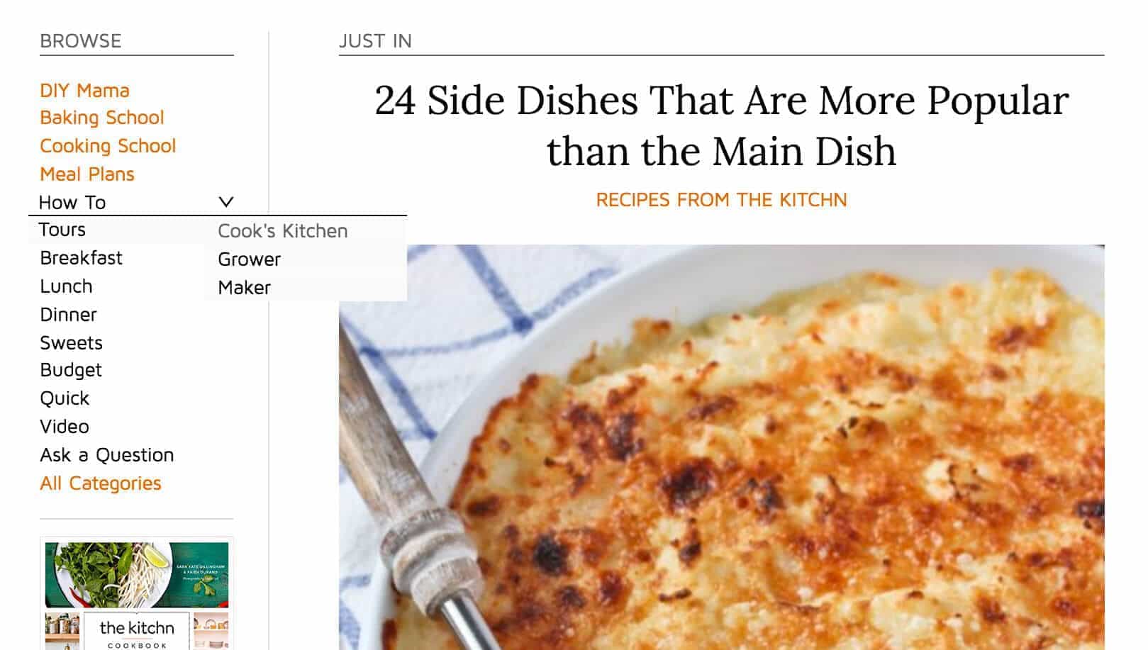
There are cases where dropdown menus might seem like a good option – they can be useful for recipe categories, for example – but consider your reader's perspective before you do. When your site loads, it may not be obvious to them that there's a whole menu hiding inside of that link, and it can be confusing or annoying to have more choices sprung on them after they've already decided to click it. In many cases, a link that takes the reader to an index page where they can drill down into more specific categories or content types makes for a much more user-friendly experience, and a better-looking one too.
Advanced: Use heat-mapping tools to analyze and optimize.
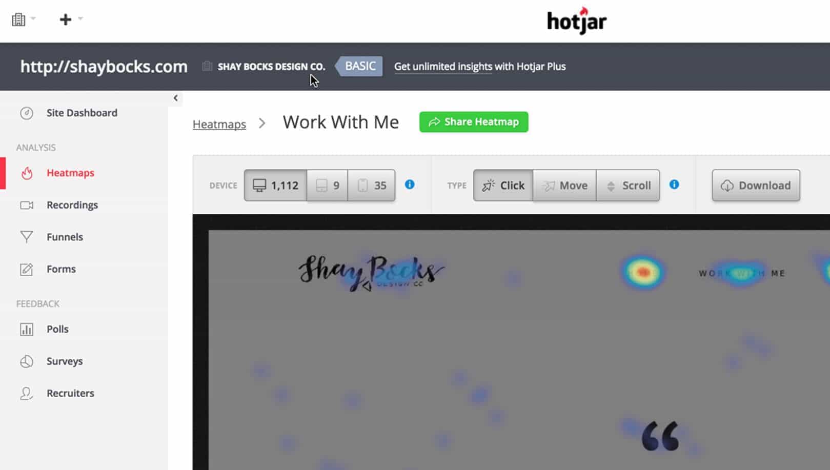
A heat-mapping tool like HotJar will record activity on your food blog over a set period of time, and then visually show you exactly what people are clicking and how often, giving you valuable insight into the minds of your readers without having to ask for it! HotJar's basic plan is free, and it's so easy to set up and use that there's no reason not to use it alongside any other research you do to optimize your website!
Note that it will load an external script, which will slow down your page speed and hurt your search engine ratings in 2018. This should only be implemented on a very advanced, already successful food blog. It should be run for short periods of time, and turned off when not actively being used.

Use a card-sorting exercise to get valuable insight.
One last thing you can do – and one of the most helpful for understanding how your visitors think – is to ask them to participate in a card-sorting exercise. A card-sorting exercise is a simple way of visualizing and organizing the pages on your website, and when you conduct them with your own users, it can give you tremendously valuable insight into what you can do to make your navigation more useful to them.
If you'd like to try it for yourself, enter your email address below and I'll send you a step-by-step guide on how to conduct your very own card-sorting exercise and how to use it to organize your site navigation!
Free Download!
Stay on top of SEO, pagespeed and compatibility updates via the newsletter!


