Modern Homepage Setup
This is the setup tutorial for the Modern Homepage, which is available exclusively through the Feast Plugin.
The Modern Homepage replaces the theme homepage, greatly improving SEO, accessibility, and your ability to customize the homepage to suit your personal style.
- improves SEO with proper heading structure
- improves SEO with unique on-page content
- improves SEO with proper site structure support author E-A-T
- fixes key accessibility issues with all themes "Featured Posts" widgets
- provides additional styling options
We have some companion pages to help understand what explains how the Modern Homepage is different from the theme homepage, but these are not necessary to implement it:
- the modern homepage vs. theme homepage details the differences between the modern homepage and theme homepage
- the rethinking the homepage post outlines the issues we discovered with the theme homepage
- the modern homepage showcase page shows some before-and-after results for sites that have made the switch

This tutorial makes use of two blocks from Feast:
- the Simple Recipe Index (FSRI) block, which displays an image+title of your posts
- the Simple Category Index (FSCI) block, which displays an image+title of your categories
- note that the FSCI block requires additional setup steps before using, and are an "enhancement" to the Modern Homepage
Follow the steps below to get the homepage setup:
Jump to:
- New sites
- Feast+
- 1. Create the page
- 2. Import the homepage template
- 3. Edit the page title
- 4. Edit the intro
- 5. Trending recipes
- 6. Search
- 7. Edit category #1
- 8. Edit category #2
- 9. Edit the user profile block
- 10. Add another category
- 11. Recent recipes
- 12. Recently updated
- 13. Set your featured image
- 14. Disable social widgets
- 15. Disable comments
- 16. Yoast settings
- 17. Full width Modern Homepage
- Sidebar
- 18. Set the homepage live
- Enhancement: Link to your categories
- Enhancement: default thumbnail size
- Troubleshooting
- Things you should know
- Unique content
New sites
For sites that have a low amount of content (less than 50 recipes): you can skip this entire tutorial and simply display your 50 most recent posts.
Just insert an FSRI block and set the limit to 50:
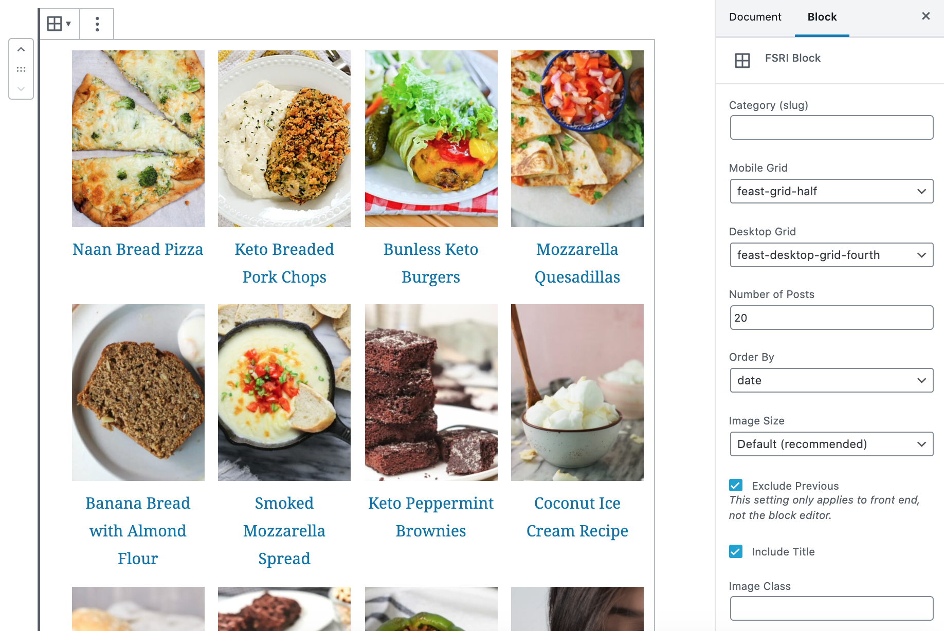
The full Modern Homepage setup will not benefit you until you have enough content to break into proper categories. Come back to this once you're getting traffic or feel like you need to rebuild the homepage.
See: how to launch your food blog.
Feast+
If you have Feast+, follow the Feast+ homepage tutorial section instead.
1. Create the page
Navigate to the Feast Plugin > Setup and simply click the button to create the Modern Homepage:

2. Import the homepage template
This step is now obsolete, after we updated step 1.
3. Edit the page title

We recommend using a short, user-first description (similar to a "tagline") as the homepage h1. To do this, simply click on the post title and edit it.
See this guide on page titles from Google for more information.
We've had feedback from people saying that they don't like the page title appearing, but this is absolutely critical to have for SEO and accessibility compliance. A single page-specific h1 is required for every page on your site, full stop.
Hiding the title is technically possible, but not an option we recommend or support.
4. Edit the intro

Following the site tagline, you should have a 2-3 sentence intro that explains what types of recipes you specialize in and what people love about your site.
See the Yoast Homepage Optimization post for additional tips.
There should be enough content above the fold to force the first set of images below the fold, so that they lazyload, for pagespeed purposes.
5. Trending recipes
Linking to your top-trafficked posts reinforces their importance to Google, helping them rank, using the FSRI block.
Use this tutorial on finding your top 8 trending recipes and insert them into the "ID" section of the FSRI block.
The post ID can be found in the admin bar on the individual post when visiting that page:

We do not recommend using a "trending" category to manage this, because that requires editing the posts that rank well to add/remove them from the category, and editing a post can (but not always) cause a recrawl and ranking loss.
6. Search
The search block is included with the Modern Homepage template and requires no action. Styling included in the Modern Homepage removes the heading and button, and this is perfectly fine for SEO and accessibility.
7. Edit category #1
Update the heading, description and FSRI block, and category link to point to the first category you want to feature.
The category link below the FSRI block should point to your actual category - to find this, you'll want to navigate to the category normally, or find it in the admin, and copy+paste the link.
8. Edit category #2
Update the heading, description and FSRI block, and category link to point to the second category you want to feature.
9. Edit the user profile block
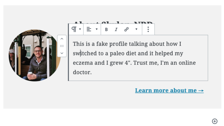
The about section uses the User Profile Block.
Be sure to change the image (1000x1000, or at least square), heading, description and link.
10. Add another category
Remove the paragraph below the user profile block and practice inserting your own heading, paragraph, FSRI block and paragraph with category link below the user profile block.
11. Recent recipes
For sites with high volumes of social media or email subscribers, the "recent recipes" section can be moved up higher on the page. This is because returning users may be landing on the homepage looking for the newest recipes
Broadly speaking, nobody visits your site to see your recent recipes and putting this at the top of the homepage is a mistake. We recommend all sites include this, and leave it at the bottom.
For sites that are primarily search engine and Pinterest driven, your recent recipes generally aren't the most relevant or timely content, and this section should stay at the bottom.
The FSRI block in the "Recent recipes" section displays posts using the Order by: date to show recently published posts. As with all FSRI blocks, it will not show previously displayed posts. This is intentional, and this is the correct behavior.
Nothing needs to be done in this section.
Displaying "recent recipes" is scraping the bottom of the barrel in terms of SEO and user experience - it's only important if you've screwed everything else up on your website which isn't the case if you have the Modern Homepage.
12. Recently updated
Having a "recently updated" section on your homepage helps to give those updated posts a little search engine boost, so that content can be recrawled and pushed up in search rankings.
This section selects posts by with the Order by set to modified date.
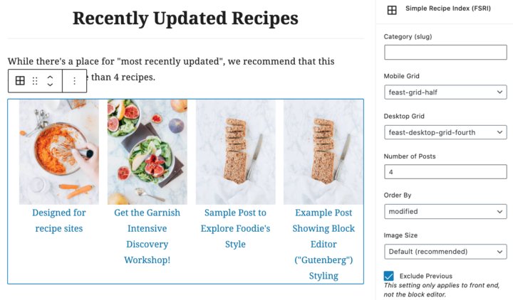
The FSRI block in the "Recent recipes" section displays posts using the Order by: modified to show recently modified posts. As with all FSRI blocks, it will not show previously displayed posts.
Nothing needs to be done in this section.
13. Set your featured image
We recommend setting the featured image for this page as your logo at 1200x1200 resolution. This gets pulled for the featured image by social networks like Facebook when you share your homepage. See: image optimization for Facebook.
Follow this tutorial to set your default featured image.
14. Disable social widgets
You don't need people sharing the homepage, and social widgets can slow page rendering.
If running Hubbub (Formerly Grow / Social Pug), scroll to the bottom of the block editor and disable it in their settings.

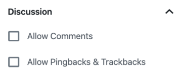
15. Disable comments
You shouldn't need people commenting on the homepage.
16. Yoast settings
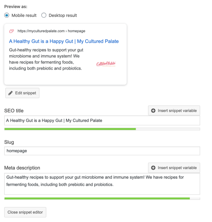
Configure the Yoast meta boxes at the bottom of the page using:
- your site tagline as the SEO title
- your homepage intro as the Meta description
Once done, this will look similar to:
17. Full width Modern Homepage
Our recommendations for all homepages - on all sites - without exception, is to use a full width layout.
This is because our setup incorporates the same content from the sidebar into the actual home page content.
Google (and readers) consider the main content section to be more authoritative than sidebar content. For more information, see the page structure document.
Sidebars are "boilerplate" content that provide weaker signals than content that you place in the actual page content. Putting your author bio, trending recipes, and seasonal recipes into the actual content on the homepage is far superior than having it in the sidebar.
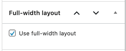
To do this, enable the "Full Width" setting for the Modern Homepage:
Video tutorial:
It also enables the use of the full-width FSRI option.
Note that disabling the sidebar on the homepage does NOT disable the sidebar site-wide. The sidebar should be on ALL OTHER PAGES on your website because it contains important site-wide internal signals.
Sidebar
This is important and people tend to miss it, so it's worth repeating.
We don't recommend having the sidebar on the homepage and that you follow the instructions in #17 to remove it.
The reason for this is simple:
your about profile and trending recipes are main content of the website and main content must be in the content
Sidebars are for accessory content. On every other page on your website (except the about page), your author bio and trending recipes are accessory content. The main content of all other pages are your recipes.
Removing it from the homepage does not remove it from the rest of the website.
18. Set the homepage live
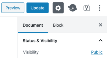
Once you're happy with the homepage, you can set the visibility to public:
Then go to Admin > Settings > Reading and set the Your homepage displays to a static page and choose the name of your homepage (site tagline)

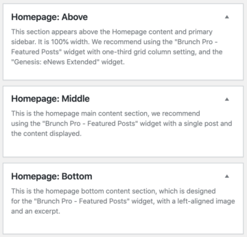
Finally, go to Appearances > Widgets and remove any widgets from the following widget areas:
- Homepage: Above
- Homepage: Middle
- Homepage: Bottom
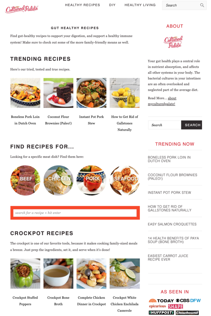
Your homepage should then be live:
Note: after setting the homepage live, do not set it back to private. It needs to remain public.
Enhancement: Link to your categories
We recommend inserting the Simple Category Index (FSCI) block below the "Trending Recipes" section.
Link to your top 4-8 categories to give an internal link boost to them, and the posts they contain.
For more than 8 categories, we recommend converting the theme's recipe index to the Modern Recipe Index.
Enhancement: default thumbnail size
We recommend setting the default thumbnail size in the Feast Plugin by following the FSRI Block troubleshooting tutorial.
Troubleshooting
If you're having issues with the thumbnails (or they're missing), see the FSRI Block troubleshooting tutorial.
Things you should know
The Modern Homepage is designed with based on best practices we've seen from high performing sites.
We moved the homepage to the block editor because of the amount of customization you can make to it, which is a good thing, but can also be bad if you don't know what you're doing.
Here's the principles behind the homepage:
- your homepage is the most important page on your site for internal linking and is the basis for your site structure
- content and links at the top of the page have what is known as "prominence", which means that users and search engines believe it's the most important - keep your site's introduction and trending/top posts at the top
- posts that are shown on the homepage get extra "link juice" and will rank better than posts not on the homepage
- do not overstuff your homepage by trying to fit everything on it - we recommend keeping it less than 60 links to posts and categories
- having too much on the homepage can cause a "too many DOM nodes" issue in pagespeed insights and will cause pagespeed issues
- to reinforce your site structure, we recommend converting the theme's recipe index to the Modern Recipe Index
- the headings on the Modern Homepage are important, as they provide landmarks for screen readers to navigate, and are important for search engines, see the Modern Guidelines for Page Headings
- the unique content in the paragraphs provide context for your readers, and additional information about your site to search engines, and are important to include
- By default, it will exclude previously displayed - we recommend leaving this enabled to avoid repetitive internal links
- This means that a post may not show up where you expect it to, if it shows up earlier on the page and this is fine
- your "recent posts" is not the most important part of your page
Unique content
We've had enough questions about the site title + intro paragraphs that this bears repeating: it's necessary.
Some people feels this "detracts" from the homepage or that it's too much of a change, and unfortunately that's simply not important.
Your homepage is possibly the most important page on your site, and the content there tells Google (and site visitors) what the entire content of your website is about.
Not having any unique content, or not having enough, is a problem.
This is very simple:
- The page title (h1) should be your Yoast page title
- The intro paragraph should be your Yoast page description
- The 1-2 sentence sentence explanation for each category displayed with FSRI blocks should explain why this lives on your page and the idea behind the category
- Imagine a blind person has landed on your site and the only information they're aware of, is what is in the page content (no headers, no sidebar, no footer, no images) - do they understand what your site is about?
You want to at least mention the keywords your site/categories/posts rank for, but don't try to optimize this page at all. That's not the purpose here.
Focus on providing context, and a little teaser for your readers to dive deeper into the site.


Hi thanks so much for this. Many of us have both categories and custom taxonomies that we use to categorize recipes. So far, your updated recipe index, and now your home page make no provisions for displaying these taxonomies. Is there either a workaround, or a roadmap to make this functionality available?
Custom taxonomies, much like custom post types and custom templates, are a customization that introduces tons of unnecessary complexity. They're extremely technically advanced, and would cause more problems than they're worth for our average user.
There are simply far more important things to focus on that actually provide tangible benefits. The post content is priority #1, #2 and #3 and there's a long way to go before this is optimized.
At this time, we have no intention of supporting custom taxonomies. Our philosophy is K.I.S.S.: https://feastdesignco.com/principles-best-practices/
If you're at the stage where you require this extent of customization, I would recommend hiring an in-house developer.
Thank you thank you thank you. These updates are what I've been waiting for and I'm thrilled to be able to customize our homepage (and have it be more mobile friendly)! I've already been updating our homepage per your instructions above and I'm thrilled. Thank you!
Are you recommending changing the sidebar as well? For example I have my about me in the sidebar as well as popular recipes.
Great question! At this time, no. The sidebar is used on every other page on the site and the about and popular recipes should appear on those.
You can exclude the about from the homepage if you'd like.
We'll release an alternate guide down the road for creating a full-width homepage (no sidebar) but this will need more testing with regards to the image sizes and widths.
Is there a way to have the fsri point to a page rather than a category?
Yes! We've added this to the tutorial:
[fsri post_type="page" id="111,222,333"]Replacing the ids with the page ID.
Hey Skylar, just setting up my new homemage. Say you have 8 posts in a category, but only want to display 4 on your homepage at any one time I'm wondering if there's a way to make it random which 4 out of the 8 are selected? From what I'm reading they are set to default to display most recently published/ updated? Correct me if I'm wrong.
Generally, you want the links being displayed to be consistent. Google uses an "average" of the last 10-20 page crawls to determine what's actual permanent content on your homepage, and what isn't.
Randomly displaying posts would eliminate the "authority" being passed to any posts being displayed.
You CAN set the orderby parameter to change which posts are preferentially displayed. Two good options would be orderby="modified" or orderby="comment_count"
Can you enable the modern homepage if you're not using the block editor?
In theory, you could. But we haven't tested it, wouldn't recommend it, and wouldn't support it.
The block editor can be enabled on a post by post basis. You don't have to use it on your entire site just because you use it for one page.
See: block editor tutorials
Thank you so much for making this easier than before! I really appreciate your work on it. I've got the basic set up done and look forward to making some customization.
Hi Skylar. I am trying to add ads to the homepage in the middle of the page. Is there something I can do to insert an ad space in the middle of the page?
You'll want to ask your ad company if there's some HTML snippet you need to insert, or whatever their instructions are.
This tutorial was insanely helpful! I really appreciate it. As someone who hates doing the tech stuff, you made it super simple. Just wanted to quickly mention that the video shown under 17. Set The Homepage Live is the wrong one. It's showing the social sharing video again. Thank you so much for putting this tutorial together!
Thanks for catching that! The video has been updated.
Hi Skylar, I originally made my modern homepage using the shortcode. Do I need to do over using blocks instead, asper this tutorial? My host updated to WP 5.5 automatically (have asked them to stop auto updates now) I reverted to my back up but my homepage isn't pulling recently published posts and I wondered if something went screwy with the WP update and revert? Thanks so much, Amy
Thanks for asking! We have a shortcode-to-block conversion video tutorial at https://feastdesignco.com/fsri-block/#conversion-video
You'd have to submit a support ticket for troubleshooting that specific issue.
I just switched to the modern homepage and I love it!!! So versatile and easy to use!
I do have 2 questions:
1) Which CSS code should I use if I want the search label (above the search bar) to be visible and the search button to be visible as well, but still in line with the search bar?
2) And is there a CSS code I could apply to insert some white space between the menu and the H1 title on the modern homepage?
Thank you so much! Elo
Great to hear Elo!
1) We haven't provided any styling for the search label and wouldn't provide support for this - you would just remove the CSS code snippet we included to hide this off screen
2) You can follow this tutorial to learn how to do this: https://feastdesignco.com/how-to/use-inspect-element-troubleshoot/
For the user profile block on the modern homepage, what dimensions should the image be?
By default it uses a 1fr/2fr layout (33%/66%) and with the Full Width, you'd be looking at 1140px / 3 = 380px - so round up to 400 to be safe. If you need a retina quality display on desktop (not really) you'd want to upload at 800px. Personally, I'd stick with 400x400px and let the Modern Thumbnails generate the required 180px/360px variations.
I was checking https://foodiepro.com/bloggers/ and https://cheerfulcook.com/ is using the modern homepage.The top image is a Featured Recipe similar to Featured Post Widget with food description. Is there a tutorial for this. Also, can we incorporate the widgets from previous versions to modern homepage. Thanks
This is a customization the user decided to make, and not one we'd recommend. "Read more" is terrible anchor text for SEO as well as accessibility.
You could, in theory, do this using regular locks and manually typing in the description.
The Modern Homepage does not use widgets, and it can't incorporate any widgets.
I have the full width container for Trending Recipes at the top of the page. What is the CSS for changing the background color for the container and eliminating the white outline around the pictures?
We have the homepage styling guide at https://feastdesignco.com/modern-homepage-styling-guide/
Previously in the Widgetized Home set up, I could select to display the author and published date.
Is there a way of adding the Authors to the modern homepage? I have multiple authors on our site and it would be great to show this underneath each category! I'm using the Foodie Pro theme at the moment on my site: http://www.honestfoodtalks.com
Adding authors to post display would create an excessive amount of duplicate links for screen readers, and would require custom styling.
If "author" is an important factor for you, I wouldn't recommend creating a section (h2 + description + fsri block + link to category) for each specific author.
However, I would only do this if your users come to your site looking for a specific author - 99% of websites this wouldn't be applicable. Visitors land on SPECIFIC POSTS looking for SPECIFIC RECIPES - 90% of your users won't care who the author is, only the author. In my opinion, you should link to the authors bio/site from the POST only, not the homepage. The homepage is for diving deeper into categories/posts, not highlighting the author that the reader doesn't know or care about.
Hi,
I was experiencing great confusion why a posts in a particular category was not showing up in the blocks in the front end on the home page. (in the editor it is fine) I tried everything but unchecking "exclude previous" made it work in the front end.
These posts already appear in another category block, so is that why they weren't showing up?...due to the "exclude previous"?
I busted my brain trying everything that could be wrong, and then I read what you wrote about exclude previous and duplicate links.
I think it threw me way off because I have very few posts so it looked like a whole category wasn't working, but really it was just two posts that already appear in the "trending" block.
If this is the case, does that mean if a post is in the trending block, I cannot also have it in a specific category block somewhere else on the page?
For example:
1. A sauerkraut (fermented cabbage) post appears in the "Trending Recipes" block.
2. Then I have a "Fermentation and Pickling" block...which pulls from the "fermentation-pickling" category slug. That category would contain the same sauerkraut post as in #1 among others.
Love the tutorial, very helpful.
I noticed the slug for the homepage shown in the video is "homepage" but the slug for the modern homepage is "modern-homepage." Neither of which would contain a blog's keywords. Should this slug be changed to include keywords or do we need to keep it as it is?
Hey Beth!
The slug is not shown when the page gets assigned as the homepage, which makes it totally irrelevant. Don't worry about the slug on the homepage it's not important at all.