Note: we highly recommend setting up the Modern Homepage using the Feast Plugin instead. The theme homepages have a number of issues as outlined here.

Brunch Pro Classic uses a widgetized home page template to accomplish the flexible layout that shows recent and/or featured posts in full-width or grid format. The widget used to create these sections of posts is built in to the theme, so there's no need for an additional plugin.

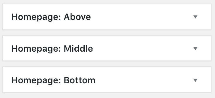
The Homepage: Above, Homepage: Middle, and Homepage: Below widget areas are setup to display recent and featured posts in different ways using the Brunch Pro Featured Posts widget.
You will drag and drop a Brunch Pro Featured Posts widget to one of these widget areas and then configure them as you wish. These screenshots show how I have chosen to set things up for the demo site:
Homepage: Above
The Homepage: Top widget area is designed for a Brunch Pro Featured Posts widget (which will showcase your three most recent posts) and the Genesis eNews Extended widget.
This section will appear above what is normally the "content" section, including the sidebars, if they're set.
The Genesis eNews Extended widget is used to set up your newsletter opt-in. This plugin is designed to be used with a newsletter service such as Mailchimp, Aweber, Mailpoet, or any of the other popular newsletter services.
You can Google "Genesis eNews Extended + Service" for whichever service you want, and there are bound to be some tutorials and videos to guide you in getting that set up.
Here's the plugin info page where you can read about installation and get support: https://wordpress.org/plugins/genesis-enews-extended/

Homepage: Middle
This will appear where your regular content normally appears in a post - below the header, and below the Homepage: Top section. The sidebar will appear beside this section, if it's set.
You may have noticed that the Homepage: Middle section on the brunch pro demo home page shows an image yet we have configured this widget area with the setting "Don't Show an Image."
In order to get your Homepage: Middle to display like the demo please place an image at the very top of your posts and then in the post editor create your own excerpt by inserting the read more tag, which looks like this:


Homepage: Below
You can add an entirely separate set of widgets below the Homepage: Middle section here.

Why isn't there any pagination in the Brunch Pro Classic Home Page?
Because the home page is so flexible, pagination would not work well. We would need to limit the flexibility of the home page in order to add that feature and we chose to stick with flexibility. Your readers should still be able to navigate your site with a well established menu.
If you must have pagination, one option to get around this is to add a text link at the bottom of your home page that goes to your blog. Something like this should work well:
<div align="right"> <a href="https://yoursite.com/blog">See More →</a> </div>
