Note: This tutorial is outdated for Foodie Pro version 3.1.5 and newer, see: Rethinking the Header and the logo tutorial

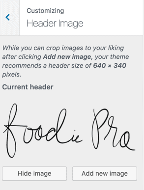
- To display a logo in your header instead of your site title, navigate to Appearance > Customize and find the Header Image option in the customizer to upload your logo, which should be roughly 320 x 100 pixels.
- Click on Add New Image and either select your header image from your Media Library or upload the image to the Media Library and click Select and Crop.
- Crop the image to your liking or skip cropping if you have already prepared your image before uploading (recommended).
- Don't forget to click Save and Publish!
- Note: your image will display at exactly the quality and size you upload it at, so upload a high quality image

Stylized Logos
The Foodie Pro logo is a handwritten, stylized logo - it is not made using a font. You can outsource this sort of thing via gig sites like:
- https://www.etsy.com/ca/market/handwritten_logo
- https://www.fiverr.com/search/gigs?query=handwritten%20logo
You can also simply use a logo generator to get a close-enough result, from sites like:
You can also see our tutorial on how to create a logo.
Retina Logos
In the past, we recommend "retina logos", which was an image at double the pixels you wanted it to display at. As the web has changed, it's become more important to have images that are small and therefore download quicker, and optimized for mobile, which are generally much smaller screen sizes.
Mobile makes up roughly 80% of pageviews for most food blogs, and this makes sense, because people often search for recipes on their downtime, or while at the grocery store. A good chunk of traffic for food blog often comes from Pinterest, which people tend to use disproportionately on their mobile devices.
Finally, mobile devices aren't always connected to wifi, which means they're running on a slower mobile connection, which is metered (you only typically have a few GB of monthly bandwidth). Small images are essential for pagespeed purposes.
All these factors combined means that it's far more important to have a small header than it is to have a pixel-perfect "retina" logo on desktop. The oversized headers of food blogs of 2016 are gone. Modern logos are are small so that they respect the devices your visitors use, and unobtrusive, so that they don't take up valuable above-the-fold screen real estate.
